Neutral Sans Workhorse

Imprimo Letterpress + Taught
Lets Imprimo Letterpress own the focal silhouette while handling secondary copy, sizing and subheads cleanly.
Inspect Taught specimenDisclosure: MakerFileHub may earn a commission from qualifying purchases via paid links on this page. How our links work.
Worn wood-type letterpress condensed sans display
Imprimo Letterpress is a tall, condensed uppercase sans-display font stamped with subtle vintage ink grain and soft wood-type corners.
Paid link
Get this fontProject & layout blueprintsAt-a-glance maker compatibility
Sturdy stroke walls and open counters weed cleanly on adhesive vinyl, HTV apparel film, and cut cardstock.
Visual anatomy & craft review
Imprimo Letterpress is a condensed uppercase sans drawn with the soft, slightly rounded corners a worn wood type sorts acquires after decades of printing, and the interior of each stem carries uneven ink mottling rather than a uniform grunge overlay. Vertical bars stay perfectly upright while the shoulders and junctions sit a fraction tight, which is what makes the face read as pressed into paper instead of printed on top of it. Because the fills are already uneven, the face needs a decent size to show its character, and it pairs naturally with a plain text serif for anything longer than a headline.
Archival-press · Tactile · Condensed
Two-font hierarchy recipes
Tested contrast partners — pairing Imprimo Letterpress with grounded secondary typography.
Imprimo Letterpress + Taught
Lets Imprimo Letterpress own the focal silhouette while handling secondary copy, sizing and subheads cleanly.
Inspect Taught specimen
Imprimo Letterpress + Evoire
Grounds bold display lettering with classic typographic authority on posters, badges and apparel.
Inspect Evoire specimenPractical applications
Concrete hierarchy, scale and production guidance tailored to Imprimo Letterpress’s stroke geometry.
Tall condensed press capitals are the shape a masthead actually had, so a history publication gains period credibility without a single faux-distress asset. Interior ink mottling survives newsprint absorbency, where a crisp geometric face would look pasted on.
Hierarchy & layout recipe
Masthead 300 x 40 mm, 42 pt, 30 units tracking, 1 pt rule 4 mm beneath. Podcast cover 3000 x 3000 px, title 420 px cap-height, episode label 90 px. Zine 148 x 210 mm, masthead 54 pt across the head trim, three 42 mm columns with 5 mm gutters.
Pre-production check
Newsprint absorbs ink and closes the tight junctions between stem and shoulder. Print one test sheet on the actual 45 gsm stock, and open the tracking rather than the stroke weight if the fill looks blocked.
Letterpress-weight capitals read as a stamp on a paper bag, which is the register small producers use to signal that a label was made by a person. Condensed width fits a long origin name on the narrow gusset of a coffee bag without abbreviation.
Hierarchy & layout recipe
Bag 100 x 250 x 60 mm, origin 16 mm on the front panel, roast data 6/8 pt on the gusset. Soap wrap 90 x 120 mm, name 12 mm, ingredients 5.5 pt at 6 mm from the foot. Tote panel 300 x 300 mm, name 45 mm, 30 mm margins to the seam.
Pre-production check
One-colour print on kraft shows through any ink at more than about 85 percent coverage, and the mottled stems fill to a solid black bar. Reduce to a 75 percent tint or specify an opaque white base, and check a filled bag for surface scuffing.
Heavy press capitals feel warm on a cold-season label, and the condensed width lets a long seasonal blend name sit on one line at label scale. The mottling reads as wear rather than decoration, which suits a market board that will be handled all season.
Hierarchy & layout recipe
Roast bag 100 x 250 mm, blend name 18 mm, tasting notes 6/8 pt. Menu A4, headings 20 pt, dishes 9/13 pt, 15 mm margins. Price board 500 x 350 mm, item 22 mm, price 18 mm on a 30 mm right column, 30 mm margins.
Pre-production check
Laminate over a mottled fill produces a visible patchwork when the sheet is viewed at an angle. Proof the laminate choice on one board, and prefer a matte finish if the mottling reads as blotches rather than texture.
Technical & licence verification
Confirm included OTF/TTF/WOFF formats, full glyph tables and licence coverage on the live store page before batch production.
Closest visual alternatives
Matched across letterform anatomy, stroke behaviour and craft applications.
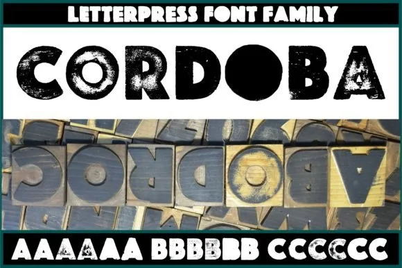
Real wood-carved & pressed letterpress sans family (6 alternates/glyph)
Cordoba is an authentic wood-carved letterpress display family digitized from real inked hardwood blocks with 6 contextual variants per letter.
Ideas for this font
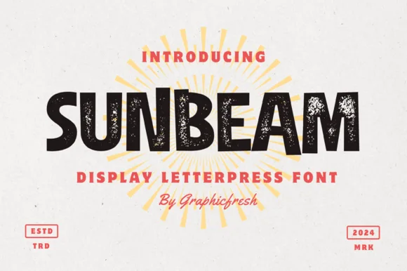
Chunky hand-cut vintage letterpress sans display
Sunbeam is a bold, wide-stance vintage sans display typeface pairing hand-carved organic contours with subtle letterpress speckle texture.
Ideas for this font
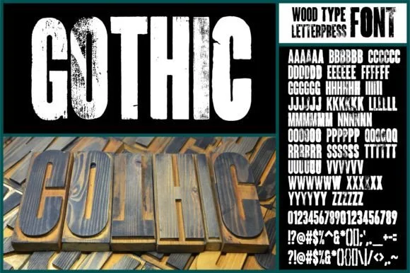
Real hand-carved woodblock letterpress condensed sans (6 alternates per glyph!!)
Gothic (by wtl.typography — historical 'Wood-Type Gothic' condensed sans!) was physically carved from wood, inked, letterpress-printed & scanned with 6 unique alternates per letter!
Ideas for this font
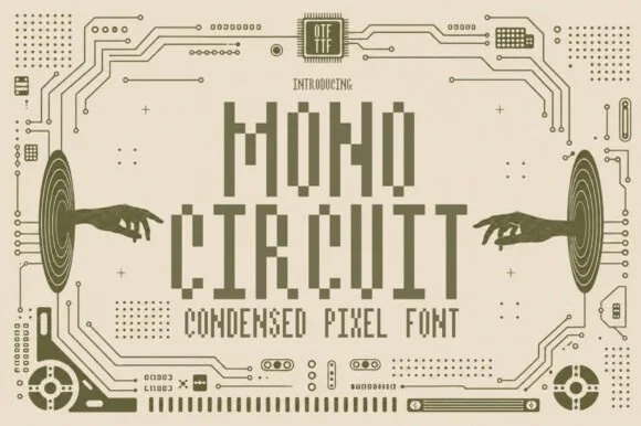
Condensed pixel font with a technical ground
Mono Circuit is a condensed pixel font in olive on cream: letters built from square blocks in a narrow grid, with circuit-board traces, hands reaching toward the type and small technical marks filling the page.
Ideas for this font
Allow optional Google Analytics to measure visits and catalogue actions. Your search words and notes are not included. Privacy & storage