Neutral Sans Workhorse

Cordoba + Godthem
Lets Cordoba own the focal silhouette while handling secondary copy, sizing and subheads cleanly.
Inspect Godthem specimenDisclosure: MakerFileHub may earn a commission from qualifying purchases via paid links on this page. How our links work.
Real wood-carved & pressed letterpress sans family (6 alternates/glyph)
Cordoba is an authentic wood-carved letterpress display family digitized from real inked hardwood blocks with 6 contextual variants per letter.
Paid link
Get this fontProject & layout blueprintsAt-a-glance maker compatibility
Sturdy stroke walls and open counters weed cleanly on adhesive vinyl, HTV apparel film, and cut cardstock.
Visual anatomy & craft review
Cordoba is a sans family built from real wood-carved and pressed letterpress blocks: softly rounded shoulders, a slightly uneven contour where the wood grain nicks the edge, and six alternates per glyph so a repeated letter never matches. The nicked contour and the alternates are the point, which means automatic repetition defeats the face. It needs roughly 26 mm for the grain nick to read, and it is best in one deep ink pressed into soft cotton stock rather than coated paper.
Wood-carved · Authentic-press · Tactile
Two-font hierarchy recipes
Tested contrast partners — pairing Cordoba with grounded secondary typography.
Cordoba + Godthem
Lets Cordoba own the focal silhouette while handling secondary copy, sizing and subheads cleanly.
Inspect Godthem specimen
Cordoba + Lumera Editorial
Grounds bold display lettering with classic typographic authority on posters, badges and apparel.
Inspect Lumera Editorial specimenPractical applications
Concrete hierarchy, scale and production guidance tailored to Cordoba’s stroke geometry.
A pressed wood-type sans gives a literary journal the feel of letterpress printing rather than a digital cover, which is what a small press sells. The alternates keep repeated letters in the title from looking machine-set, and the soft contour holds at 48 pt under a deep impression.
Hierarchy & layout recipe
Cover 148 x 210 mm, title 48 pt with alternates on, 12 mm margins. Title page 148 x 210 mm, title 30 pt, imprint 8/11 pt. Folio initial 20 mm, 9 pt caption underneath.
Pre-production check
On coated stock the nicked contour prints as a clean edge and the wood character disappears entirely. Specify a soft cotton sheet at 300 gsm or heavier, and pull one letterpress proof before the run.
A wood-pressed sans reads as a hand-set mark rather than a designed logo, which is what a small roaster wants on a kraft bag. The six alternates stop the double letters in the name from repeating, and the soft contour survives a one-colour flexo print on unbleached paper.
Hierarchy & layout recipe
Bag 100 x 200 mm, word 22 mm with alternates on, weight 9 mm, 10 mm margins. Loyalty card 85 x 55 mm, word 12 mm, 5 mm margins. Window decal 300 x 120 mm, word 60 mm, 15 mm edge clearance.
Pre-production check
Flexo on unbleached kraft sinks the 0.4 mm grain nick into the paper and the word prints as a plain sans. Request a heavier impression or print the bag digitally, and check one bag on the production stock.
A wood-type sans reads as a printed workshop sheet rather than a classroom handout from a laser printer, which is what a design-technology department wants. The alternates give the title an honestly hand-set rhythm, and the soft contour stays readable at 14 pt in a small label.
Hierarchy & layout recipe
Handout A4, title 36 pt with alternates on, body 10/14 pt, 18 mm margins. Bench label 120 x 40 mm, word 14 mm, 4 mm margins. Library plate 90 x 60 mm, word 11 mm, 4 mm margins.
Pre-production check
A 90 x 60 mm library plate at 11 mm falls below the point where the nick reads and the plate looks like any other sans. Use 14 mm minimum and one alternate per repeated letter, and print one plate before the set.
Technical & licence verification
Confirm included OTF/TTF/WOFF formats, full glyph tables and licence coverage on the live store page before batch production.
Closest visual alternatives
Matched across letterform anatomy, stroke behaviour and craft applications.
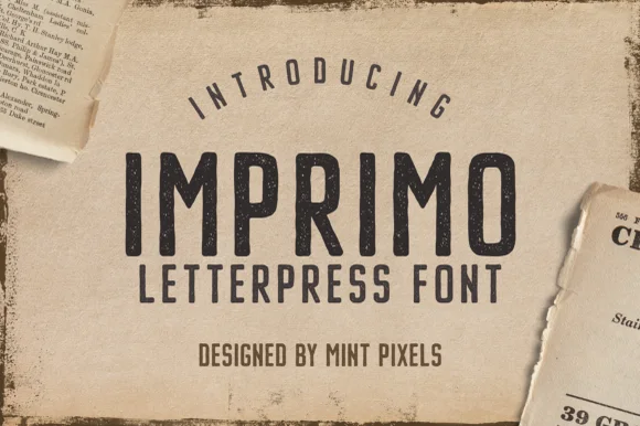
Worn wood-type letterpress condensed sans display
Imprimo Letterpress is a tall, condensed uppercase sans-display font stamped with subtle vintage ink grain and soft wood-type corners.
Ideas for this font
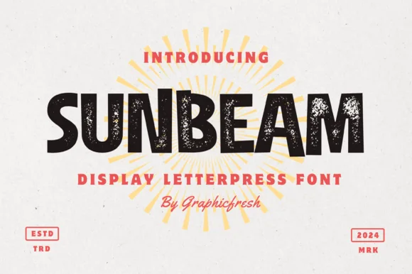
Chunky hand-cut vintage letterpress sans display
Sunbeam is a bold, wide-stance vintage sans display typeface pairing hand-carved organic contours with subtle letterpress speckle texture.
Ideas for this font
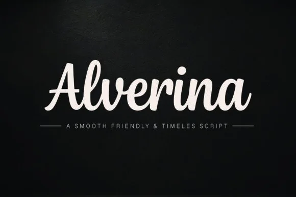
Warm thick-ribbon upright friendly script (Cricut & puff-HTV ready!)
Alverina is a warm, bold-stroke handwritten script with upright rhythm and sturdy connectors that cut and weed cleanly on vinyl, HTV, and wood!
Ideas for this font
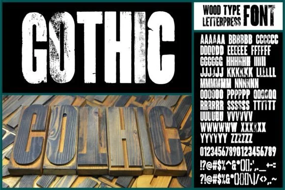
Real hand-carved woodblock letterpress condensed sans (6 alternates per glyph!!)
Gothic (by wtl.typography — historical 'Wood-Type Gothic' condensed sans!) was physically carved from wood, inked, letterpress-printed & scanned with 6 unique alternates per letter!
Ideas for this font
Same independent foundry
Allow optional Google Analytics to measure visits and catalogue actions. Your search words and notes are not included. Privacy & storage