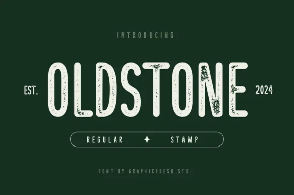
Neutral Sans Workhorse

Sunbeam + Bargain Condensed
Lets Sunbeam own the focal silhouette while handling secondary copy, sizing and subheads cleanly.
Inspect Bargain Condensed specimenDisclosure: MakerFileHub may earn a commission from qualifying purchases via paid links on this page. How our links work.
Chunky hand-cut vintage letterpress sans display
Sunbeam is a bold, wide-stance vintage sans display typeface pairing hand-carved organic contours with subtle letterpress speckle texture.
Paid link
Get this fontProject & layout blueprintsAt-a-glance maker compatibility
Sturdy stroke walls and open counters weed cleanly on adhesive vinyl, HTV apparel film, and cut cardstock.
Visual anatomy & craft review
Sunbeam is a chunky hand-cut letterpress sans with an uneven contour: heavy squared stems, small blade nicks along the edge, blunt corners and a baseline that drifts by a fraction across the word. The cut marks are drawn, so a one-colour print keeps them, and the chunky weight holds a poster at arm's length. It needs roughly 28 mm for the nicks and the blunt corner to read, and it is best in one dense ink on a warm uncoated sheet, or white on a dark board where the nicks print as small lights.
Sunny-vintage · Hand-carved · Bold
Two-font hierarchy recipes
Tested contrast partners — pairing Sunbeam with grounded secondary typography.
Sunbeam + Bargain Condensed
Lets Sunbeam own the focal silhouette while handling secondary copy, sizing and subheads cleanly.
Inspect Bargain Condensed specimen
Sunbeam + Majestic Letters
Grounds bold display lettering with classic typographic authority on posters, badges and apparel.
Inspect Majestic Letters specimenPractical applications
Concrete hierarchy, scale and production guidance tailored to Sunbeam’s stroke geometry.
A hand-cut letterpress sans reads as a painted kiosk board rather than a designed logo, which is what a beach kiosk wants above its hatch. The nicks give the name texture at 40 mm, and one ink prints the board and the cups from the same separation.
Hierarchy & layout recipe
Sign board 900 x 400 mm, word 120 mm with 12 mm nick clearance, 25 mm margins. Cup print 70 x 50 mm, word 16 mm, 5 mm margins. Card 85 x 55 mm, word 16 mm, 5 mm margins.
Pre-production check
A 70 x 50 mm cup panel at 16 mm turns the nicks into dirt and the name looks stained. Raise cup type to 22 mm or use the clean cut, and check one printed cup before the order.
A chunky cut sans reads as a stamp pressed on a bag rather than a label, which is what a small roaster wants on kraft packaging. The heavy stems hold at 26 mm on a bag, and one ink prints the bag and the crate mark without a second plate.
Hierarchy & layout recipe
Bag print 100 x 200 mm, word 26 mm with 6 mm nick clearance, 10 mm margins. Crate mark 300 x 150 mm, word 60 mm, 15 mm margins. Card 85 x 55 mm, word 14 mm, 5 mm margins.
Pre-production check
On unbleached kraft the nicks fill with paper fibre and the word prints as a plain condensed sans. Print on coated kraft or raise the word to 34 mm, and check one bag on the production stock.
A hand-cut letterpress sans reads as a printed farm-stand bill rather than a modern flyer, which is what an orchard wants in season. The chunky weight holds at 110 mm, and one dark ink prints the poster, the crate labels and the box stamp in a single order.
Hierarchy & layout recipe
Poster A2, word 110 mm with 12 mm nick clearance, details 34 mm, 20 mm margins. Crate label 120 x 80 mm, word 26 mm, 8 mm margins. Box stamp 200 x 100 mm, word 50 mm, 15 mm margins.
Pre-production check
A 120 x 80 mm crate label at 26 mm puts the blunt corner against the die edge and the cut clips the letter. Keep the word 8 mm inside the die margin, and cut one label from the actual dieline before the batch.
Technical & licence verification
Confirm included OTF/TTF/WOFF formats, full glyph tables and licence coverage on the live store page before batch production.
Closest visual alternatives
Matched across letterform anatomy, stroke behaviour and craft applications.

Bold letterpress-inked vintage editorial serif
Worldstar is a bold vintage editorial serif (NOT casual handwriting!) featuring warm bracketed curves and subtle antique letterpress edge ink.
Ideas for this font
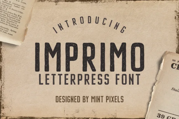
Worn wood-type letterpress condensed sans display
Imprimo Letterpress is a tall, condensed uppercase sans-display font stamped with subtle vintage ink grain and soft wood-type corners.
Ideas for this font
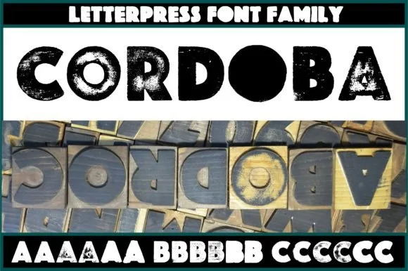
Real wood-carved & pressed letterpress sans family (6 alternates/glyph)
Cordoba is an authentic wood-carved letterpress display family digitized from real inked hardwood blocks with 6 contextual variants per letter.
Ideas for this font
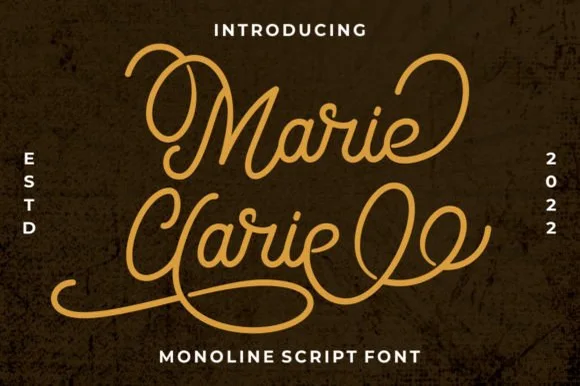
Vintage neon-sign & badge monoline script
Marie Clarie is a smooth, medium-fine monoline script featuring oversized vintage ribbon loops on capitals and spiraled terminal flourishes.
Ideas for this font
Same independent foundry
Allow optional Google Analytics to measure visits and catalogue actions. Your search words and notes are not included. Privacy & storage