Neutral Sans Workhorse

Ganker Storm + Homies
Lets Ganker Storm own the focal silhouette while handling secondary copy, sizing and subheads cleanly.
Inspect Homies specimenDisclosure: MakerFileHub may earn a commission from qualifying purchases via paid links on this page. How our links work.
Dripping street-tag & chisel-marker urban graffiti display
Ganker Storm is a bold urban graffiti display font combining sharp chisel-tag capitals, wet paint drips, and underline swooshes.
Paid link
Get this fontProject & layout blueprintsAt-a-glance maker compatibility
Sturdy stroke walls and open counters weed cleanly on adhesive vinyl, HTV apparel film, and cut cardstock.
Visual anatomy & craft review
Ganker Storm is a street-tag display drawn with a chisel marker and then dripped: flat-cut tag letters, a slight lean, blunt blade ends and long paint runs that fall from the terminal of the last letter. The drips add height below the baseline, so a centred block needs clearance underneath. It needs roughly 28 mm for the chisel cut and the drip to read, and it is best in one wet black on a pale wall or white card, or a single saturated colour where the runs stay sharp.
Street-storm · Dripping · Rebellious
Two-font hierarchy recipes
Tested contrast partners — pairing Ganker Storm with grounded secondary typography.
Ganker Storm + Homies
Lets Ganker Storm own the focal silhouette while handling secondary copy, sizing and subheads cleanly.
Inspect Homies specimen
Ganker Storm + Raffined
Grounds bold display lettering with classic typographic authority on posters, badges and apparel.
Inspect Raffined specimenPractical applications
Concrete hierarchy, scale and production guidance tailored to Ganker Storm’s stroke geometry.
A chisel-tag display reads as a wall rather than a styled headline, which is what a feature about city culture wants at the opener. The knife-cut terminals give the title edge at 64 pt, and the drips supply the gesture with no extra artwork.
Hierarchy & layout recipe
Opener 210 x 297 mm, title 64 pt with 14 mm drip clearance, standfirst 11/15 pt, body 9/13 pt, 18 mm margins. Pull quote 40 pt. Caption tag 90 x 25 mm, word 8 mm.
Pre-production check
At 8 mm on a caption tag the chisel cut turns to noise and the word reads as a printing fault. Set tags at 12 mm or in a plain sans, and proof one spread at 1:1.
A dripped tag display gives a streetwear label the look of a wall tag rather than a studio logo, which is what its buyers respond to. The chisel stems hold at 34 mm on a print, and one black pass covers the tape and the care label without registration risk.
Hierarchy & layout recipe
Tag print 300 x 300 mm, word 70 mm with 12 mm drip clearance, 25 mm margins. Tape 50 mm wide, word 14 mm along the run. Care label 40 x 20 mm, word 6 mm, 2 mm margin.
Pre-production check
A 40 x 20 mm care label at 6 mm merges the chisel cut into a solid block and the brand reads as a smudge on the seam. Keep small labels in a plain sans, and check one sewn label before the run.
A marker tag display suits a summer street festival because the drips look painted on a hoarding overnight. The letters hold at 140 mm across a poster, and one ink prints the poster and the stage banner from a single separation.
Hierarchy & layout recipe
Poster A2, word 140 mm with 18 mm drip clearance, details 40 mm, 20 mm margins. Stage banner 3000 x 800 mm, word 260 mm, 60 mm safe edge. Shirt back 300 x 400 mm, word 90 mm, 20 mm margins.
Pre-production check
Screen printed on a shirt at 90 mm the drips bridge into the letters below and the word reads as a smear after one wash. Use the drip-free cut on fabric, and wash one sample before the order.
Technical & licence verification
Confirm included OTF/TTF/WOFF formats, full glyph tables and licence coverage on the live store page before batch production.
Closest visual alternatives
Matched across letterform anatomy, stroke behaviour and craft applications.
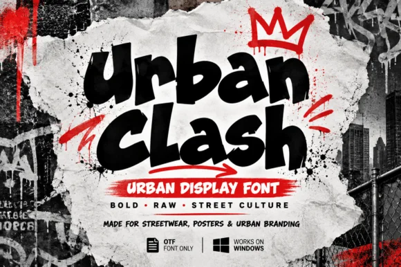
Chunky street-marker graffiti display
Urban Clash is a heavy, tight-set street-marker display typeface with flared chisel terminals, energetic bounce, and raw urban presence.
Ideas for this font
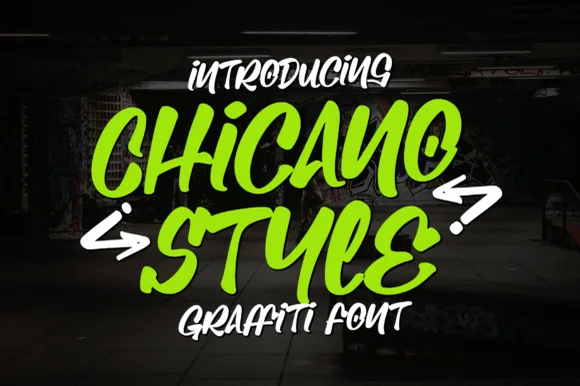
Bold chisel-marker street-tag graffiti font (not a script)
Chicano Style is actually a chunky chisel-marker urban graffiti display font (not a fine tattoo script) packed with bold street-tag bounce.
Ideas for this font
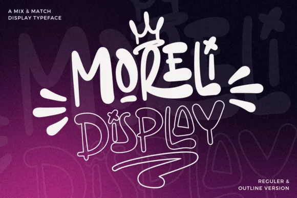
Street-art bubble & outline graffiti display duo
Moreli is a playful mix-and-match street-bubble display typeface shipped in both solid Regular and matching hollow Outline versions.
Ideas for this font

Heavy graffiti bubble caps with rough edges and paint splatter
Street Blaze is a heavy graffiti capital alphabet in which the letters swell into bubbles, the contours chip and the stems carry a rough inner edge, so a two-word title reads as something sprayed on a wall.
Same independent foundry
Allow optional Google Analytics to measure visits and catalogue actions. Your search words and notes are not included. Privacy & storage