Editorial Serif Anchor

Death Subway Graffiti + Kernova
Anchors Death Subway Graffiti's fluid strokes with crisp Roman proportions on wedding suites, headers and packaging.
Inspect Kernova specimenDisclosure: MakerFileHub may earn a commission from qualifying purchases via paid links on this page. How our links work.
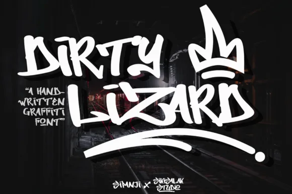
Dripping spray-tag street graffiti
Death Subway Graffiti captures a raw underground marker-and-spray handstyle, where angular street slashes meet organic drip terminals that hang below the letters for skate decks, streetwear and flyers.
Paid link
Get this fontProject & layout blueprintsAt-a-glance maker compatibility
Fine grain and micro-texture excel in 300 DPI print, sublimation, and screen print rather than small vinyl weeding.
Visual anatomy & craft review
The strokes stay uneven and fast, the slashes cut at angles, the drips hang from the ends and no two letters repeat the same width. That drip is the character: the word looks tagged rather than designed, which is why the sample keeps one short phrase on a plain ground. The drips form part of the silhouette, so keep 20 mm of clearance beneath from 40 pt and check whether the drip terminals ship as characters or exist only in the sample.
Raw · Dripping · Handstyle
Two-font hierarchy recipes
Tested contrast partners — pairing Death Subway Graffiti with grounded secondary typography.
Death Subway Graffiti + Kernova
Anchors Death Subway Graffiti's fluid strokes with crisp Roman proportions on wedding suites, headers and packaging.
Inspect Kernova specimen
Death Subway Graffiti + Saltriver Grotesk
Keeps small-scale dates, URLs, nutrition facts and care instructions crisp and legible below script titles.
Inspect Saltriver Grotesk specimenPractical applications
Concrete hierarchy, scale and production guidance tailored to Death Subway Graffiti’s stroke geometry.
The dripping tag suits a deck, and the fast strokes hold a short name at 40 mm on a printed panel, where the drips give the graphic its movement.
Hierarchy & layout recipe
Print a 200 mm deck graphic: set the tag at 40 mm on one row, keep 14 mm of clear ground beneath for the drips, and keep 12 mm of clear edge so no terminal runs off the deck.
Pre-production check
Drips printed at 20 mm read as smudges; check the proof and hold the tag at 36 mm or above.
The tag energy sets a street poster, and the angular strokes hold a two-word title at 50 pt on an A3 sheet, readable from across a pavement.
Hierarchy & layout recipe
Print an A3 poster: set the title at 50 pt on one row, keep 22 mm beneath before the date block at 14 pt, and keep 20 mm of margin so the drips stay inside the sheet.
Pre-production check
A tag printed at 26 pt on a busy background vanishes; check the poster and keep a plain field behind it.
The handstyle suits a teenager's card, and the heavy slashes hold a name at 32 pt on an A6 sheet, with the drips left to finish the line.
Hierarchy & layout recipe
Print an A6 card: set the name at 32 pt on one row, keep 16 mm of clear ground beneath for the drips, and set the details at 11 pt in a plain sans at the foot.
Pre-production check
Two tags on one small card compete; check the card and keep the second line in a simple face.
Technical & licence verification
Confirm included OTF/TTF/WOFF formats, full glyph tables and licence coverage on the live store page before batch production.
Closest visual alternatives
Matched across letterform anatomy, stroke behaviour and craft applications.
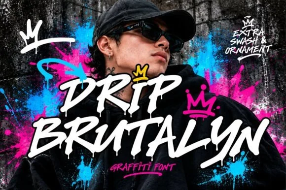
Dripping marker-slash street font with rough edges and ragged tails
Drip Brutalyn is a street brush alphabet in which the strokes are cut with slashes, the edges are rough and the tails run down as drips, so a word reads as lettering sprayed on a wall that has not dried.
Ideas for this font

Heavy graffiti bubble caps with rough edges and paint splatter
Street Blaze is a heavy graffiti capital alphabet in which the letters swell into bubbles, the contours chip and the stems carry a rough inner edge, so a two-word title reads as something sprayed on a wall.
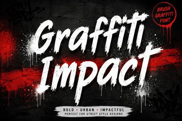
Slanted urban dry-brush & spray-can graffiti script
Graffiti Impact is a fast, forward-slanted urban brush script combining connected marker flow with gritty spray-splatter energy.
Ideas for this font
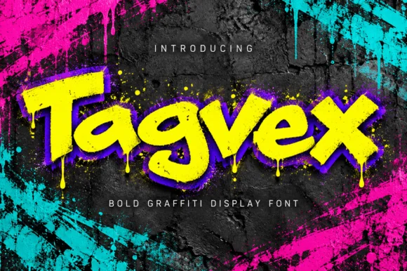
Dripping chisel-tip marker street-graffiti font
Tagvex is a chunky mixed-case graffiti display font combining wide chisel-marker strokes with hanging wet-paint drips.
Ideas for this font
Same independent foundry
Allow optional Google Analytics to measure visits and catalogue actions. Your search words and notes are not included. Privacy & storage