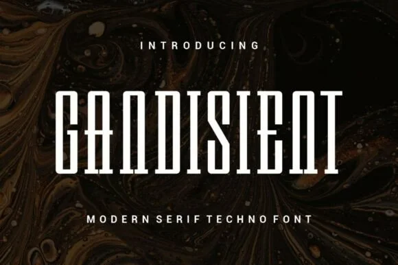
Neutral Sans Workhorse

Celapha Bakhars + Clyne Sans
Lets Celapha Bakhars own the focal silhouette while handling secondary copy, sizing and subheads cleanly.
Inspect Clyne Sans specimenDisclosure: MakerFileHub may earn a commission from qualifying purchases via paid links on this page. How our links work.
Energetic flat-chisel street-marker all-caps display
Celapha Bakhars is a punchy street-marker display font slashing thick, slightly overlapping chisel-tip capitals with urban poster energy.
Paid link
Get this fontProject & layout blueprintsAt-a-glance maker compatibility
Sturdy stroke walls and open counters weed cleanly on adhesive vinyl, HTV apparel film, and cut cardstock.
Visual anatomy & craft review
Celapha Bakhars is a street-marker display in flat caps with chisel tips, slightly overlapping strokes and angled legs, so a word reads as a poster painted fast with a wide marker. The overlap is deliberate and gives the face its energy, while the flat chisel ends keep it readable at 24 mm. It needs roughly 28 mm for the chisel edges to read, and it is best in white on a dark ground or in one bright ink on a pale one.
Street-marker · Chisel-caps · Urban-bold
Two-font hierarchy recipes
Tested contrast partners — pairing Celapha Bakhars with grounded secondary typography.
Celapha Bakhars + Clyne Sans
Lets Celapha Bakhars own the focal silhouette while handling secondary copy, sizing and subheads cleanly.
Inspect Clyne Sans specimen
Celapha Bakhars + Grandeur – Elegant Classic Serif
Grounds bold display lettering with classic typographic authority on posters, badges and apparel.
Inspect Grandeur – Elegant Classic Serif specimenPractical applications
Concrete hierarchy, scale and production guidance tailored to Celapha Bakhars’s stroke geometry.
Flat chisel marker caps read as a brand painted on a shop shutter, which is what a small streetwear label wants. The overlapping strokes hold at 60 mm in plastisol, and one ink keeps the print cheap.
Hierarchy & layout recipe
Tee print 280 x 160 mm, word 60 mm, 40 mm margins. Sticker 90 x 60 mm, word 18 mm, 3 mm die margin. Window vinyl 900 x 300 mm, word 150 mm, 60 mm margins.
Pre-production check
A vinyl cut at 150 mm loses the chisel kick under 0.5 mm and the word arrives with flat ends. Keep the kicks at 1.5 mm on cut artwork, and weed one window word before the run.
Marker caps read as a flyer put up around the city, which is what a street-culture title uses on a cover. The overlapping strokes give the headline texture in one ink, and the chisel ends hold at 90 pt on cheap stock.
Hierarchy & layout recipe
Cover 148 x 210 mm, title 60 mm, cover lines 8/11 pt, 12 mm margins. Opener 420 x 297 mm, headline 110 mm, body 9/13 pt. Flyer A5, title 60 mm, lineup 8/11 pt.
Pre-production check
A photocopied zine at 80 percent reduction erodes the chisel edges into dots and the title looks faded. Print at 100 percent, and check one reduced spread before the run.
Marker caps read as a neighbourhood party bill, which is what a summer block event prints. The heavy strokes hold at 260 mm in one ink, and the chisel ends stay legible on a 25 mm wristband.
Hierarchy & layout recipe
Poster A2, word 260 mm, times 22/28 pt, 30 mm margins and 20 mm trim. Stage sign 1200 x 500 mm, word 200 mm, 80 mm margins. Wristband 250 x 25 mm, word 8 mm, 4 mm margins.
Pre-production check
A wristband at 8 mm reduces the overlapping strokes into a solid bar and the act name smears. Use the plain caps for small formats, and check one printed band on a wrist before the gate.
Technical & licence verification
Confirm included OTF/TTF/WOFF formats, full glyph tables and licence coverage on the live store page before batch production.
Closest visual alternatives
Matched across letterform anatomy, stroke behaviour and craft applications.
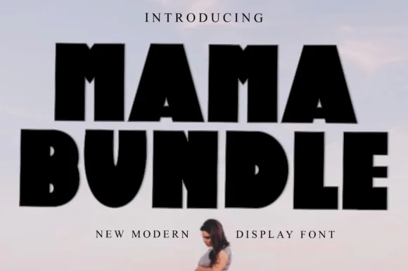
Fat condensed display with notched counters
Mama Bundle is a fat condensed display in black on a pale sky: extremely heavy strokes, counters reduced to narrow slots, letters set almost touching, and small notches cut into the tops of the M and the A that keep the mass from reading as a solid block.
Ideas for this font
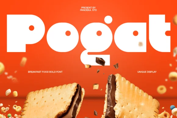
Ultra-fat heavy-packaging & cereal-box geometric display
Pogat is an ultra-heavy, slab-thick retro packaging font with massive ink mass and tiny circular pinhole counters built for snack and food branding!
Ideas for this font
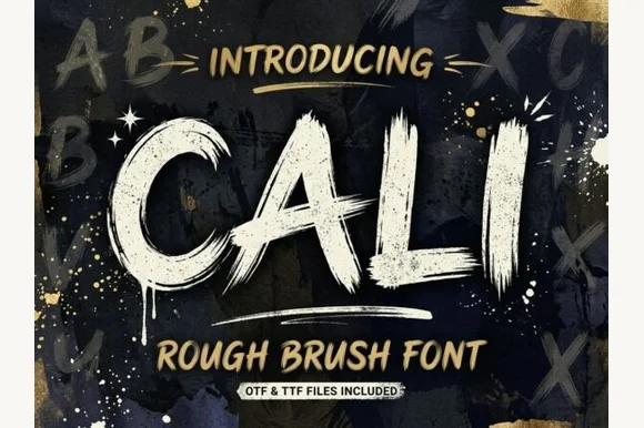
Heavy streaky hog-bristle wall-paint brush font (OTF & TTF)
Cali is a bold, wide-bristle rough brush display font streaked with authentic paint-roller and dry-brush fibers (OTF & TTF).
Ideas for this font
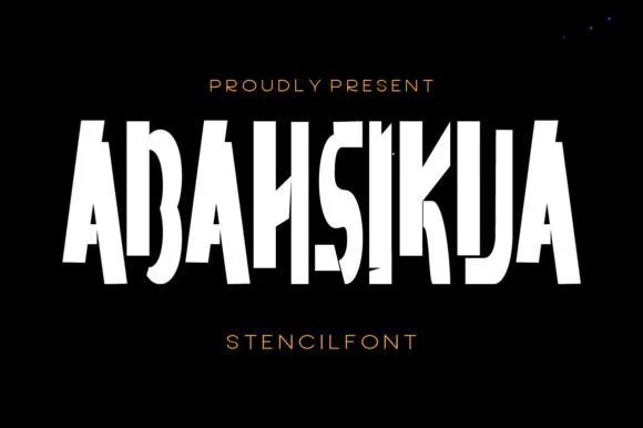
Tall condensed diagonal-sliced architectural stencil display
Abahsikua is a tall, condensed modern stencil display font sliced by bold diagonal negative-space cuts across geometric block pillars.
Ideas for this font
Same independent foundry
Allow optional Google Analytics to measure visits and catalogue actions. Your search words and notes are not included. Privacy & storage