Editorial Serif Anchor

Masterday + Orvelia
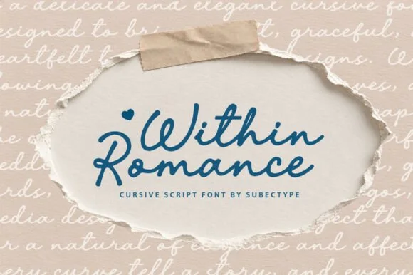
Anchors Masterday's fluid strokes with crisp Roman proportions on wedding suites, headers and packaging.
Inspect Orvelia specimenDisclosure: MakerFileHub may earn a commission from qualifying purchases via paid links on this page. How our links work.
Dense retro script with interlaced lower swashes
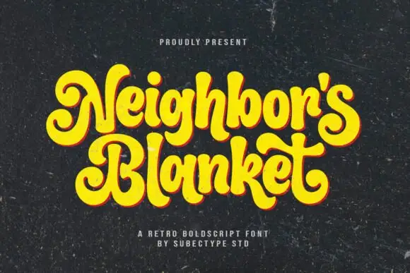
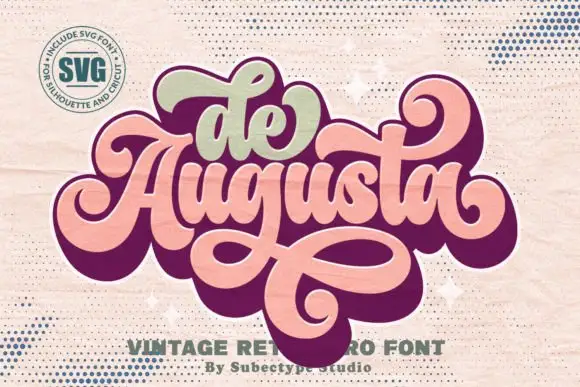
Masterday builds a dense connected title above large intertwined lower loops, where upper curls and crossing strokes demand more space than the small internal letters alone suggest and a black offset extrusion deepens the silhouette.
Paid link
Get this fontProject & layout blueprintsAt-a-glance maker compatibility
Cut solid base, outline, and shadow layers in separate vinyl colors and align on registration marks.
Visual anatomy & craft review
The body stays compact, the loops grow large, the lower strokes cross one another and the offset shadow repeats the whole word behind it. That interlacing is the character: the phrase reads as a finished badge rather than a line of type, which is why the sample keeps one title with heavy loops beneath. The extrusion belongs to the artwork, so test the plain face first, keep 26 mm between baselines and check that the crossing strokes actually exist as characters.
Retro · Heavy · Interlaced
Two-font hierarchy recipes
Tested contrast partners — pairing Masterday with grounded secondary typography.
Masterday + Orvelia
Anchors Masterday's fluid strokes with crisp Roman proportions on wedding suites, headers and packaging.
Inspect Orvelia specimen
Masterday + One More
Keeps small-scale dates, URLs, nutrition facts and care instructions crisp and legible below script titles.
Inspect One More specimenPractical applications
Concrete hierarchy, scale and production guidance tailored to Masterday’s stroke geometry.
The dense retro script suits a diner, and the interlaced loops hold a two-word name at 26 pt on a 55 mm panel, where the offset adds depth.
Hierarchy & layout recipe
Print a 55 by 45 mm label: set the name at 26 pt on two short rows, keep 14 mm of clear ground between them for the loops, and set the street at 6 pt in a plain sans.
Pre-production check
Crossing loops printed at 16 pt merge into a mass; check the plate proof and keep the name at 24 pt.
The retro script reads across a forecourt, and the heavy loops hold a short name at 50 pt on a printed board, where the interlace supplies the movement.
Hierarchy & layout recipe
Print a 500 by 250 mm board: set the name at 50 pt on one row, keep 26 mm of clear ground beneath for the lower loops, and keep 24 mm of border all round.
Pre-production check
Thin loops at 28 pt disappear at distance; check the mounted board and hold the name at 44 pt or above.
The dense script gives a card a period feel, and the loops hold a short greeting at 30 pt on an A6 sheet, where the interlace stays readable.
Hierarchy & layout recipe
Print an A6 card: set the greeting at 30 pt on one row, keep 20 mm of clear ground beneath for the loops, and set the details at 11 pt in a plain sans.
Pre-production check
Two script rows on a small card tangle; check the card and keep the second line in a sans.
Technical & licence verification
Confirm included OTF/TTF/WOFF formats, full glyph tables and licence coverage on the live store page before batch production.
Closest visual alternatives
Matched across letterform anatomy, stroke behaviour and craft applications.
Retro connected script
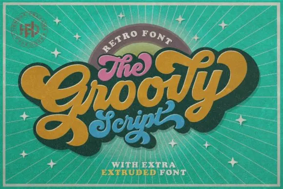
Groovy is a compact connected script drawn from late-sixties and seventies advertising, where the letters join in a rounded loop and the whole word keeps the squat, cheerful proportions of that period rather than the tall slant of a calligraphic hand.
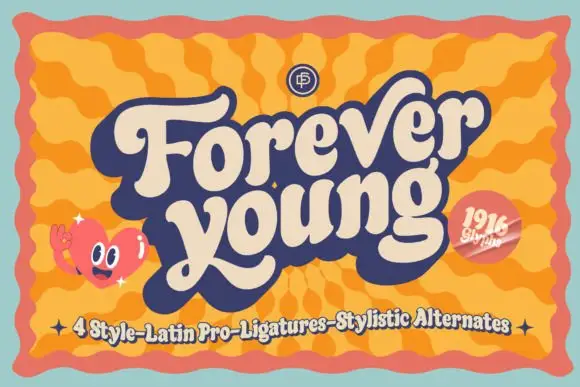
Heavy retro script with broad curled terminals and a tight rhythm
Forever Young is a heavy retro script with broad strokes, curled terminals and a tight rhythm, drawn so two stacked words read as a single filled shape with no gaps between letters.
Ideas for this font
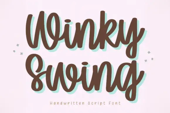
Bold handwriting with a coloured drop shadow
Winky Swing is a bold handwritten script in brown on cream: fat rounded letters with open loops, a tilted baseline and a mint shadow offset behind them, with two small sparkles either side and a tracked caption below.
Ideas for this font

Heavy calligraphy with large curled terminals
Thick Black combines heavy rounded stems with large looping T, B and k forms, where two stacked words sit with tight middle counters and sweeping outer terminals, and a faint landscape runs behind the lettering as separate artwork.
Ideas for this font
Same independent foundry
Allow optional Google Analytics to measure visits and catalogue actions. Your search words and notes are not included. Privacy & storage