Neutral Sans Workhorse

Urban Clash + Sailors
Lets Urban Clash own the focal silhouette while handling secondary copy, sizing and subheads cleanly.
Inspect Sailors specimenDisclosure: MakerFileHub may earn a commission from qualifying purchases via paid links on this page. How our links work.
Chunky street-marker graffiti display
Urban Clash is a heavy, tight-set street-marker display typeface with flared chisel terminals, energetic bounce, and raw urban presence.
Paid link
Get this fontProject & layout blueprintsAt-a-glance maker compatibility
Sturdy stroke walls and open counters weed cleanly on adhesive vinyl, HTV apparel film, and cut cardstock.
Visual anatomy & craft review
Urban Clash is a chunky street-marker graffiti display: fat interlocking letters with a squared marker edge, a hard keyline, small drips running off the baseline and a few counters cut through as if sprayed over a layer. The drips and the cut counters are the finest elements and both close when the face is reduced. It needs roughly 30 mm for the drip and the keyline to read, and it is best as a flat two-colour print on coated stock, or one vinyl colour where the drips become cut paths.
Bold · Street-culture · Punchy
Two-font hierarchy recipes
Tested contrast partners — pairing Urban Clash with grounded secondary typography.
Urban Clash + Sailors
Lets Urban Clash own the focal silhouette while handling secondary copy, sizing and subheads cleanly.
Inspect Sailors specimen
Urban Clash + Lumera Editorial
Grounds bold display lettering with classic typographic authority on posters, badges and apparel.
Inspect Lumera Editorial specimenPractical applications
Concrete hierarchy, scale and production guidance tailored to Urban Clash’s stroke geometry.
A marker graffiti display turns a street-culture page into its own wall. The drips hold at 44 pt on a coated page, and two flat inks keep the keyline crisp against a photographic ground.
Hierarchy & layout recipe
Header 44 pt with 10 mm drip clearance, body 9/13 pt over two columns of 82 mm, 18 mm margins and a 12 mm head. Opener 36 pt with 10 mm of clear ground. Pull quote 32 pt with 8 mm above and 8 mm below.
Pre-production check
At 32 pt on the pull quote the drips merge into the keyline and the quote reads as a solid block. Keep the face at 40 pt and above, and proof one spread at 1:1.
A marker graffiti face reads as a printed sticker rather than a corporate mark, which is what a skate shop wants on a board. The keyline holds at 30 mm on a sticker, and two flat inks print the sticker and the mural from one separation.
Hierarchy & layout recipe
Sticker 90 x 60 mm, word 30 mm with 8 mm drip clearance, 5 mm die margin. Mural 3000 x 2000 mm, word 600 mm, 100 mm safe edge. Card 85 x 55 mm, word 20 mm, 5 mm margins.
Pre-production check
A 90 x 60 mm sticker at 30 mm closes the drips into the keyline and the name reads as a solid tile. Raise the sticker word to 38 mm, and check one sheet before the run.
A graffiti display reads as a youth-club flyer rather than a school notice. The keyline holds at 120 mm on a poster, and two flat inks print the poster and the shirts in one pass.
Hierarchy & layout recipe
Poster A2, word 120 mm with 14 mm drip clearance, details 40 mm, 20 mm margins. Banner 1500 x 400 mm, word 150 mm, 30 mm safe edge. Shirt print 300 x 400 mm, word 90 mm, 20 mm margins.
Pre-production check
Screen printed on a shirt at 70 mm the drips bridge and the cut counters fill after a wash. Use a 2 mm stencil bridge, and wash one sample before the order.
Technical & licence verification
Confirm included OTF/TTF/WOFF formats, full glyph tables and licence coverage on the live store page before batch production.
Closest visual alternatives
Matched across letterform anatomy, stroke behaviour and craft applications.
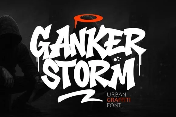
Dripping street-tag & chisel-marker urban graffiti display
Ganker Storm is a bold urban graffiti display font combining sharp chisel-tag capitals, wet paint drips, and underline swooshes.
Ideas for this font
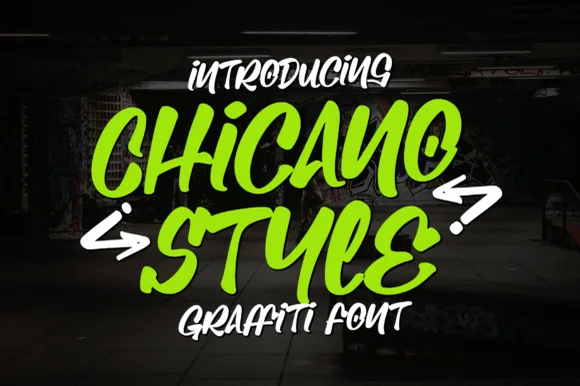
Bold chisel-marker street-tag graffiti font (not a script)
Chicano Style is actually a chunky chisel-marker urban graffiti display font (not a fine tattoo script) packed with bold street-tag bounce.
Ideas for this font
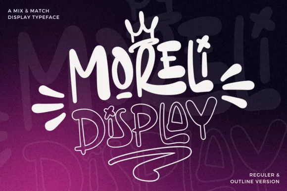
Street-art bubble & outline graffiti display duo
Moreli is a playful mix-and-match street-bubble display typeface shipped in both solid Regular and matching hollow Outline versions.
Ideas for this font

Heavy graffiti bubble caps with rough edges and paint splatter
Street Blaze is a heavy graffiti capital alphabet in which the letters swell into bubbles, the contours chip and the stems carry a rough inner edge, so a two-word title reads as something sprayed on a wall.
Same independent foundry
Allow optional Google Analytics to measure visits and catalogue actions. Your search words and notes are not included. Privacy & storage



