Neutral Sans Workhorse

Blazefang + Noar
Lets Blazefang own the focal silhouette while handling secondary copy, sizing and subheads cleanly.
Inspect Noar specimenDisclosure: MakerFileHub may earn a commission from qualifying purchases via paid links on this page. How our links work.
Slanted dry-brush action & dark-fantasy display
Blazefang is a forward-leaning, heavy dry-brush display typeface torn with raw bristle streaks and jagged diagonal momentum.
Paid link
Get this fontProject & layout blueprintsAt-a-glance maker compatibility
Fine grain and micro-texture excel in 300 DPI print, sublimation, and screen print rather than small vinyl weeding.
Visual anatomy & craft review
Blazefang is a slanted dry-brush display drawn for action and dark-fantasy covers: a steep forward lean, ragged bristle edges, tapered stroke ends and dry gaps where the brush skipped across the surface. The slant and the taper push the word right, so a centred block needs uneven side margins to look straight. It needs roughly 34 mm for the bristle edge and the dry gaps to read, and it is best in one ink on a dark ground with a scratched texture, or black on a pale bone tone.
Fierce · Streaked · High-impact
Two-font hierarchy recipes
Tested contrast partners — pairing Blazefang with grounded secondary typography.
Blazefang + Noar
Lets Blazefang own the focal silhouette while handling secondary copy, sizing and subheads cleanly.
Inspect Noar specimen
Blazefang + Evoire
Grounds bold display lettering with classic typographic authority on posters, badges and apparel.
Inspect Evoire specimenPractical applications
Concrete hierarchy, scale and production guidance tailored to Blazefang’s stroke geometry.
A dry-brush action display reads as a painted cover title rather than a typeset one, which is what a dark-fantasy series wants on a shelf. The ragged edge and the steep slant give the title motion at 72 pt, and the dry gaps hold as paper-white marks in a single-ink print on a dark ground.
Hierarchy & layout recipe
Cover 130 x 198 mm, title 72 pt with 10 mm bristle clearance, author 16 pt, 12 mm margins. Chapter opener 30 pt, text 10/14 pt. Series mark 40 mm wide, 12 mm tall.
Pre-production check
At 30 pt on the chapter opener the dry gaps fill in and the word reads as a solid slanted bar with dirty edges. Keep the face to the cover and series mark, set openers in a companion, and proof one cover at 1:1.
A bristle-edged dry brush reads as a hand-painted warning rather than a printed flyer, which is the right register for a scare attraction. The slant drives the poster line forward at 140 mm, and one bone ink on black prints the poster, the tickets and the prop jars from a single separation.
Hierarchy & layout recipe
Poster A2, word 140 mm with 15 mm bristle clearance, times 40 mm, 20 mm margins. Ticket strip 180 x 50 mm, word 20 mm, 4 mm perforation. Prop label 70 x 50 mm, word 12 mm, 4 mm margins.
Pre-production check
A 70 x 50 mm prop label at 12 mm collapses the dry gaps and the label prints as a filled smear. Raise the label word to 18 mm or use the solid companion, and check one label under the actual lighting before the night.
A dry-brush fantasy display gives a game studio the painted look of its own key art rather than a clean logo, which is what a small indie team wants on a box sleeve. The slant and the taper hold at 40 mm on a sleeve, and the same artwork prints the tour shirt in one screen with a 2 mm minimum gap request.
Hierarchy & layout recipe
Box sleeve 190 x 140 mm, word 40 mm with 8 mm bristle clearance, 10 mm margins. Tour shirt 280 x 350 mm, word 120 mm, 20 mm margins. Sticker 90 x 60 mm, word 22 mm, 4 mm die margin.
Pre-production check
At 22 mm on a die-cut sticker the tapered stroke end falls under 0.5 mm and the blade tears the point during weeding. Widen the taper or cut the sticker as a rectangle, and weed one sheet before the batch.
Technical & licence verification
Confirm included OTF/TTF/WOFF formats, full glyph tables and licence coverage on the live store page before batch production.
Closest visual alternatives
Matched across letterform anatomy, stroke behaviour and craft applications.
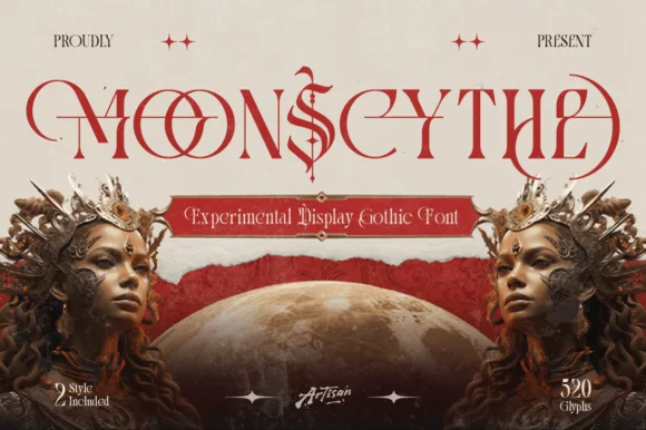
Experimental gothic display with long ligatures
Moonscythe is an experimental gothic display face in red on cream: tall narrow letters built from thin straight strokes, with long horizontal ligatures running between them and a diamond ornament in the middle, presented as an elaborate masthead with two crowned figures and a moon.
Ideas for this font
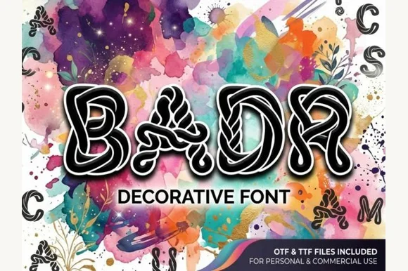
Interlaced labyrinth & ribbon-knotwork display font (OTF & TTF)
Badr is an intricate decorative display font weaving continuous white interlaced knotwork ribbons inside bold black uppercase silhouettes (OTF & TTF).
Ideas for this font
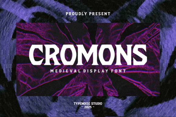
Heavy wide battle-ready medieval wedge serif
Cromons is a brawny, heavy-weight medieval wedge serif built to punch stark white fantasy, gaming, and esport headlines through dark backgrounds!
Ideas for this font
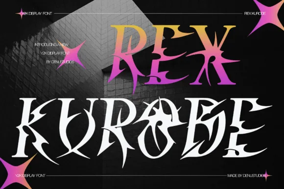
Spiked gothic display with gradient fill
Rex Kurode is a decorative display face in gradient and white on a dark brick wall: sharp gothic letters with thorn-like terminals, split stems and a wide set, mixed with star sparkles and small tracked capital lines.
Ideas for this font
Same independent foundry
Allow optional Google Analytics to measure visits and catalogue actions. Your search words and notes are not included. Privacy & storage