Editorial Serif Anchor

Teacher Handmade + Gorga
Anchors Teacher Handmade's fluid strokes with crisp Roman proportions on wedding suites, headers and packaging.
Inspect Gorga specimenDisclosure: MakerFileHub may earn a commission from qualifying purchases via paid links on this page. How our links work.
Upright handwritten brush sans
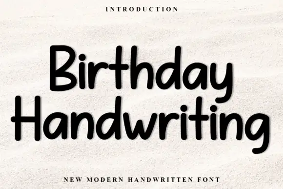
Teacher Handmade is an upright handwritten face in black on white: thick monoline-brush strokes with rounded ends, tall ascenders, an open e and a lower-case g with a straight tail, so the two words read as marker lettering written quickly and confidently.
Paid link
Get this fontProject & layout blueprintsAt-a-glance maker compatibility
Fine grain and micro-texture excel in 300 DPI print, sublimation, and screen print rather than small vinyl weeding.
Visual anatomy & craft review
The two words are stacked and the drawing is handwriting rather than a script: nothing is connected, the stroke weight is nearly constant, and the ends are rounded, which is what a round-tip marker produces. The x-height is large and the ascenders are tall, so the pair fills its lines without needing a heavy weight, and the letters lean very slightly to the right, which keeps the writing from looking mechanical. The counters are generous and the spacing is even, so the face stays readable at paragraph sizes, which is unusual for a handwritten display. The specimen sets the phrase inside a pale wooden frame with tracked caps above and below, and the light grey ground keeps the black strokes crisp, so the page reads as a framed print rather than a type sheet.
Handwritten, upright, warm, informal
Two-font hierarchy recipes
Tested contrast partners — pairing Teacher Handmade with grounded secondary typography.
Teacher Handmade + Gorga
Anchors Teacher Handmade's fluid strokes with crisp Roman proportions on wedding suites, headers and packaging.
Inspect Gorga specimen
Teacher Handmade + Taught
Keeps small-scale dates, URLs, nutrition facts and care instructions crisp and legible below script titles.
Inspect Taught specimenPractical applications
Concrete hierarchy, scale and production guidance tailored to Teacher Handmade’s stroke geometry.
A handwritten face reads as a personal note from the teacher, and the upright unconnected letterforms stay legible for parents where a connected script at the same size would work harder.
Hierarchy & layout recipe
A4 print: the headline at 40 mm cap height, the times in a 9 mm sans beneath, and the room numbers in 8 mm. Keep 20 mm margins and print one colour so the notices look consistent across a whole corridor.
Pre-production check
Check the A4 at two metres, where the rounded ends can blur on a cheap copier; keep the headline above 30 mm. Confirm the 8 mm room numbers read at arm's length and that the stacked headline still parses at half size on a screen.
A marker-style handwriting gives a group card a warm voice, and the even stroke lets thirty children sign around the message without the card becoming unreadable.
Hierarchy & layout recipe
A4 folded card: the message at 26 pt with 34 pt leading, the class line at 10 pt, and a 12 mm margin so signatures have space. Keep the text block in the upper two thirds and leave the lower third blank for the class.
Pre-production check
Check the 26 pt message, where a rounded stroke can close the counters at small sizes; keep the leading loose. Confirm the 10 pt class line reads at arm's length and that the signature area stays usable after folding.
A handwritten face makes a small batch look made by a person, and the upright letterforms keep the scent name readable on a jar where a slanted script would wrap awkwardly.
Hierarchy & layout recipe
Print a 60 by 80 mm label: the brand at 16 pt, the scent at 11 pt, and the weight in 6 pt. Keep 5 mm clear inside the die and print one ink on a kraft stock so the strokes read as marker on paper.
Pre-production check
Check the 6 pt weight on kraft, where the rounded ends can fill; keep the smallest text in a plain sans. Confirm the 11 pt scent reads on a curved jar and that the label survives a warm bath in a shop window.
Technical & licence verification
Confirm included OTF/TTF/WOFF formats, full glyph tables and licence coverage on the live store page before batch production.
Closest visual alternatives
Matched across letterform anatomy, stroke behaviour and craft applications.
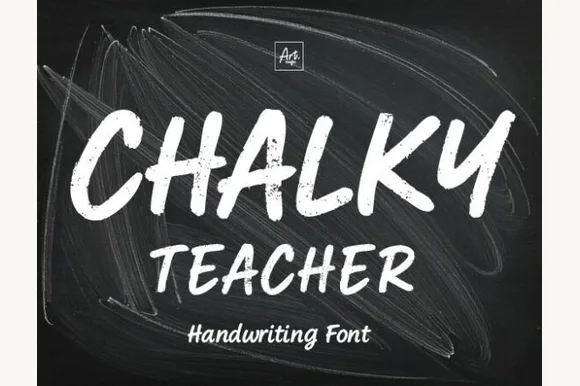
Streaky dust-textured blackboard chalk marker font
Chalky Teacher is an authentic blackboard handwritten font streaked internally with realistic dry-chalk grain across bold slanted strokes.
Ideas for this font
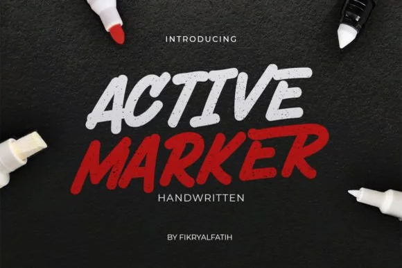
Slanted chisel-tip whiteboard & chalkboard marker sans
Active Marker captures brisk, slanted broad-tip marker lettering with organic stroke tapers and natural double-letter ligatures.
Ideas for this font
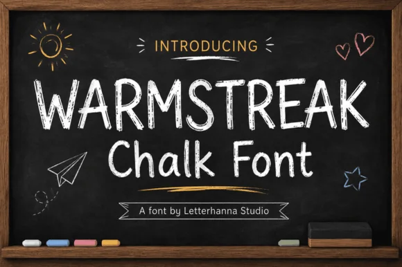
Authentic dusty-chalkboard café & classroom print sans
Warmstreak is an authentic, chalk-textured upright print font capturing real dusty calcium-chalk grain on café menus and school boards!
Ideas for this font
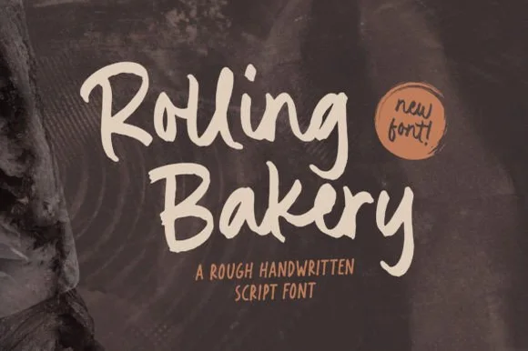
Rough handwritten brush script
Rolling Bakery is a rough handwritten brush script in warm cream on a dark ground: tilted strokes, a dry brush texture along the edges, tall looping caps and a baseline that wanders just enough to read as written by hand.
Ideas for this font
Same independent foundry
Allow optional Google Analytics to measure visits and catalogue actions. Your search words and notes are not included. Privacy & storage