Editorial Serif Anchor

Drip Brutalyn + Things
Anchors Drip Brutalyn's fluid strokes with crisp Roman proportions on wedding suites, headers and packaging.
Inspect Things specimenDisclosure: MakerFileHub may earn a commission from qualifying purchases via paid links on this page. How our links work.
Dripping marker-slash street font with rough edges and ragged tails
Drip Brutalyn is a street brush alphabet in which the strokes are cut with slashes, the edges are rough and the tails run down as drips, so a word reads as lettering sprayed on a wall that has not dried.
Paid link
Get this fontProject & layout blueprintsAt-a-glance maker compatibility
Weld or Unite overlapping script joins into one continuous vector path before sending to the blade.
Visual anatomy & craft review
The D opens with a hard slash and a squared bowl, the r keeps a short arm, the i stands as a narrow bar with a rough top and the p drops a stem that ends in a drip, all at a heavy weight with torn edges and sharp angles. The drips are the character: several letters carry a run of paint below the baseline, which is what gives the face its aggressive street register and also what makes it unsuitable for anything that must align. Because the strokes are wide, the face holds at 40 pt on a print and at 80 mm on a garment, and it fails below 20 pt where the tears turn to noise. The graffiti wall, the pink and blue splashes, the crown marks and the small caption are presentation; the brush face is the two words.
Dripping · Street · Rough
Two-font hierarchy recipes
Tested contrast partners — pairing Drip Brutalyn with grounded secondary typography.
Drip Brutalyn + Things
Anchors Drip Brutalyn's fluid strokes with crisp Roman proportions on wedding suites, headers and packaging.
Inspect Things specimen
Drip Brutalyn + Inkora
Keeps small-scale dates, URLs, nutrition facts and care instructions crisp and legible below script titles.
Inspect Inkora specimenPractical applications
Concrete hierarchy, scale and production guidance tailored to Drip Brutalyn’s stroke geometry.
The slash strokes and drips suit a screen print on fleece, and the heavy weight reads at 70 mm across a chest panel where a clean brush would look borrowed.
Hierarchy & layout recipe
Screen a 280 mm chest print: set the word at 70 mm, keep the drips inside the print area rather than running to the hem, and stay 50 mm below the collar so the print clears the yoke seam.
Pre-production check
Drips printed close to a hem read as a fault on the garment; check the artwork against the panel size and shorten the runs before the screens are made.
The dripping strokes give a cover its street register at 80 pt, and the rough edges hold over a printed photograph where a clean face would look pasted on.
Hierarchy & layout recipe
Print a 120 mm square sleeve: set the title at 80 pt across the centre, set the artist in a 9 pt caps sans at the foot, and keep 12 mm of margin so the drips stay inside the square trim.
Pre-production check
A drip crossing the trim line looks accidental; check the artwork at final size and pull the word up until every run ends above the cut.
The rough strokes read at 14 pt on a die-cut sticker, and the drips give a small mark the street character the shop trades on.
Hierarchy & layout recipe
Print a 60 mm die-cut sticker: set the shop name at 14 pt, keep the longest drip 4 mm inside the die line, and check that the rough edge is not smoothed by the cut.
Pre-production check
A die cut through a drip leaves a sliver that curls; check the cut file against the artwork and shorten the drip rather than the letters.
Technical & licence verification
Confirm included OTF/TTF/WOFF formats, full glyph tables and licence coverage on the live store page before batch production.
Closest visual alternatives
Matched across letterform anatomy, stroke behaviour and craft applications.
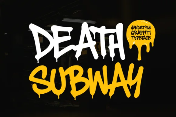
Dripping spray-tag street graffiti
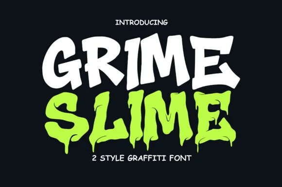
Death Subway Graffiti captures a raw underground marker-and-spray handstyle, where angular street slashes meet organic drip terminals that hang below the letters for skate decks, streetwear and flyers.
Ideas for this font

Heavy graffiti bubble caps with rough edges and paint splatter
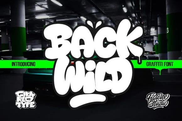
Street Blaze is a heavy graffiti capital alphabet in which the letters swell into bubbles, the contours chip and the stems carry a rough inner edge, so a two-word title reads as something sprayed on a wall.
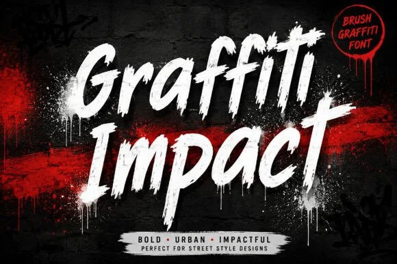
Slanted urban dry-brush & spray-can graffiti script
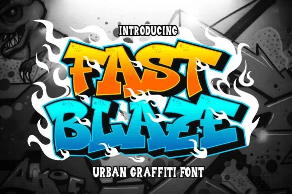
Graffiti Impact is a fast, forward-slanted urban brush script combining connected marker flow with gritty spray-splatter energy.
Ideas for this font
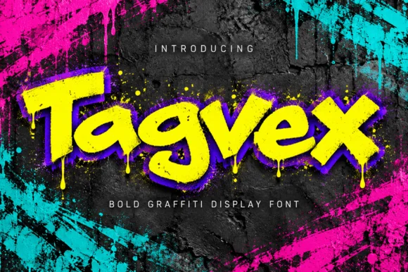
Dripping chisel-tip marker street-graffiti font
Tagvex is a chunky mixed-case graffiti display font combining wide chisel-marker strokes with hanging wet-paint drips.
Ideas for this font
Same independent foundry
Allow optional Google Analytics to measure visits and catalogue actions. Your search words and notes are not included. Privacy & storage