Neutral Sans Workhorse

Chaos Reality + Prime Nordic
Lets Chaos Reality own the focal silhouette while handling secondary copy, sizing and subheads cleanly.
Inspect Prime Nordic specimenDisclosure: MakerFileHub may earn a commission from qualifying purchases via paid links on this page. How our links work.
Experimental warped & mismatched-case brutalist ransom display
Chaos Reality is an experimental brutalist ransom display font mixing chunky blocks, coiled spirals, and warped mixed-weight letterforms.
Paid link
Get this fontProject & layout blueprintsAt-a-glance maker compatibility
Sturdy stroke walls and open counters weed cleanly on adhesive vinyl, HTV apparel film, and cut cardstock.
Visual anatomy & craft review
Chaos Reality is an experimental ransom display in which each glyph is warped on a different axis, cases are mismatched within a single word, weights jump between characters and baselines tilt independently. The deliberate inconsistency means a word cannot be tracked or aligned normally, and the tallest and shortest glyphs set the line box. It needs roughly 26 mm for the warp to read as intent rather than error, and it is best in flat black on cheap white and newsprint, where the mixed weights stay legible.
Distorted · Experimental · Acid-punk
Two-font hierarchy recipes
Tested contrast partners — pairing Chaos Reality with grounded secondary typography.
Chaos Reality + Prime Nordic
Lets Chaos Reality own the focal silhouette while handling secondary copy, sizing and subheads cleanly.
Inspect Prime Nordic specimen
Chaos Reality + Things
Grounds bold display lettering with classic typographic authority on posters, badges and apparel.
Inspect Things specimenPractical applications
Concrete hierarchy, scale and production guidance tailored to Chaos Reality’s stroke geometry.
A warped ransom display is the visual argument of an art issue about noise and fractured systems, so the title carries the idea rather than describing it. The mismatched weights give the opener texture at 64 pt, and the flat black on uncoated stock keeps every jump in weight readable as a decision.
Hierarchy & layout recipe
Opener 210 x 297 mm, title 64 pt with uneven line box, standfirst 11/15 pt, body 9/13 pt, 18 mm margins. Deck 120 x 40 mm, 14 pt. Caption labels 8 pt.
Pre-production check
At 8 pt the warped glyphs lose their counter detail and the caption reads as printing errors rather than a system. Keep the face to titles above 30 pt, set captions in a plain sans, and proof one spread at 1:1.
A ransom display suits a label that presses difficult music, because the artwork already looks like it was assembled in a hurry. The mismatched cases give the imprint a recognisable disorder at 40 mm, and one black pass prints the tape and the poster run on cheap stock without registration risk.
Hierarchy & layout recipe
Tape 50 mm wide, word 18 mm repeating along the roll. Poster A2, word 120 mm, listings 12 mm, 20 mm margins. Card 85 x 55 mm, word 16 mm, 4 mm margins.
Pre-production check
A 50 mm tape at 18 mm crosses the seam of the roll and the tallest glyph clips at the wrap. Keep the word inside a 30 mm band with 6 mm clear of each edge, and test one roll before ordering.
A warped ransom display reads as a paste-up flyer rather than a designed poster, which is the correct register for a summer punk festival. The mismatched weights hold at 140 mm across a wall, and one ink on newsprint prints the poster, the wristband and the times board for the price of a single screen.
Hierarchy & layout recipe
Poster A2, word 140 mm, band names 40 mm, 20 mm margins. Wristband 250 x 25 mm, word 10 mm along the run. Times board 600 x 900 mm, act names 50 mm, times 24 mm.
Pre-production check
On newsprint the thin warped glyphs at 24 mm on the times board drop out where the ink meets the fibre. Set times in a solid sans and keep the face for act names, and print one board before the weekend.
Technical & licence verification
Confirm included OTF/TTF/WOFF formats, full glyph tables and licence coverage on the live store page before batch production.
Closest visual alternatives
Matched across letterform anatomy, stroke behaviour and craft applications.
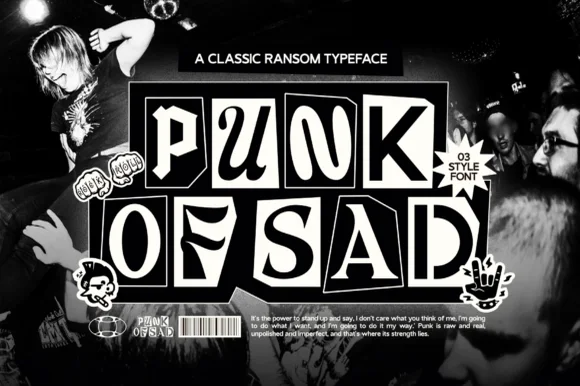
3-style monochrome punk-zine cut-paper ransom font
Punk of Sad is a classic black-and-white punk-zine ransom typeface (3 styles) setting gritty serif/sans letters inside uneven cut-newspaper tiles.
Ideas for this font
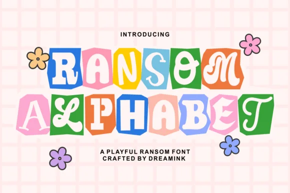
Cute pastel scrapbook & groovy ransom-tile font
Ransom Alphabet is a cheerful, kid-friendly ransom-cutout font pairing groovy 70s, serif, and bubble letters inside colorful rounded paper tiles.
Ideas for this font
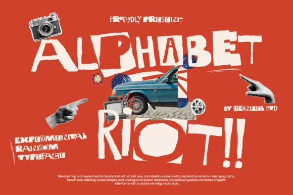
Rebellious mixed-case collage & street-poster ransom font
Alphabet Riot is a bold, gritty street-collage ransom font mixing solid hand-cut block letters with tilted cutout boxes and exclamation energy.
Ideas for this font
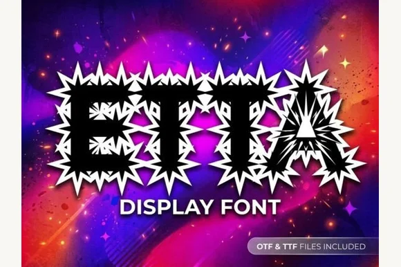
Explosive spiky starburst-halo Y2K streetwear font (OTF & TTF)
Etta is a high-octane Y2K decorative display font encasing heavy black block capitals inside jagged white comic-explosion starbursts (OTF & TTF).
Ideas for this font
Same independent foundry
Allow optional Google Analytics to measure visits and catalogue actions. Your search words and notes are not included. Privacy & storage