Neutral Sans Workhorse

Chunky Plump + Olline
Lets Chunky Plump own the focal silhouette while handling secondary copy, sizing and subheads cleanly.
Inspect Olline specimenDisclosure: MakerFileHub may earn a commission from qualifying purchases via paid links on this page. How our links work.
Heavy 3D-extruded retro cartoon groovy bubble font
Chunky Plump is a bubbly retro-groovy display font wrapped in bold black comic outlines and extruded 3D drop shadows!
Paid link
Get this fontProject & layout blueprintsAt-a-glance maker compatibility
Cut solid base, outline, and shadow layers in separate vinyl colors and align on registration marks.
Visual anatomy & craft review
Chunky Plump is an inflated retro-groovy display with a groovy waist pinch, heavy black comic outlines and an extruded 3D drop shadow baked into the glyph, so a word reads as a screen-printed poster sticker rather than a flat letter. The extrusion always falls to one side, which fixes the light direction and means the word cannot be flipped without looking wrong. It needs roughly 32 mm for the extrusion to read as depth, and it is best in peach or pink with a black shadow on a pale grid ground.
3D-comic-groovy · Peach-and-pink · 70s-sticker
Two-font hierarchy recipes
Tested contrast partners — pairing Chunky Plump with grounded secondary typography.
Chunky Plump + Olline
Lets Chunky Plump own the focal silhouette while handling secondary copy, sizing and subheads cleanly.
Inspect Olline specimen
Chunky Plump + Mewah
Grounds bold display lettering with classic typographic authority on posters, badges and apparel.
Inspect Mewah specimenPractical applications
Concrete hierarchy, scale and production guidance tailored to Chunky Plump’s stroke geometry.
Inflated groovy letters with an extruded shadow read as a 1970s packaging panel, which is what a small food brand borrows. The baked shadow gives depth in a single print pass, and the heavy outline survives a screen print on a garment.
Hierarchy & layout recipe
Box 200 x 150 x 80 mm, word 44 mm on the lid, 25 mm margins. Sticker 80 x 50 mm, word 16 mm, 3 mm die margin. Merch print 280 x 160 mm, word 60 mm, 40 mm margins.
Pre-production check
A screen print at 60 mm bridges the 1 mm gap between the letter and its extrusion and the word fuses into a solid mass. Keep the gap at 1.5 mm or raise the print to 75 mm, and approve a strike-off.
Inflated retro lettering reads as a decade-themed party, which is what a milestone birthday is. The extruded shadow cuts cleanly at 50 mm with wide bridges, and one bright ink on white covers the whole set.
Hierarchy & layout recipe
Invite A6, word 40 mm, details 8/11 pt, 12 mm margins. Banner 900 x 300 mm, word 140 mm, 40 mm margins and 20 mm clear of each eyelet. Cup wrap 200 x 90 mm, word 20 mm, 10 mm from the rim.
Pre-production check
A cup wrap crosses a taper and the extrusion slides out of alignment at the seam, so the word looks doubled. Keep the word inside the flat 60 mm centre band, and check one wrapped cup before the party.
Retro groovy bubbles read as a community fair rather than a corporate event, which is what a spring market wants on a poster. The heavy shadow holds at 260 mm in one colour, and the extruded depth gives the poster presence without a photograph.
Hierarchy & layout recipe
Poster A2, word 260 mm, details 22/28 pt, 30 mm margins and 20 mm trim. Sign 900 x 400 mm, word 160 mm, 60 mm margins. Tote print 300 x 300 mm, word 70 mm, 60 mm margins.
Pre-production check
A tote print on canvas loses the 1 mm extrusion gap and the shadow merges into the letter. Keep the gap at 2 mm for canvas, and check one sewn tote before the order.
Technical & licence verification
Confirm included OTF/TTF/WOFF formats, full glyph tables and licence coverage on the live store page before batch production.
Closest visual alternatives
Matched across letterform anatomy, stroke behaviour and craft applications.
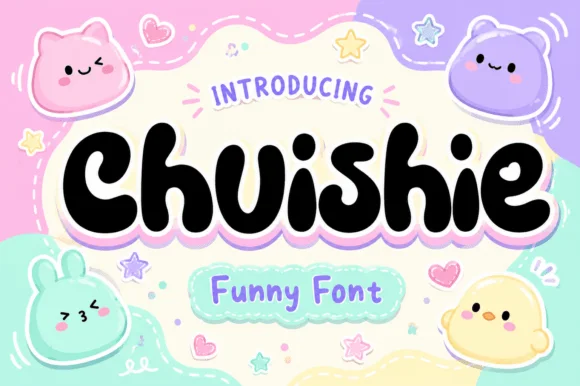
Squishy plushie-blob kawaii cartoon display
Chuishie is a squishy, mochi-soft kawaii bubble font featuring adorable scalloped plushie toes on 'u', 'h', and 'n'!
Ideas for this font
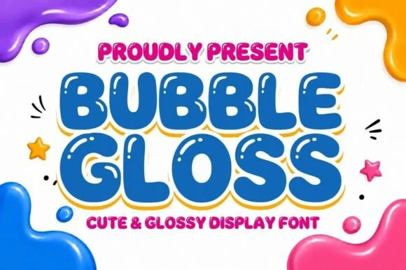
Inflated 3D-highlight cartoon bubble display
Bubble Gloss is a chunky cartoon bubble display typeface with built-in interior specular highlight cutouts that create an instant shiny 3D look.
Ideas for this font
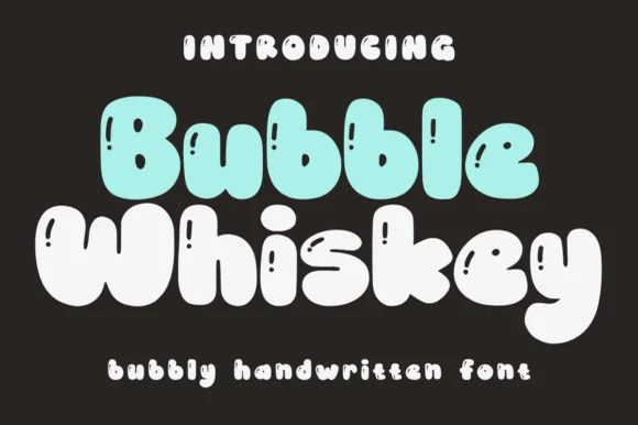
Plump marshmallow-puffy cartoon bubble font
Bubble Whiskey is an ultra-plump, pillow-soft cartoon bubble display font with tiny pinhole counters and joyful kawaii bounce.
Ideas for this font
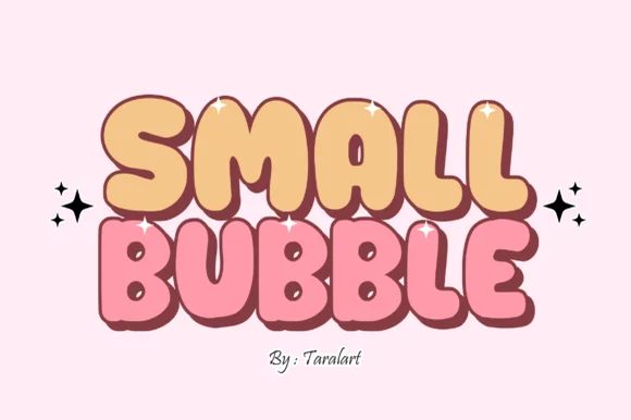
Cute hand-outlined comic-pop bubble display
Small Bubble is a cozy, hand-drawn cartoon bubble display font with chubby rounded capitals and sweet comic-sticker personality.
Ideas for this font
Allow optional Google Analytics to measure visits and catalogue actions. Your search words and notes are not included. Privacy & storage