Neutral Sans Workhorse

Cute Stickers + Clyne Sans
Lets Cute Stickers own the focal silhouette while handling secondary copy, sizing and subheads cleanly.
Inspect Clyne Sans specimenDisclosure: MakerFileHub may earn a commission from qualifying purchases via paid links on this page. How our links work.
Dashed-inset sticker capitals
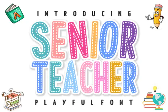
Cute Stickers shows thick rounded capitals with short white dash marks following the inner contours. The C curves broadly, the T carries a soft wide top, the strokes stay even and heavy, and the smaller line beneath repeats the same dashed decoration.
Paid link
Get this fontProject & layout blueprintsAt-a-glance maker compatibility
Sturdy stroke walls and open counters weed cleanly on adhesive vinyl, HTV apparel film, and cut cardstock.
Visual anatomy & craft review
The bodies stay thick and round, the dashes run parallel inside the stroke, the counters stay open and the decoration repeats on the second line. That inset dash is the character: the letters look die-cut from a sticker sheet rather than printed, which is why the sample repeats the same treatment twice. The dashes are the whole effect, so keep them at a printable weight, avoid adding a second outline and test the smallest size before you promise a sticker look.
Dashed-inset sticker capitals
Two-font hierarchy recipes
Tested contrast partners — pairing Cute Stickers with grounded secondary typography.
Cute Stickers + Clyne Sans
Lets Cute Stickers own the focal silhouette while handling secondary copy, sizing and subheads cleanly.
Inspect Clyne Sans specimen
Cute Stickers + Rosemode
Grounds bold display lettering with classic typographic authority on posters, badges and apparel.
Inspect Rosemode specimenPractical applications
Concrete hierarchy, scale and production guidance tailored to Cute Stickers’s stroke geometry.
The dashed inset suits a sticker sheet, and the rounded caps hold a short name at 30 pt on a 40 mm circle, where the dashes stay even around the contour.
Hierarchy & layout recipe
Print a 40 mm circle sticker: set the name at 30 pt on one row, keep the dashes at least 1.2 mm wide, and keep 4 mm of clear ground from the die edge so the inset is not cut.
Pre-production check
Dashes under 0.8 mm disappear in a die-cut; check the cut file and hold the name at 26 pt or above.
The sticker capitals give a card a playful tone, and the rounded forms hold a greeting at 36 pt on an A6 sheet, where the dashed decoration reads at arm's length.
Hierarchy & layout recipe
Print an A6 card: set the greeting at 36 pt on one row, keep 16 mm of clear ground beneath before the details at 12 pt, and keep the dashed treatment on the greeting only so the card stays clean.
Pre-production check
Two dashed rows read as a test sheet; check the card and keep the details in a plain rounded sans.
The thick caps suit a name label, and the rounded strokes hold a first name at 22 pt on a 60 by 25 mm label, where the inset dashes survive a laminate.
Hierarchy & layout recipe
Print a 60 by 25 mm label: set the name at 22 pt on one row, keep 4 mm of clear ground at each end, and laminate with a matte film so the white dashes stay visible.
Pre-production check
A glossy film reflects the white dashes away; check a laminated sample and choose a matte film before the class set.
Technical & licence verification
Confirm included OTF/TTF/WOFF formats, full glyph tables and licence coverage on the live store page before batch production.
Closest visual alternatives
Matched across letterform anatomy, stroke behaviour and craft applications.
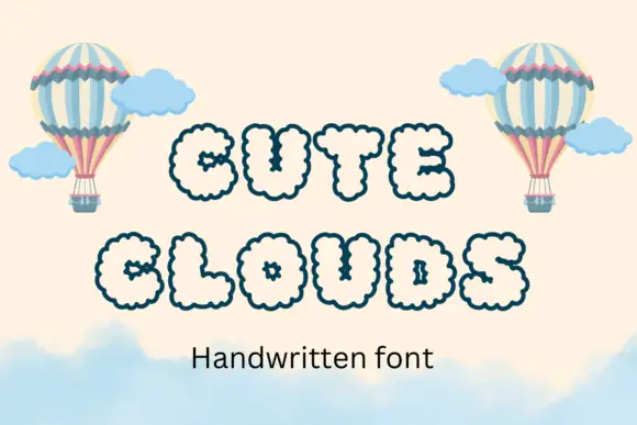
Puffy outlined capitals with repeated small scallops around outer edges and counters
Cute Clouds draws every capital as a puffy cloud with scalloped edges and a hand-dotted outline, set in a soft cream on a pale sky with hot-air balloons.
Ideas for this font
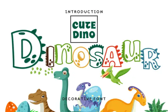
Hollow irregular mixed case with dinosaur-like spikes and rounded footprint-like spots
Dinosaur draws hollow letters with an unsteady hand, gives several of them spikes along the top and fills the neighbours with round footprint spots, so a word looks assembled by a child who likes big reptiles.
Ideas for this font
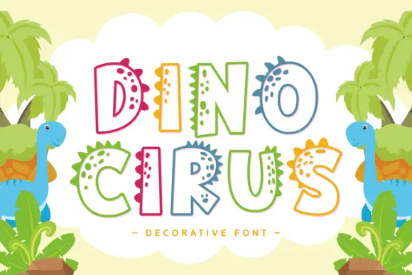
Hollow broad capitals with triangular spines and small solid spot clusters
Dino Cirus displays multicoloured outlined capitals in two rows, where small triangular spines project from the upper and side edges, solid spot clusters follow the inner curves and the hollow bodies keep a broad friendly silhouette across both rows.
Ideas for this font
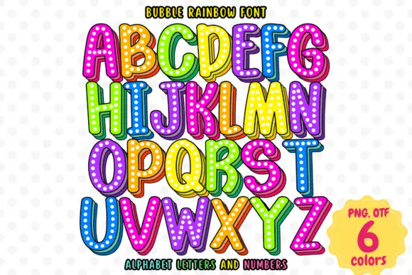
Bright rounded capitals with dotted faces and shaded offset edges
Bubble Rainbow sets fat rounded letters with a heavy outline, a white inline and a grid of pale dots across the fill, supplied in six bright colourways across letters and numerals.
Ideas for this font
Same independent foundry
Allow optional Google Analytics to measure visits and catalogue actions. Your search words and notes are not included. Privacy & storage