High-Contrast Display Serif

Kindergarten + The Lumina Awesome
Pairs sculptural editorial warmth with Kindergarten's clean modern geometry.
Inspect The Lumina Awesome specimenDisclosure: MakerFileHub may earn a commission from qualifying purchases via paid links on this page. How our links work.
Narrow informal capitals with rounded ends and an open angled K
Kindergarten shows dark capitals split into KINDER and GARTEN over a pink cloud-like patch, where rounded ends and slightly changing widths soften the tall stems, the K and R carry open angled legs and the G keeps a short inward bar.
Paid link
Get this fontProject & layout blueprintsAt-a-glance maker compatibility
Sturdy stroke walls and open counters weed cleanly on adhesive vinyl, HTV apparel film, and cut cardstock.
Visual anatomy & craft review
The stems run narrow and tall, the terminals round off, the widths shift a little from letter to letter and the angled legs open rather than closing into right angles. That softened stem is the character: the word reads as friendly signage rather than a neutral cap font, which is why the sample splits it across two rows. One small detail makes it distinctive too, the I carrying short horizontal bars, and the whole specimen proves no teaching alphabet, so check real letterforms before classroom use and keep 26 pt as the floor.
Narrow caps · Rounded ends · Angled legs
Two-font hierarchy recipes
Tested contrast partners — pairing Kindergarten with grounded secondary typography.
Kindergarten + The Lumina Awesome
Pairs sculptural editorial warmth with Kindergarten's clean modern geometry.
Inspect The Lumina Awesome specimen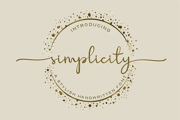
Kindergarten + Simplicity
Introduces organic movement on pull-quotes, signatures and gift tags.
Inspect Simplicity specimenPractical applications
Concrete hierarchy, scale and production guidance tailored to Kindergarten’s stroke geometry.
The narrow rounded caps suit a classroom door, and the open legs keep a short name clear at 44 pt on a printed sign, readable from down the corridor.
Hierarchy & layout recipe
Print an A4 sign: set the name at 44 pt on one row, keep 20 mm of clear ground beneath before the room number at 13 pt, and keep 20 mm of margin all round so the rounded ends are not clipped.
Pre-production check
The angled legs close under 26 pt; check the printed sheet at full size and hold the name at 40 pt or above.
The friendly caps mark a milestone, and the softened stems keep a short phrase readable at 30 pt on an A6 card without looking childish.
Hierarchy & layout recipe
Print an A6 card: set the phrase at 30 pt on two rows, keep 14 mm of clear ground between the rows, and leave the lower third blank for a handwritten note from a parent.
Pre-production check
Two narrow rows at the same size look cramped; check the card and reduce the second row by six points.
The rounded capitals give a toy shop a warm mark, and the changing widths hold a two-word name at 24 pt on a 60 mm label.
Hierarchy & layout recipe
Print a 60 by 40 mm label: set the shop name at 24 pt on one row, keep 7 mm of clear ground beneath before the street at 7 pt, and keep 5 mm of border on each side.
Pre-production check
Small I bars disappear under 18 pt; check the plate proof and keep the name at 22 pt or above.
Technical & licence verification
Confirm included OTF/TTF/WOFF formats, full glyph tables and licence coverage on the live store page before batch production.
Closest visual alternatives
Matched across letterform anatomy, stroke behaviour and craft applications.
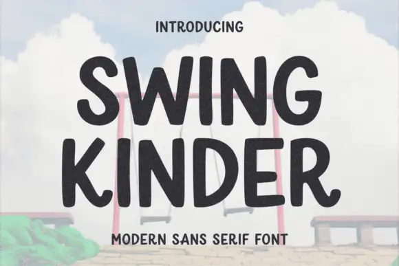
Thick rounded organic sans
Swing Kinder is a thick rounded sans in near-black on a pale sky: heavy strokes with soft, slightly irregular edges, wide round counters, an angled leg on the R and a curved tail on the G, so the pair reads as a friendly sign cut by hand rather than a geometric grotesque.
Ideas for this font
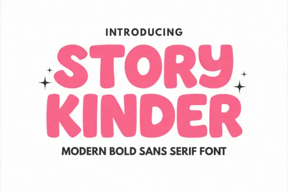
Soft heavy rounded sans
Story Kinder is a soft heavy sans in pink on white: caps with thick rounded strokes, uneven widths, a curved y that drops below the line like a lowercase letter and generous bowls, set in two lines with sparkles at the sides and a plain line beneath naming the style.
Ideas for this font
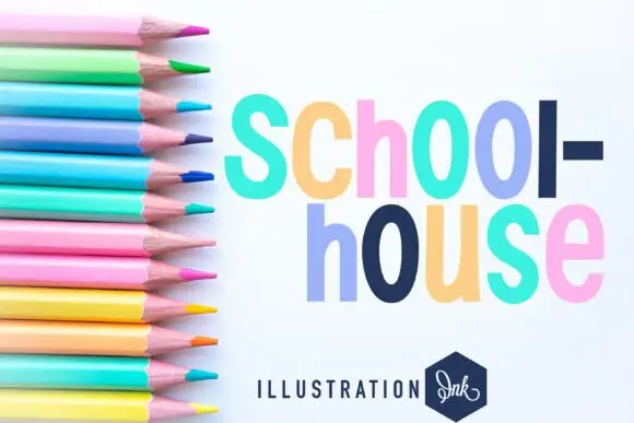
Heavy narrow rounded sans
Schoolhouse is a heavy narrow sans shown in pastel lilac, navy, pink and mint on white: mixed case with long oval bowls, softly uneven rounded shoulders and a slightly loose rhythm, set in two lines beside a fan of coloured pencils and a small studio badge.
Ideas for this font

Heavy rounded school sans
School Bold shows heavy upright sans capitals with rounded corners and tall oval counters: the C opening stays broad and the B closes two small rounded bowls, while the cover adds a white edge and a deep offset shadow.
Ideas for this font
Same independent foundry
Allow optional Google Analytics to measure visits and catalogue actions. Your search words and notes are not included. Privacy & storage