High-Contrast Display Serif

Precision + Glofi
Pairs sculptural editorial warmth with Precision's clean modern geometry.
Inspect Glofi specimenDisclosure: MakerFileHub may earn a commission from qualifying purchases via paid links on this page. How our links work.
Tall ultra-condensed geometric headline grotesk
Precision is a bold, ultra-condensed sans serif typeface with tall vertical pillars, tight flat-sided counters, and clean modernist snap.
Paid link
Get this fontProject & layout blueprintsAt-a-glance maker compatibility
Sturdy stroke walls and open counters weed cleanly on adhesive vinyl, HTV apparel film, and cut cardstock.
Visual anatomy & craft review
Precision is a tall ultra-condensed grotesk in caps with flat-sided counters, squared corners and very tight sidebearings, so a word reads as a compressed panel of vertical pillars rather than a normal headline. The extreme condensation packs long names into narrow columns, which is its purpose, and the tight fit means lines need tracking to avoid a solid band. It needs roughly 30 mm for the flat counters to stay open, and it is best in white on a dark ground or a single flat ink on a pale one.
Disciplined · Towering · Sharp
Two-font hierarchy recipes
Tested contrast partners — pairing Precision with grounded secondary typography.
Precision + Glofi
Pairs sculptural editorial warmth with Precision's clean modern geometry.
Inspect Glofi specimen
Precision + Autography
Introduces organic movement on pull-quotes, signatures and gift tags.
Inspect Autography specimenPractical applications
Concrete hierarchy, scale and production guidance tailored to Precision’s stroke geometry.
Ultra-condensed pillars read as a printed masthead built to fit a fixed measure, which is what a broadsheet-style cover is. The face packs a five-word headline into a narrow column at 120 pt, and the flat counters keep it readable at 10 pt in a data block.
Hierarchy & layout recipe
Cover 210 x 297 mm, title 120 pt, cover lines 9/12 pt, 18 mm margins and 10 mm trim. Poster A2, word 300 mm, details 22/28 pt, 30 mm margins. Index column 60 mm wide, entries 9 pt on an 11 pt leading.
Pre-production check
An index column set in an ultra-condensed face at 9 pt reads as a vertical grey ribbon and the numbers stop lining up. Use a wider companion for index text, and check one printed column at final measure before the run.
Compressed grotesk caps read as a specification plate, which is what an electronics or tool brand prints on a carton. The narrow stance fits a long model name plus a version number on one 60 mm carton edge, and the flat counters stay open in a one-colour print.
Hierarchy & layout recipe
Carton 60 x 140 x 30 mm, name 18 mm, spec 5 pt, 8 mm margins. Label 120 x 40 mm, word 10 mm, 3 mm die margin. Panel 2000 x 800 mm, word 400 mm, 150 mm margins.
Pre-production check
A 5 pt spec line on a carton edge closes its counters and becomes a barcode that a scanner cannot read. Keep the fine print in a wider sans, and check one assembled carton before the order.
Ultra-condensed caps read as an academic programme that respects a grid, which is what a university department posts in a corridor. The narrow pillars fit a full lecture title plus a speaker on one poster, and the flat fill prints in one colour on a house press.
Hierarchy & layout recipe
Poster A2, title 220 mm, speaker 24/30 pt, 30 mm margins and 20 mm trim. Banner 1500 x 400 mm, word 250 mm, 100 mm margins. Cover 170 x 240 mm, title 60 pt, 18 mm margins.
Pre-production check
A corridor poster is read at an angle from two metres and a 220 mm condensed word foreshortens into a solid band. Increase the tracking on the title by 2 percent, and check one poster from the corridor's far end before printing the run.
Technical & licence verification
Confirm included OTF/TTF/WOFF formats, full glyph tables and licence coverage on the live store page before batch production.
Closest visual alternatives
Matched across letterform anatomy, stroke behaviour and craft applications.
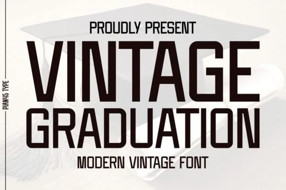
Condensed modern vintage sans
Vintage Graduation is a condensed sans in near-black on a pale ground, set over a graduation cap: tall narrow caps with flat terminals, a high waist, closed counters and tight spacing, arranged on two lines with a tracked label above and beneath in the same face.
Ideas for this font
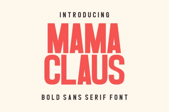
Heavy condensed bold sans
Mama Claus is a heavy condensed sans in red on cream: very thick stems, narrow counters, flat terminals and a tall x-height, with two stacked lines filling the plate and a tracked caption beneath, so the pair reads as a modern poster headline rather than a period display.
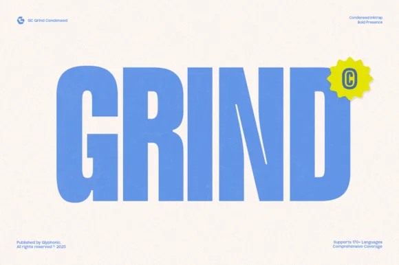
Heavy condensed inktrap display sans
Gc Grind is a bold condensed sans-serif engineered with subtle corner inktraps and flat industrial curves across 170+ languages.
Ideas for this font

Bold flat-sided condensed poster grotesk
Taught is a heavy, flat-sided condensed sans-serif with tight interior counters and commanding vertical headline presence.
Ideas for this font
Same independent foundry
Allow optional Google Analytics to measure visits and catalogue actions. Your search words and notes are not included. Privacy & storage