High-Contrast Display Serif

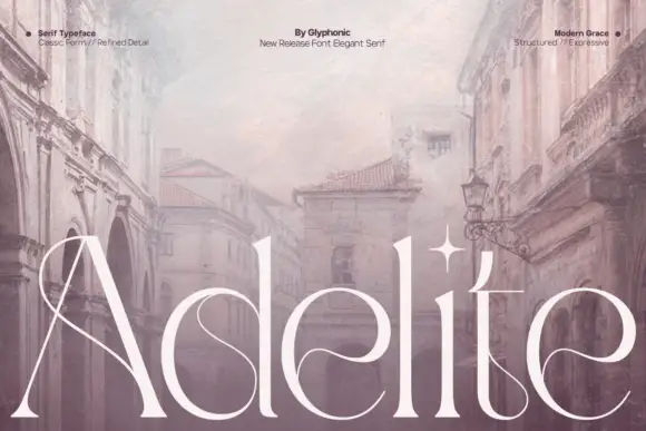
Fentura + Cronelo
Pairs sculptural editorial warmth with Fentura's clean modern geometry.
Inspect Cronelo specimenDisclosure: MakerFileHub may earn a commission from qualifying purchases via paid links on this page. How our links work.
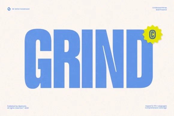
Substantial plain mixed case with broad bowls and open horizontal e bars
Fentura presents three black lines on light grey, the name above Modern Forms and Bold Structure, where straight substantial stems meet broad rounded bowls, the e opens wide, the a keeps a double storey and the crossbars stay flat and plain.
Paid link
Get this fontProject & layout blueprintsAt-a-glance maker compatibility
Sturdy stroke walls and open counters weed cleanly on adhesive vinyl, HTV apparel film, and cut cardstock.
Visual anatomy & craft review
The construction stays geometric, the bowls stay circular, the joints close tightly and the crossbars sit level. That plainness is the character: the sample shows a consistent solid texture rather than a contrast face, which is why the three rows read as one voice across the page. The corner notes advertise eight weights from hairline to bold and a variable build, so check what your file actually exposes before planning a hierarchy. Keep 12 pt for body use and test the a and e at small sizes where the geometry can tighten.
Substantial plain mixed case with broad bowls and open horizontal e bars
Two-font hierarchy recipes
Tested contrast partners — pairing Fentura with grounded secondary typography.
Fentura + Cronelo
Pairs sculptural editorial warmth with Fentura's clean modern geometry.
Inspect Cronelo specimen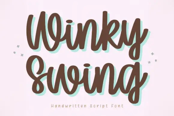
Fentura + Winky Swing
Introduces organic movement on pull-quotes, signatures and gift tags.
Inspect Winky Swing specimenPractical applications
Concrete hierarchy, scale and production guidance tailored to Fentura’s stroke geometry.
The plain geometry gives a small studio a mark that reads as engineering rather than marketing, and the weight range covers a full identity from logo to legal line.
Hierarchy & layout recipe
Print an 85 by 55 mm card: set the wordmark in the bold weight at 22 pt, set the address in the regular weight at 7 pt, keep 12 mm of clear ground between them, and keep 10 mm of margin at each side.
Pre-production check
The advertised weights may install separately; check the file list before planning a hierarchy.
The three-level structure matches a report cover, where a title, a subtitle and a descriptor have to sit in one column without decoration.
Hierarchy & layout recipe
Print an A4 cover: set the title in the bold weight at 40 pt, set the subtitle in the regular weight at 16 pt, set the descriptor in the light weight at 10 pt, keep 14 mm between the blocks, and keep 22 mm of margin.
Pre-production check
Light weights under 10 pt on uncoated stock thin out; check the proof and use regular for small text.
The even geometry reads on a door plate and the flat crossbars keep a long department name legible at corridor distance.
Hierarchy & layout recipe
Print a 300 by 120 mm plate: set the department name in the bold weight at 26 pt, set the room number in the regular weight at 11 pt, keep 12 mm between the lines, and keep 16 mm of margin for the fixings.
Pre-production check
Rounded bowls lose definition on brushed metal; check the plate proof before the etch is cut.
Technical & licence verification
Confirm included OTF/TTF/WOFF formats, full glyph tables and licence coverage on the live store page before batch production.
Closest visual alternatives
Matched across letterform anatomy, stroke behaviour and craft applications.
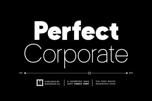
Heavy and thin geometric pair
Perfect Corporate is a geometric sans pair in white on black: a very heavy mixed-case word above a thin, wide mixed-case line, with a weight scale between them running from 100 to 900, three small credits beneath and a boxed mark at the left.

Geometric sans with a variable weight range
Prime Nordic is a geometric sans in white on charcoal, set as two lines of the same name: the first in a light cut and the second in a heavy one, with a small badge tucked at the shoulder stating nine weights and two notes in the corners about the variable file and the language support.
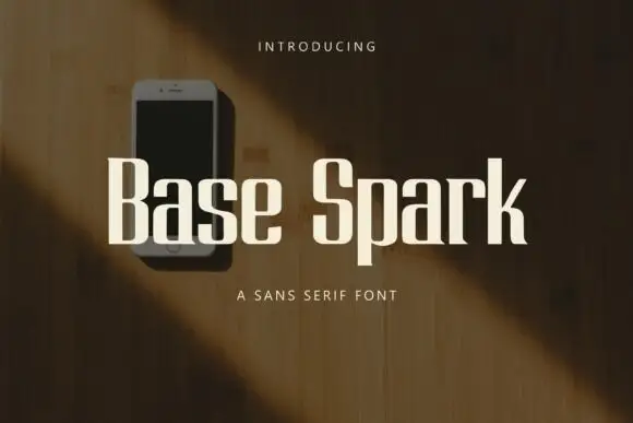
Heavy condensed sans letters with squared curves and abrupt flat ends
Base Spark is a condensed sans with tall stems, a light overall weight, flat terminals and a narrow set of counters that keep a long word inside a small width.
Ideas for this font
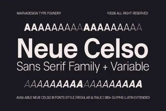
Neutral sans family with variable weights
Neue Celso is a neutral sans family shown in pale cream on charcoal: a title line in mixed case with open e bowls, a subtitle in a lighter cut, and above and below it two rows of A samples that step through the weights, with small notes in the corners that state the count, the styles and the glyph set.
Ideas for this font
Same independent foundry
Allow optional Google Analytics to measure visits and catalogue actions. Your search words and notes are not included. Privacy & storage