High-Contrast Display Serif

Minimalist Aesthetic + Flowsky Editorial
Pairs sculptural editorial warmth with Minimalist Aesthetic's clean modern geometry.
Inspect Flowsky Editorial specimenDisclosure: MakerFileHub may earn a commission from qualifying purchases via paid links on this page. How our links work.
Light rounded geometric sans
Minimalist Aesthetic is a light rounded sans in near-black on a pale grey ground: mixed case with circular bowls, even strokes and short curved feet on the t, set on two lines with a small tracked line above and beneath and nothing else on the sheet.
Paid link
Get this fontProject & layout blueprintsAt-a-glance maker compatibility
Sturdy stroke walls and open counters weed cleanly on adhesive vinyl, HTV apparel film, and cut cardstock.
Visual anatomy & craft review
The two words are stacked and the drawing is a light geometric sans: the bowls are near-circular, the strokes are even, and the feet curl slightly, which keeps a minimal face from looking cold. That construction is why the plate leaves the sheet almost empty — the face is sold on restraint, so the specimen has to resist adding anything. Because the strokes are light, the face works at moderate sizes on a white or pale ground, and the plate shows it at a size where the curls on the t and the terminals are visible. The two tracked lines are set in a smaller size with wide spacing, which is a common pairing for a minimal brand and shows how the family behaves in a minor key.
Sans serif, light, geometric, minimal
Two-font hierarchy recipes
Tested contrast partners — pairing Minimalist Aesthetic with grounded secondary typography.
Minimalist Aesthetic + Flowsky Editorial
Pairs sculptural editorial warmth with Minimalist Aesthetic's clean modern geometry.
Inspect Flowsky Editorial specimen
Minimalist Aesthetic + Esmeralda
Introduces organic movement on pull-quotes, signatures and gift tags.
Inspect Esmeralda specimenPractical applications
Concrete hierarchy, scale and production guidance tailored to Minimalist Aesthetic’s stroke geometry.
A light geometric sans reads as skincare or architecture, and the even strokes keep a wordmark clean at the small sizes cartons demand.
Hierarchy & layout recipe
Set the mark at 16 pt on a carton, 85 mm on a shelf panel and 11 pt on a card, keeping the light cut only above 13 pt. Keep one colour and clear space equal to the x-height.
Pre-production check
Check the 11 pt card mark on uncoated stock, where a light stroke can fade; use a regular cut at that size. Confirm the shelf panel reads at four metres and that the curls stay open.
A light sans gives a design book a quiet cover, and the even strokes hold at thumbnail size where a busier face would clot.
Hierarchy & layout recipe
Set the title at 80 mm cap height across 190 mm, the subtitle in a 10 pt sans, and the author at 8.5 pt. Print one ink on a matte stock and keep the title in the upper half.
Pre-production check
Check the title at 80 mm on matte stock, where a light stroke can break; keep it above 0.25 mm. Confirm the 8.5 pt author survives lamination and that the title clears the trim.
A light sans gives a contemporary invitation restraint, and the rounded bowls keep two long names from looking clinical on the card.
Hierarchy & layout recipe
A5 invitation: the names at 24 pt, the request in a 9.5 pt serif, and the date at 8.5 pt. Keep 24 mm margins, letterpress one ink on a heavy card and hold 6 mm under the names.
Pre-production check
Check the 24 pt names in letterpress, where a light stroke can sink; proof the plate first. Confirm the 9.5 pt request reads at arm's length and that the names clear the trim.
Technical & licence verification
Confirm included OTF/TTF/WOFF formats, full glyph tables and licence coverage on the live store page before batch production.
Closest visual alternatives
Matched across letterform anatomy, stroke behaviour and craft applications.
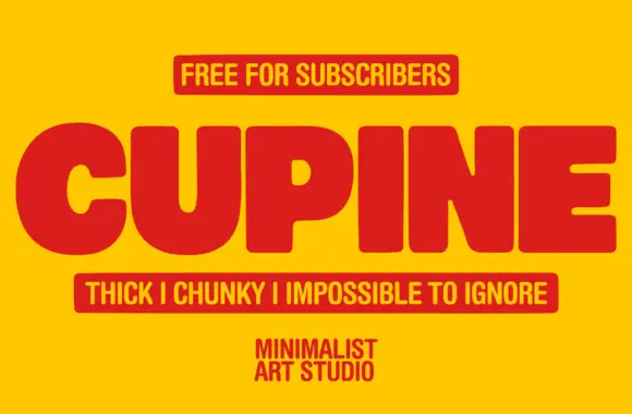
Very heavy compact capitals with small rounded counters and softened corners
Cupine is a thick display sans with almost no contrast, counters cut down to slits, corners just eased off the square, and a width that makes a short word fill a poster.
Ideas for this font

Light geometric capitals with circular O and broad angular diagonals
Modern Heritage shows black capitals in two closely stacked lines on white, where thin nearly even strokes form a circular O, a broad M and N and a large triangular A, while the G keeps an open right side with a short inner bar.
Ideas for this font
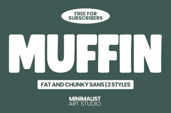
Fat chunky sans display
Muffin is a fat chunky sans in white on dark green: extremely heavy caps with squared corners, narrow counters, and a slightly condensed width, presented as a two-style family with a tracked label beneath and a badge above.
Ideas for this font

Light contrast capital sans
Mansory is a light contrast sans in black on cream, shown small against a sunlit venetian blind: wide capitals with a broad circular O, fine diagonal joins and hairline uprights, with a small serif line beneath and an italic credit under that.
Ideas for this font
Same independent foundry
Allow optional Google Analytics to measure visits and catalogue actions. Your search words and notes are not included. Privacy & storage