High-Contrast Display Serif

Solen + Cervelique
Pairs sculptural editorial warmth with Solen's clean modern geometry.
Inspect Cervelique specimenDisclosure: MakerFileHub may earn a commission from qualifying purchases via paid links on this page. How our links work.
Heavy neutral grotesque family with italic
Solen is a heavy neutral sans shown as a white caps wordmark on layered beige paper folds, presented as an eighteen-font family: thick uniform strokes, tight apertures and an italic companion that gives the same weight a forward lean.
Paid link
Get this fontProject & layout blueprintsAt-a-glance maker compatibility
Sturdy stroke walls and open counters weed cleanly on adhesive vinyl, HTV apparel film, and cut cardstock.
Visual anatomy & craft review
The preview sets the name in heavy capitals so the face's neutrality is visible at once: the strokes are thick and almost identical in weight, the terminals are cut horizontally, the R has a straight angled leg, and the bowls of the O and the S stay close to the skeleton of a classic grotesque rather than a geometric circle. Beside the display word, a small italic line runs in the same weight, which is the real news here: the family ships as a system, so a single project can pair the upright for headings with the oblique for captions without mixing typefaces. The mockup places the type over torn sheets of beige paper in soft light, and the tracked caption above and below the sample is set in a much lighter cut, showing how the family behaves when the weight drops. Because the counters are wide at every weight and the letter spacing is even, the face survives long lines as well as two-word statements.
Heavy, neutral, workhorse, family
Two-font hierarchy recipes
Tested contrast partners — pairing Solen with grounded secondary typography.
Solen + Cervelique
Pairs sculptural editorial warmth with Solen's clean modern geometry.
Inspect Cervelique specimen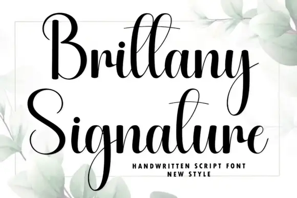
Solen + Brittany Signature
Introduces organic movement on pull-quotes, signatures and gift tags.
Inspect Brittany Signature specimenPractical applications
Concrete hierarchy, scale and production guidance tailored to Solen’s stroke geometry.
A neutral grotesque with a full weight range is the safest base for a packaging system, because one family covers the product name, the legal text and the weight table without visible seams.
Hierarchy & layout recipe
Choose three cuts only: heavy for the front-of-pack name at 28 pt, medium for the descriptor at 11 pt, and regular for the back panel at 8.5 pt. Keep a 4 mm minimum gap between the descriptor and the name, and set the net weight in the medium italic so it separates from the surrounding text.
Pre-production check
Test the back panel at actual size: the tight apertures of the a and e must stay open at 8.5 pt on the chosen board, and the italic must align its baseline with the upright when the two sit on the same line. Confirm the printed 4 pt rule does not run into the descenders.
Using one family in two weights and one italic keeps a long report quiet, and the heavy cut gives section openers enough presence without introducing a second typeface.
Hierarchy & layout recipe
Set the cover in the heavy cut at 96 pt with tracking at minus 20 units, section openers at 34 pt in heavy, body at 10 pt in regular with a 14 pt leading, and the pull quotes in the italic at 18 pt. Keep the italic reserved for quotes only so the reader learns the pattern on page two.
Pre-production check
Check the numerals in the financial tables: proportional figures in the heavy cut must not jump the column width, and the italic must not be used for anything longer than three lines, where the lean starts to slow slow reading. Verify the 10 pt body keeps a 14 pt leading on both paper and screen.
Room signs get read in a hurry from an angle, and a heavy neutral sans with wide counters holds up where lighter faces smear into the wall colour.
Hierarchy & layout recipe
Set the wing name in the heavy cut at 60 mm cap height, white on a dark grey plate, with the room number in the same family at 30 mm and the floor beneath it at 12 mm. Mount the plate at 1,500 mm centre height and keep 40 mm of clear plate on every side of the text.
Pre-production check
Check the plate in the corridor at the angle a visitor actually approaches from, and confirm the tight apertures do not close when the sign is viewed from 30 degrees off axis. Test the contrast of white on grey with the accessibility checker before the sign is fabricated.
Technical & licence verification
Confirm included OTF/TTF/WOFF formats, full glyph tables and licence coverage on the live store page before batch production.
Closest visual alternatives
Matched across letterform anatomy, stroke behaviour and craft applications.

Heavy mixed case with broad bowls and closely packed short lowercase
Base Edge sets a heavy grotesque in cream over a dark glass tower, the strokes thick, the terminals flat and the spacing tight enough that the words read as one block of light.
Ideas for this font
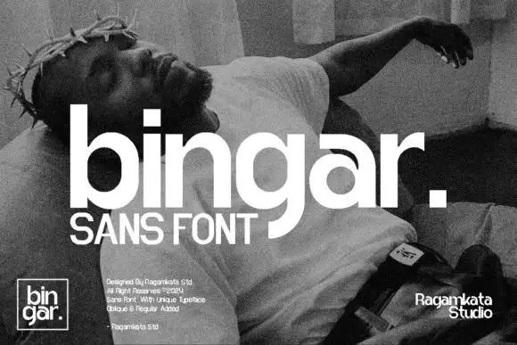
Heavy rounded lowercase with square i dot and a long curved g descender
Bingar shows a large white lowercase name over a grainy monochrome sculpture photograph, where broad bowls and heavy upright strokes make the row substantial, the square i dot, open r shoulder and curling g descender add distinct details and a square full stop ends the displayed word.
Ideas for this font
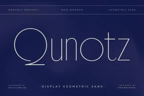
Very fine geometric mixed case with a large open Q sweep and circular o
Qunotz shows pale slender lettering on navy: the Q is a large nearly circular form that opens near its lower edge and sweeps into a long flat tail, while the u and n keep simple rounded turns, the o stays circular and the t carries a light crossbar above a curved foot.
Ideas for this font
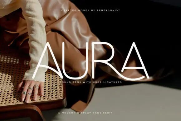
Light rounded capitals with long curved A bars and an extended R leg
Aura shows pale thin capitals over a dark fashion photograph, where near-even rounded strokes build an open U and a broad R bowl, the first A carries a long curved cross-stroke that sweeps toward the centre and the R leg continues below the final A as a broad flowing curve.
Ideas for this font
Same independent foundry
Allow optional Google Analytics to measure visits and catalogue actions. Your search words and notes are not included. Privacy & storage