High-Contrast Display Serif

Forest Clipart + Majestic Letters
Pairs sculptural editorial warmth with Forest Clipart's clean modern geometry.
Inspect Majestic Letters specimenDisclosure: MakerFileHub may earn a commission from qualifying purchases via paid links on this page. How our links work.
Tall hand-shaped capitals with uneven stroke edges and angled R legs
Forest Clipart draws tall hand-lettered capitals with a deliberately unsteady stroke, keeps the widths uneven, and sets two stacked words on a plain cream ground with small sparkles in the margins.
Paid link
Get this fontProject & layout blueprintsAt-a-glance maker compatibility
Sturdy stroke walls and open counters weed cleanly on adhesive vinyl, HTV apparel film, and cut cardstock.
Visual anatomy & craft review
FOREST over CLIPART fills the page in mid grey, the letters narrow with rounded ends, the O drawn slightly oval and the R carrying a short leg that stops before the baseline. Nothing is aligned to a strict grid, so the block reads as something written on a card rather than set from a font. Pale pink four-point stars and small dots sit either side, and a plain tracked caption under the words names the style. The face is a decorative approximation of handwriting that keeps its even, single weight, which makes it useful for headings at moderate size and hard to read in a paragraph.
Tall hand-shaped capitals with uneven stroke edges and angled R legs
Two-font hierarchy recipes
Tested contrast partners — pairing Forest Clipart with grounded secondary typography.
Forest Clipart + Majestic Letters
Pairs sculptural editorial warmth with Forest Clipart's clean modern geometry.
Inspect Majestic Letters specimen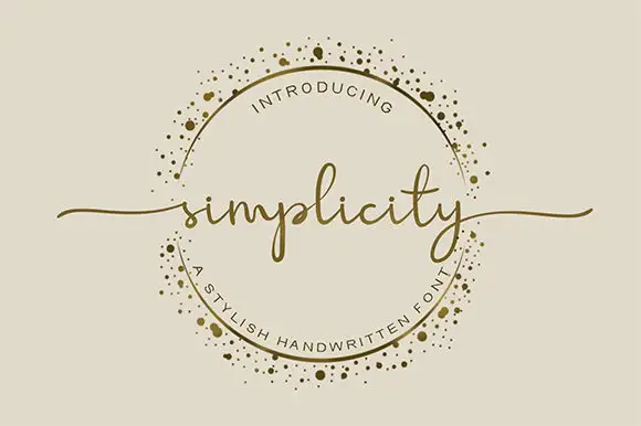
Forest Clipart + Simplicity
Introduces organic movement on pull-quotes, signatures and gift tags.
Inspect Simplicity specimenPractical applications
Concrete hierarchy, scale and production guidance tailored to Forest Clipart’s stroke geometry.
The hand-drawn letters take the formality out of a worksheet, and the single even weight stays readable at a heading size on a photocopy.
Hierarchy & layout recipe
Print an A4 worksheet: set the header at 34 pt on one row, keep 14 mm of clear ground beneath before the first question at 11 pt, and keep 16 mm of margin on both sides of the sheet.
Pre-production check
Uneven strokes thin on cheap copiers; check a photocopy before running a full class set on the school copier.
The wobbly lettering matches a handmade market better than a clean grotesque, and the tall narrow forms fit a long fair name on one board.
Hierarchy & layout recipe
Print a 700 by 400 mm board: set the fair name at 64 mm on one row, keep 26 mm of clear ground beneath before the dates at 16 pt, and keep 30 mm of border so no letter is clipped.
Pre-production check
Hand-drawn widths vary; check the layout at final size before the sign board is made by the fabricator.
The irregular caps give a local newsletter a friendly voice without an illustration, and the light strokes keep a large kicker from dominating the page.
Hierarchy & layout recipe
Print an A4 page: set the kicker at 28 pt on one row, keep 10 mm of clear ground beneath before the headline at 24 pt, and keep 14 mm of margin from the text block edge.
Pre-production check
Sparkles are decoration, not glyphs; check the supplied files before planning them into the layout.
Technical & licence verification
Confirm included OTF/TTF/WOFF formats, full glyph tables and licence coverage on the live store page before batch production.
Closest visual alternatives
Matched across letterform anatomy, stroke behaviour and craft applications.
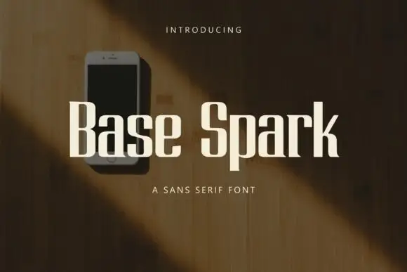
Heavy condensed sans letters with squared curves and abrupt flat ends
Base Spark is a condensed sans with tall stems, a light overall weight, flat terminals and a narrow set of counters that keep a long word inside a small width.
Ideas for this font
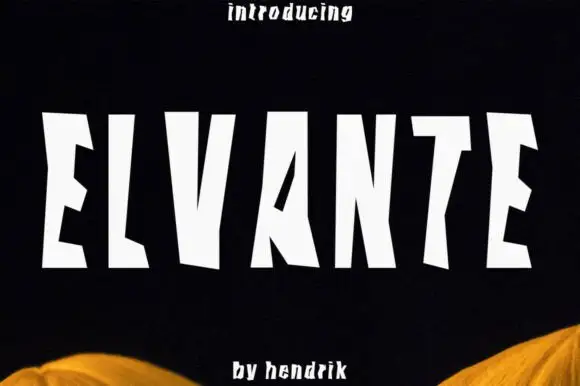
Tall irregular block capitals with wedge-shaped cuts
Elvante shows white uppercase letters with long straight sides and abrupt angled cuts, where the E has sloping arm ends, the V forms a narrow deep notch and the A uses a small triangular counter beside a long diagonal.
Ideas for this font
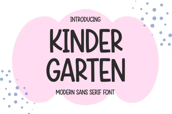
Narrow informal capitals with rounded ends and an open angled K
Kindergarten shows dark capitals split into KINDER and GARTEN over a pink cloud-like patch, where rounded ends and slightly changing widths soften the tall stems, the K and R carry open angled legs and the G keeps a short inward bar.
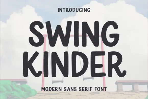
Thick rounded organic sans
Swing Kinder is a thick rounded sans in near-black on a pale sky: heavy strokes with soft, slightly irregular edges, wide round counters, an angled leg on the R and a curved tail on the G, so the pair reads as a friendly sign cut by hand rather than a geometric grotesque.
Ideas for this font
Same independent foundry
Allow optional Google Analytics to measure visits and catalogue actions. Your search words and notes are not included. Privacy & storage