 #1 · Best Overall
Lutheria
Upright single-line casual script with a very light even stroke
Get fontPaid link
Read review ↓Disclosure: MakerFileHub may earn a commission from qualifying purchases via paid links on this page. How our links work.
Note cards, favour tags & gift wrapping
A thank you card is a small format with a lot of white space, which means the lettering carries the whole tone. Lutheria and Bachelor Notes supply an honest handwriting register, Farmhouse Handmade and Sweet Boho soften it, and Bunglon and William Jameson add the formal script option for a wedding thank you. Timeless Handwriting covers the fountain-pen correspondence look.
Quick verdict
Lutheria is the most natural handwriting for a thank you note, Bunglon is the formal choice, and Farmhouse Handmade suits tags and wrapping. Timeless Handwriting is the pick for a personal, pen-written feel.
Quick answer
Short on time? Start with our three highest-rated thank you standouts before scrolling the full breakdown.
#1 · Best OverallUpright single-line casual script with a very light even stroke
 #2 · Runner-Up Pick
 #3 · Editor's Choice
We kept 29 of 1,539 candidates after removing Thanksgiving-themed lettering that shares the keyword but not the job. Judged on how the face reads at 14 to 18 pt on a 3.5 by 5 inch card, stroke consistency, and whether it survives printing on textured stock.
Side-by-side summary
Compare specimens, OpenType/PUA traits and primary project roles side by side.
| Rank & Font | Style & File Specs | Best Project Fit | Store Listing |
|---|---|---|---|
| HandwrittenAiry | Cricut Joy drawn thank-you insert card | Get fontPaid link | |
| HandwrittenPUA encoded · Ligatures · Alternates & swashes | Handmade linen care tag & craft-booth price card | Get fontPaid link | |
| HandwrittenGraph-paper-notes | Study-gram thumbnail, lab-notebook cover & zine | Get fontPaid link | |
| HandwrittenTidy-print | Gratitude card, classroom bulletin header & recipe sheet | Get fontPaid link | |
| ScriptCozy | Tea mug decal, bridesmaid gift box or cozy home sign | Get fontPaid link |
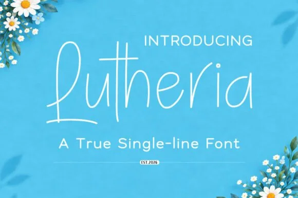
#1 · Best OverallLutheria is a true single-line script in which the stroke never thickens, the letters stay upright and the joins are open, so a word reads as something written with a fine pen at an even pace.
The capital L opens with a tall stem that loops back from the base, and the letters after it keep an easy rhythm: the u closes a small bowl, the t crosses with a single bar, the h rises into a plain stem, the e loops back high and the r keeps a short arm. Because the construction is one line of constant weight, the face behaves almost like a handwriting sans and holds at 12 pt on a small label. The upright angle means it stacks cleanly under a printed line without the slant fighting the baseline, and the open joins keep the letters distinct. It is light, so it needs good contrast rather than a heavy background. The blue ground, the white ink, the daisies in the corners and the two caption lines are presentation; the script is the word.
Cricut Joy drawn thank-you insert card — Use fine-tip gel or technical pens (0.4 mm) on smooth cardstock.
Built for pen plotting, foil transfer and engraving — not vinyl cutting.
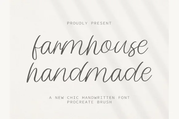
#2 · Runner-Up PickFarmhouse Handmade is a breezy, light-stroke handwritten cursive with tall open ascender loops and relaxed baseline bounce.
Farmhouse Handmade is an airy tall-looped monoline handwritten script: a fine even stroke, very high ascenders that loop twice, wide spacing and long tapered descenders that drop below the baseline. The airy spacing needs a wide measure and the descenders close the line below, so stacked text needs extra leading. It needs roughly 26 mm for the double loop and the fine stroke to read, and it is best in one warm ink on smooth or uncoated stock, or a single dark colour where the thin stroke still carries.
Handmade linen care tag & craft-booth price card — Pair lowercase two-word product titles at 22 pt on unbleached cotton paper with tiny all-caps sans weight and scent notes underneath.
Because every stroke is fine monoline, favor flat printing, rubber stamps, or Cricut fine-point pen drawing over small adhesive vinyl cuts.
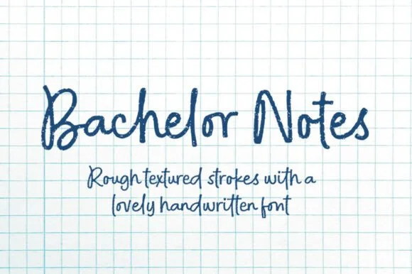
#3 · Editor's ChoiceBachelor Notes is an organic, lightly-textured felt-pen handwriting font capturing real ballpoint/marker lecture notes on quad graph paper!
Bachelor Notes is a felt-pen handwriting face with real fibre texture, uneven pressure and a lively baseline, drawn to look like notes taken quickly on quadrille paper. The letters are mixed case, tall and slightly slanted, with the pen's lift points visible, and the texture is baked in so a page reads as photographed rather than typeset. It needs roughly 9 mm to look like legible handwriting and holds up to 40 mm before the fibre starts to look like dirt. It is a prop, journal and heading face, and it should not be set as long body copy.
Study-gram thumbnail, lab-notebook cover & zine — Set titles at 64–125 pt above 2 rows of 32 pt handwritten body notes in navy or dark charcoal ink.
Organic rough edge micro-texture is designed for printables, digital planners, DTF shirts, and sublimation (not small vinyl weeding!).
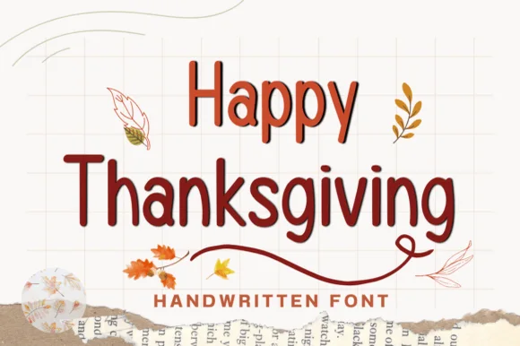 #4 · Top Maker Utility
Happy Thanksgiving (by Nun Sukhwan) is a tidy, disconnected rounded marker print font accented by a dramatic cradling underline tail on 'g'!
Happy Thanksgiving is a tidy disconnected rounded print with crisp upright stems and one dramatic gesture: a long sweeping tail on the g that cradles the word from below. Because the letters are unjoined and evenly spaced, a full phrase stays readable at 9 mm, and because the tail occupies its own band beneath the baseline, the layout needs vertical room rather than horizontal. The weight is medium with rounded ends, so the face looks written with a fine marker and reproduces cleanly on a school copier or a mug decal.
Gratitude card, classroom bulletin header & recipe sheet — Stack 2 title-case words centered at 52–90 pt so the final 'g' tail underlines the center of the word.
Clean, disconnected medium-bold strokes cut and weed fast on Cricut vinyl, HTV, and cardstock down to 0.65 inches!
 #5 · Standout Silhouette
Sweet Boho is a thick rounded brush script in which the strokes stay plump, the joins widen into soft transitions and the loops of S, B and h open wide, so a short phrase holds a large amount of ink on a craft blank.
The S swells through two wide curves, the B closes a broad upper loop, the h lifts a rounded arch and the connectors keep almost the same weight as the stems, which leaves very little thin passage anywhere in a word. The plumpness is the character: wide strokes give adhesive surface on a mug or a wooden sign, which is why the sample sets a warm phrase on a plain ground. Because the letters are fat, a title needs generous leading from 28 pt and the joins weld into a single path before cutting from 1.1 inches of x-height. The cream ground, the small daisies and the caption are presentation; the dark brush phrase is the face.
Tea mug decal, bridesmaid gift box or cozy home sign — Stack two short words tightly and Weld overlapping connections before cutting.
Top-tier vinyl & HTV friendliness thanks to thick, smooth strokes.
 #6
Bunglon is a modern copperplate script in which the downstrokes carry weight, the hairlines stay fine and generous swashes arch above the x-height and below the baseline, so a single name reads as formal calligraphy.
The B opens a wide upper loop, the bowls swell on the downstroke and thin on the join, the ascenders carry tall loops and the swash set adds long arcs that clear the word above and below. The overhead swashes are the character: they frame a name without a border, which is why the sample sets one couple's name on a plain card. Because the swashes are long, a line needs 20 mm of clearance at both ends, and the joins must be welded before cutting from 1.1 inches of x-height. The pale ground, the fine rules and the small caps line are presentation; the dark calligraphic name is the face.
Save-the-date or thank-you card headline — Use swashed forms sparingly on first and last letters and keep event logistics in a clean serif.
Fine hairlines suit print and foil; thicken with a small offset path if adapting for large vinyl signs.
 #7
William Jameson is a lively monoline signature script with broad looping capitals and a bold underline swash tail.
William Jameson is a slanted signature cursive with a sweeping underline swash: a fast forward-leaning stroke, letters joined at the baseline, and a long flat swash that draws under the whole name and lifts at the end. The swash is the design, so the face needs a wide measure rather than a square panel. The swash thins are the finest element and they break first in print and in foil. It needs roughly 30 mm for the swash and the slant to read, and it is best one dark ink on a smooth stock.
Apparel neck label, hangtag & founder sign-off — Stack the first name slightly left of the surname so the descending 'J' or capital loop balances the underline swash across a 3-inch width.
For HTV hoodies or t-shirts, size the lockup at least 3.5 inches wide so compact 'e' and 's' loops weed without lifting.
 #8
Hello Honey is fine lowercase script in which the two words are joined by a heart drawn into the connector, with long flat tails on both sides and a small even x-height.
The phrase begins with a flat entry that comes in well to the left, then the h rises into a tall plain stem, and the lowercase that follows stays small and fine: the e loops back through its bowl, the two l letters stand as narrow stems, the o closes a round counter and the n holds an even shoulder. In the middle of the line the pen rises into an open heart before joining the second word, and the line ends with a long flat tail that mirrors the entry. Weight is fine and even with slight contrast at the turns, and the ends taper to points. The heart is the only closed decorative shape, which keeps the line from reading as ornament. The cream ground, the pink ink and the two tracked captions are presentation; the script is the two words.
A heart-centred personal greeting — Keep both words on one wide line with a plain sender line below the y; avoid a second border or competing heart motif.
Verify the exact heart-linked alternate and fine-line output.
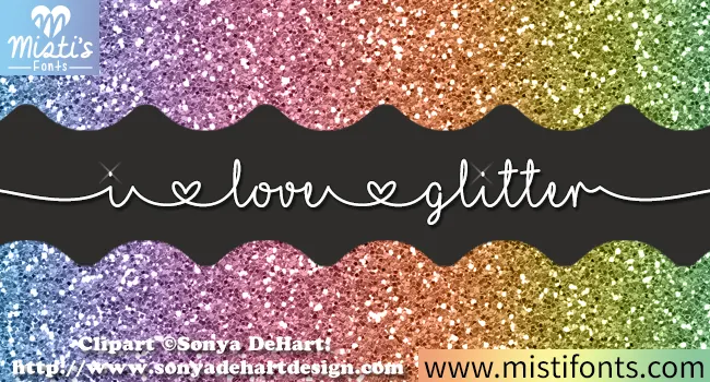 #9
I Love Glitter draws a fine handwritten line in which small heart shapes divide the words and long entry and exit strokes stretch the phrase wider than its letters alone, so a short message runs almost edge to edge.
The stroke stays thin and continuous, the joins barely widen, the hearts sit between words as dividers and the outer strokes travel far beyond the letters. The heart divider is the character: the phrase is separated by ornament rather than by a space, which is why the sample runs across the page. Because the stroke is fine and the tails are long, keep 24 pt as the floor on smooth stock and 20 mm at each end from a short line.
A birthday card with one long wish — Run the wish across the middle of a landscape card. Keep the recipient’s name above it in a plain face, with generous space at each side of the script.
Check the exact heart characters and joins in the actual files. Print a proof; fine lines may disappear at small sizes.
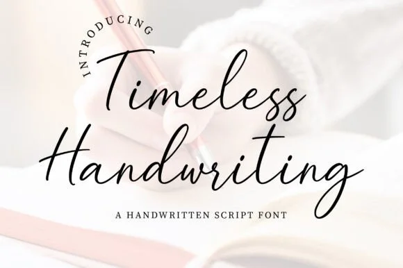 #10
JIM MART's fountain-pen handwriting script pairs airy, fast-flowing ink strokes with natural baseline bounce and crisp lowercase connections.
A natural fountain-pen handwriting shown over a sunlit notebook: slender ink-black strokes pair tall crossbar T's with open descending g loops, so the word reads as correspondence written at a desk rather than as a font imitating paper. The even slender weight is what keeps a paragraph readable, and the open loops give the lettering air at small sizes. Slight irregularities in the joins are what sell the hand. The notebook and pen are staging. Uses are addressed envelopes, vow booklets, notes from a founder and any layout where a plotted or printed hand is more honest than a styled script.
Cricut Pen addressed envelope, vow booklet & thank-you card — Stack 2 mixed-case lines at 48–96 pt above tiny spaced sans caps ('A HANDWRITTEN SCRIPT FONT').
Shines with Cricut fine-point pens, Foil Quill, and flat print; if blade-cutting vinyl, Weld joins and scale above 1.4 inches.
 #11
Hello Honey is a tall connected script in which the ascenders rise high, the bowls stay round and the y drops a descender that runs far below the line before curling away.
The capital H opens as a tall looped stem and the word after it connects without lifting: the e loops back through its bowl, the double l rises into two plain loops, the o closes a round counter and the n keeps a wide shoulder. Weight is medium and even with slight contrast at the joins, which keeps the phrase readable at 20 pt on a card while still reading as handwriting. The descender on the y is the signature gesture: it drops well below the baseline and then curls to the right, which is what fills the lower area of a composition and stops a short phrase from floating. Ends taper gently. The pale circle behind, the cream ground and the three centred caption lines are presentation; the script is the two words.
A honey-maker story card — Put the greeting across the front and the origin story in plain text on the reverse; leave the y area clear of labels.
Try the real words and verify packaging rights separately.
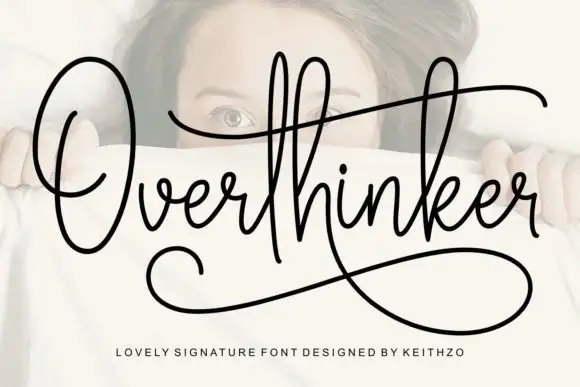 #12
Overthinker shows a large oval O, high narrow loops and a long t crossbar, with a broad lower sweep that returns under the word from the descending k-like join.
The stroke holds one even weight, the loops stay narrow and tall, the crossbar runs long and the final join sweeps back beneath the whole word as an underline. The monoline signature is the character: the underline turns a plain name into a mark without any extra artwork, which is why the sample sets one word alone with space around it. Because the sweep travels under the letters, keep 20 mm of clear ground below from 24 pt, and check that the joining stroke is supplied as a character rather than drawn in the layout.
A reflective journal title — Reserve a wide title band and begin plain text below the lower sweep.
Check actual alternate strokes instead of assuming the cover sweep.
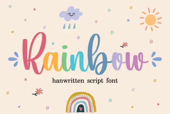 #13
Rainbow is a rounded connected script in which a narrow looped capital opens the word, the lowercase joins broadly and the b and l rise well above the body, so a single line reads as cheerful handwriting with a lift at the start.
The R closes a narrow loop, the b climbs above the ascender line, the joins stay round and open, and the lowercase bowls keep an even stroke through the connectors. The tall loop is the character: it gives one letter the vertical accent while the rest stays calm, which is why the sample sets one word alone. Because the joins are round, words need a clear gap between them, and the face cuts from about 1.1 inches of x-height before the connectors weld on vinyl. The rainbow fill and small illustrations are preview artwork; the lettering is the face.
A craft collection heading — Place the name on a clear horizontal band with product details below.
Verify alternate access and avoid assuming multicolour glyphs.
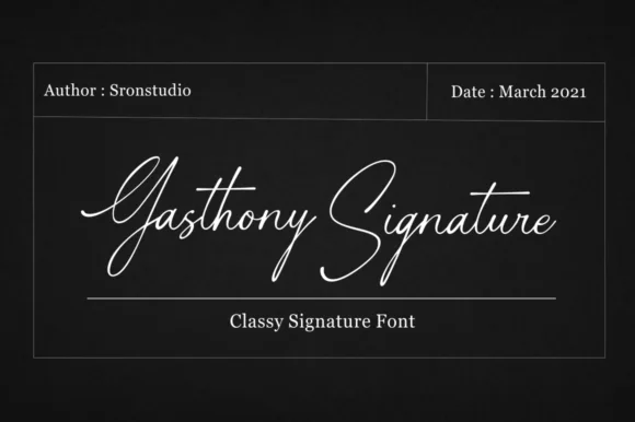 #14
Gasthony Signature is a slender, briskly slanted fountain-pen signature script with tall figure-eight capitals and airy lowercase rhythm.
Gasthony Signature is a slanted fine-nib fountain-pen signature script: a hairline stroke with a light swell on the downstrokes, a steep slant, joined letters and long tapered entries that start well before the first letter. The hairlines are the design and the first thing to break on textured stock, and the long entries need left-side clearance. It needs roughly 26 mm for the hairline and the entry to read, and it is best in one dark ink on smooth card, or a raised foil impression above 36 pt.
Real-estate sign-off, cosmetics seal & jewelry card — Place the signature at 22–28 pt in metallic silver, gold foil, or deep charcoal above a tracked uppercase title line.
Thin pen lines are built for 300 DPI print, digital watermarks, embossing, or Foil Quill—not small blade-cut vinyl weeding.
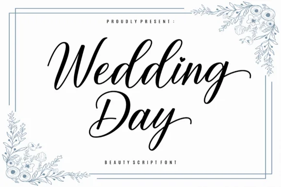 #15
Wedding Day is a smooth, romantic modern calligraphy script balancing tall looped ascenders ('d-d') with graceful horizontal exit swashes.
Wedding Day is a graceful slanted calligraphy script with an even pen angle, a light hairlines-to-swelling contrast and long sweeping exit tails that carry the last letter of a word out and upward. The tails extend well past the word box, so any centred layout needs side clearance. It needs roughly 22 mm for the pen angle and the tail to read, and it is best in a single warm ink on ivory or in foil only at large sizes.
Dusty-blue floral invitation, reception menu & vow cover — Center 2 stacked words at 44–68 pt inside corner botanical frames above wide-tracked serif subcaptions.
Works beautifully in print, sublimation, and large 1.8 in+ acrylic welcome-sign decals (weld all cursive joins first).
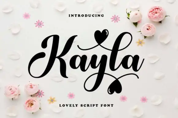 #16
Kayla is a bold cursive in which the downstrokes carry weight, the capital loops high, the connected body stays compact and the swashes finish in small hearts above and below the word, so a name reads as a warm handwritten greeting.
The K opens a tall loop, the y drops a descending loop under the centre of the word, the connectors keep one heavy weight and the swash set adds strokes that cross above and below the baseline with hearts at their ends. The heavy body is the character: it keeps a bold line legible where a fine script would thin, which is why the sample sets one word with two crossing swashes. Because the loops overlap, the face needs 20 mm between baselines from 28 pt and the joins must be welded before cutting from 1.1 inches of x-height. The pale ground, the small hearts and the caption are presentation; the dark word and its swashes are the face.
A couple's keepsake cover — Keep the phrase alone on the cover and put the date below the lowest heart in plain type.
Verify the actual heart alternates and ampersand.
 #17
Orvelia is a high-contrast display serif in which the stems alternate thick and hairline weights, the R, V and A end in curved swash legs and the bowls stay sculpted, so a name reads as a crest for a perfume box or a masthead.
The R tucks its leg into a curve, the V splits into two swashed strokes, the A carries a curling leg and the bowls close against fine joins that thin to a hairline at every junction. The swash leg is the character: three capitals carry the ornament while the rest of the alphabet stays quiet, which is why the sample frames one word for formal stationery. Because the hairlines are fine, the face wants coated stock from 16 pt and gains from hot foil on signage; the display cut ships with swashes as separate glyphs. The pale ground and the small frame rules are presentation; the dark display word is the face.
Formal wedding suite monogram & header — Track supporting lines (FOREVER BEGINS HERE) wide in a simple roman serif beneath the main display name.
Delivered as OTF; best suited to print, foil stamping and digital branding due to fine serif hairlines.
 #18
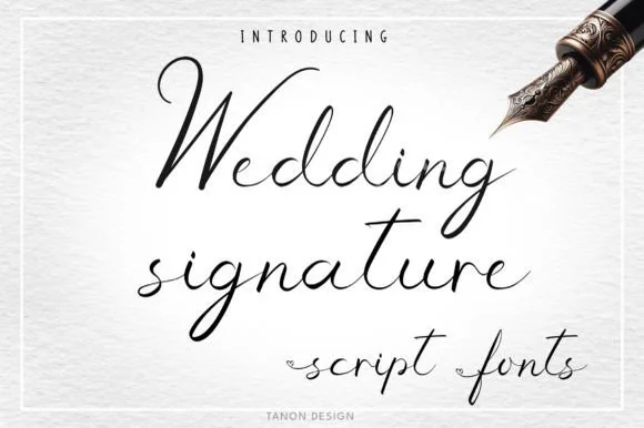
Wedding Signature is a light, airy fountain-pen cursive script with tall narrow loops and natural, unhurried handwritten spacing.
Wedding Signature is an airy fountain-pen signature script with a light even stroke, a moderate slant and loops drawn as open ellipses rather than filled coils. The pen line stays thin through the joins, so the face reads as written quickly rather than carefully drawn, and the loops leave the word tall but not heavy. It needs roughly 22 mm for the open loop and the join to read, and it is best in one warm black ink on ivory, or a fine foil impression above 30 pt where the thin stroke can still carry.
Cricut Pen envelope addressing, place card & guestbook — Set guest names at 28–38 pt with 9 pt tracked uppercase street/city lines cleanly underneath.
Thin pen lines shine in flat print, letterpress, Foil Quill, and fine-point pen plotting—avoid tiny blade-weeded vinyl.
 #19
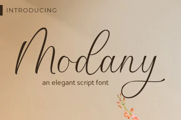
Modany is a graceful, thin-to-medium handwritten cursive script with tall peaked arches on capitals and long, airy ascenders.
Modany is a slender upright fountain-pen cursive script: a fine even stroke on a nearly vertical axis, small loops, joined letters and a light ink swell where the pen pauses, with very little contrast between thin and thick. The monoline character makes it legible at small sizes, and the fine stroke is what fails first on textured stock. It needs roughly 24 mm for the pen swell and the join to read, and it is best in one dark ink on smooth card, or a single warm ink on cream where the swell prints as a soft edge.
Minimalist save-the-date, envelope calligraphy & menu — Set single or paired names at 38–54 pt on warm cotton cardstock with generous breathing room above the tall 'M/d' peaks.
Fine pen weight excels in flat print, letterpress, and Foil Quill pen drawing; keep adhesive vinyl cuts above 1.8 in tall.
 #20
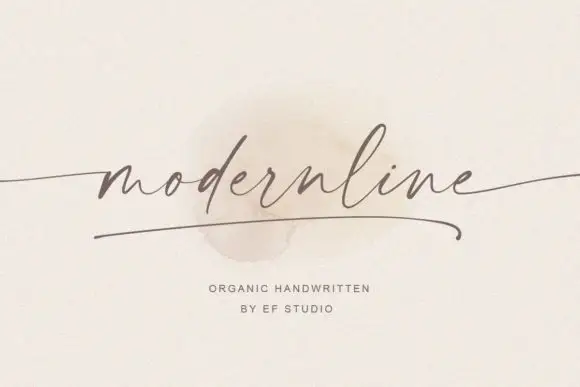
Modernline is an organic handwriting script in which the stroke stays very light, the letters lean gently and a single swash underlines the word, so a name reads as a pencil line drawn quickly on paper.
The m keeps three even arches, the o stays an open loop, the d rises into a light stem, the e turns a small eye, the r finishes a fine arm and the n repeats the arch, all at one light stroke with a modest slant, a low x-height and a drawn line running beneath the whole word. The underline is the character: it is part of the word rather than a rule added by the designer, which is why the sample sets one word with nothing else at that size. Because the stroke is very light, the face needs 26 pt upward and a smooth ground, and it greys out on textured stock. The paper texture, the soft shadow behind the word and the small caps beneath are presentation; the dark script word is the face.
A modern stationery heading — Place one name above plain product specifications with clear space beneath any underline.
Confirm actual underline options and logo terms.
 #21
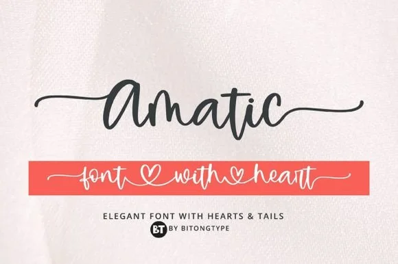
Amatic is a lively handwritten monoline script equipped with sweeping horizontal side tails and playful open-heart word connectors.
Amatic is a bouncy monoline cursive with long tails and connecting hearts: an even light stroke, joined letters, a soft bounce and tails that run under the word and link to the next with a small heart at the join. The hearts and the tails are the design and both close first at small sizes, and the long tails fix a block's width. It needs roughly 26 mm for the heart and the tail to read, and it is best in one warm ink on smooth card, or a pastel plus paper where the hearts print as knockouts.
Personalized tumbler name decal & bridesmaid tote — Run a single first name with left and right tails at 4.5 inches long, or link two names through the heart swash.
Weld all cursive connectors in Design Space before cutting permanent vinyl, and keep x-height at 0.55 in or taller.
 #22
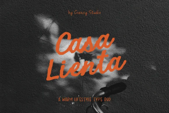
Casa Lienta is a warm Mediterranean-lifestyle font duo pairing an expressive thick brush script with a tall, slender handwritten all-caps sans!
Casa Lienta is a Mediterranean lifestyle duo: a thick expressive brush script in caps and lowercase, paired with a tall condensed handwritten sans in caps. The script carries warmth and the sans carries the small print, so the pair is designed so one line is spoken and the next is stated. The script's brush edges need size, the sans needs tight leading, and both share an uphill slant. It needs roughly 26 mm for the script, and it is best in terracotta or ink on warm plaster tones.
Tapas / wine-bar menu, ceramic studio stamp & olive-oil bottle — Tilt 2 stacked Brush Script words slightly (+4°, 84 pt) above wide-spaced tall Sans caps (24 pt).
Thick Brush Script cuts cleanly on Cricut HTV & Oracal 651 (Weld joins!); tall thin Sans shines in print or 1 in+ decals.
 #23
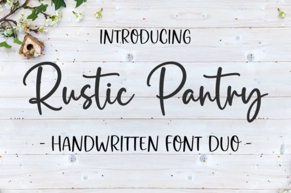
Rustic Pantry is a coordinated farmhouse font duo pairing a lively bouncy cursive script with a tall, narrow hand-drawn uppercase sans.
Rustic Pantry is a duo of a bouncy farmhouse brush script and a tall skinny marker sans: the script runs a loaded stroke with small flicks, a rising baseline and joined letters, while the sans is narrow with blunt marker ends for prices and lists. The two voices share one palette, so a jar label can carry a name and a list in the same hand. The script's bounce grows the word vertically and the marker sans stacks a long line in a narrow label. The script needs roughly 22 mm and the sans 18 mm for their detail to read.
Glass pantry canister decal, spice-jar set & kitchen sign — Center the script word at 2–3.5 inches wide above a 0.5-inch tracked skinny sans descriptor line.
Weld all touching cursive connectors before cutting Oracal 651 permanent jar vinyl; medium stroke weight weeds cleanly.
 #24
Brown Carolina Duo contrasts broad high-contrast capitals with a much finer narrow slanted script, set dark on a plain cream field, where the capital R legs sweep below the neighbouring letters and the script carries long tails that run past the ends of both words.
The caps keep thin cross strokes and heavy uprights, the script keeps one fine weight, and the two voices sit in a strict stack: script, two cap rows, script. That alternating order is the character, because the fine lines frame the heavy block like a rule above and below. Both treatments appear on a plain light field, so the cover gives no clue about texture or shadow. Keep 34 pt for the caps before the thin strokes break up, keep 20 pt as the floor for the script and check the R leg before setting a line of capitals.
A boutique stationery front — Use the capital name centrally and a small script descriptor below, leaving the R sweep clear of contact information in a plain footer.
Confirm both styles and the actual capital alternates.
 #25
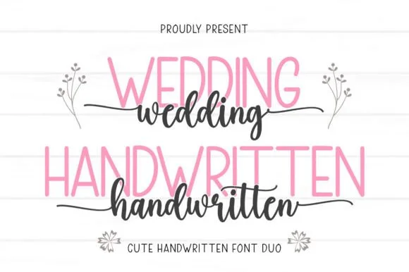
Wedding Handwritten pairs a tall, narrow rounded sans-serif with a lively thick-thin calligraphy script sporting symmetrical side tails.
Wedding Handwritten pairs a tall slender sans with a tailed calligraphy script: the sans is a narrow even-width capital set for details and directions, while the script runs a high-contrast stroke with long ascenders and a tail that lifts off the last letter. The pair is a stationery set, so both cuts have to survive one ink and a matte stock. The script tail is the finest element and it breaks first. The sans needs roughly 20 mm and the script 30 mm for their detail to read.
Save-the-date card, acrylic table sign & seating chart — Set table numbers or 'SAVE THE DATE' in 1.8 in blush or gold sans and center couple names across the lower half in charcoal script.
Weld the script letters before cutting vinyl for acrylic wedding signs, and handle the fine horizontal outer tails gently on transfer tape.
 #26
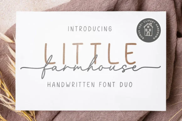
Little Farmhouse pairs a tall, narrow rounded sans-serif with a delicate, wide-tracked monoline cursive.
On the framed white card mockup, warm taupe capitals 'LITTLE' stand tall and widely spaced behind dark charcoal script 'farmhouse', whose long entry and exit tails extend past both edges of the sans word while the lowercase 'f' drops a deep narrow loop. PUA encoding provides easy access to the extended end swashes. The layering is the fragile part: the script is cut as a separate vinyl layer across the sans, so the long entry and exit tails thin out at the overlap and lift first on a textured board. Keep the script x-height at 1.5 in or above, press the sans layer down first, and test one plaque before painting a set.
Framed shiplap entryway or kitchen pantry sign — Track the sans capitals out to +120 in muted tan or gray at 2.8 in height, then center the dark script word across their lower stems.
When cutting stencil film for wood painting, keep the fine script above 1.5 in x-height so narrow 'f' and 'a' bridges hold firm against bleed.
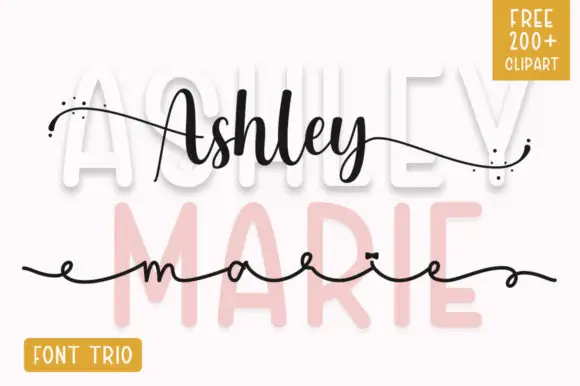 #27
Ashley Marie shows tall broad sans letters set very pale behind a darker connected Ashley line and a much finer extended marie line, where the upper script swells in the middle of the word, scattered dots sit at the ends of long outer strokes and a yellow corner badge advertises a font trio.
The pale sans stays wide and airy, the first script keeps a swelling thick-thin rhythm, the second stays hairline and extended, and the dots punctuate the tails. That three-layer build is the character, because the sample uses the sans as a background rather than as a reading row. The badge promises a trio plus clipart, so confirm what actually installs before planning a three-part lockup. Keep the hairline script at 22 pt or above and test the pale layer against your ground colour first.
A name-and-occasion invitation cover — Use the broad name above the script instead of overlapping them, then put date and venue in plain type below all tails.
Confirm the actual supplied styles and any clipart rights.
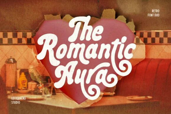 #28
Romantic Aura Duo pairs a thick, velvety 1970s swash script with a clean companion voice for nostalgic love notes and merch.
Romantic Aura Duo pairs a nineteen-seventies swashed retro script with a rounded sans: the script runs a high-contrast stroke with wide swelling swashes that lift above and below the line, while the sans is a soft rounded block for details and lists. The pair is a period look, so it works best in two warm flat inks on a light ground rather than in photographic tints. The swash thins are the finest element and they break first. The script needs roughly 32 mm and the sans 20 mm for their detail to read.
Retro Valentine sweatshirt, mug wrap & galentine card — Stack 2 to 3 centered words tightly inside a heart or arch silhouette so rising ascenders nest into the gaps of the line above.
Weld all overlapping script letters before cutting HTV, and keep total lockup width at 3.5 in+ so tight inner 'e' and 'a' counters weed cleanly.
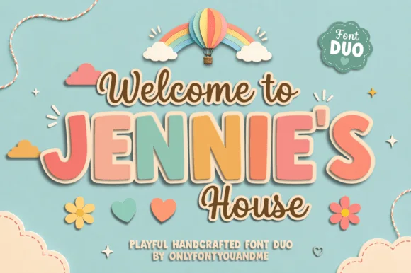 #29
Jennie's House is a two-cut family in which chunky pastel capitals wear a heavy outline and a monoline script writes a second line, so a short phrase reads as stacked paper stickers.
The J hooks a wide foot, the E stacks three short arms, the N keeps two fat stems, the I stands as a plain bar and the S holds a soft spine, all at a chunky weight with rounded corners and a thick contour; the script cut draws a connected line with a tall loop on the W and a hooked h. The layering is the character: the outlined caps sit behind the script in the sample, which gives depth without a shadow effect. Both cuts hold from 26 pt upward and cut cleanly in card. The blue ground, the hot-air balloon, the clouds, the flowers and the small badges are presentation; the outlined caps and brown script are the family.
Nursery door plaque, baby shower welcome sign or kids' room print — Set the child's name in large coral/sage block caps framed by smaller script lines.
Both fonts use smooth vector shapes that cut cleanly on vinyl and wood/acrylic.
Practical buyer checklist
Key cutting, printing and pairing answers before choosing a thank you typeface.
Between 20 and 28 pt for a 3.5 by 5 inch card, which gives the phrase enough weight to lead the layout. Below 16 pt the line looks apologetic, and above 32 pt it crowds the white space that makes the card feel considered.
Yes at 1.5 inches or larger, using a monoline or thick script. Fine handwriting with hairline connectors tears during weeding, so choose a marker-weight face or print the tags instead of cutting them.
A formal copperplate or a swashed calligraphy script that matches the invitation suite. Using the same script on the invitation and the thank you note is the simplest way to make the stationery look designed rather than assembled.
Not necessarily, but a quiet serif helps on the inside. The thank you line carries the tone, and a small serif for the message, the date and the signature keeps the card readable without adding a second decorative voice.
Keep exploring
Explore adjacent maker roundups or check our practical pre-production checklists.
36 curated fonts · Previews & pairings
28 curated fonts · Previews & pairings
39 curated fonts · Previews & pairings
20 curated fonts · Previews & pairings
Guides: Invitation font checklist · Vinyl & cutting checklist · How to pair script & sans fonts
Allow optional Google Analytics to measure visits and catalogue actions. Your search words and notes are not included. Privacy & storage