Editorial Serif Anchor

Summer Vintage + Svara
Anchors Summer Vintage's fluid strokes with crisp Roman proportions on wedding suites, headers and packaging.
Inspect Svara specimenDisclosure: MakerFileHub may earn a commission from qualifying purchases via paid links on this page. How our links work.
Tall narrow handwriting with high loops and a soft shadowed print finish
Summer Vintage is tall narrow handwriting in which the loops climb high above the smaller letters, the strokes stay even and the word is set with a soft shadow so it reads as a printed sticker rather than as flat lettering.
Paid link
Get this fontProject & layout blueprintsAt-a-glance maker compatibility
Weld or Unite overlapping script joins into one continuous vector path before sending to the blade.
Visual anatomy & craft review
The capital S opens as a tall narrow loop and the rest of the word keeps the same slim proportion: the u closes a narrow bowl, the double m holds four even arches, the e loops back high and the r keeps a short arm. Weight is an even medium with slightly varying width, which keeps the line looking written rather than drafted, and the loops are the only ornament. The shadow in the sample separates the lettering from a photographic ground, which is how the face is meant to be used on collage and travel artwork. Because the letters are narrow, two long words stack in a modest format at 30 pt. The sky, the palms, the car and the two caption lines are presentation; the handwriting is the two words.
Narrow · Looped · Tall
Two-font hierarchy recipes
Tested contrast partners — pairing Summer Vintage with grounded secondary typography.
Summer Vintage + Svara
Anchors Summer Vintage's fluid strokes with crisp Roman proportions on wedding suites, headers and packaging.
Inspect Svara specimen
Summer Vintage + Borsen
Keeps small-scale dates, URLs, nutrition facts and care instructions crisp and legible below script titles.
Inspect Borsen specimenPractical applications
Concrete hierarchy, scale and production guidance tailored to Summer Vintage’s stroke geometry.
The narrow tall letters stack two words into a square poster at 60 pt, and the soft shadow keeps the line readable over a printed photograph.
Hierarchy & layout recipe
Print a 420 by 594 mm poster: set both words at 60 pt in two lines with 10 mm leading, set the dates in a 14 pt sans at the foot, and keep 30 mm of margin so the shadow never reaches the trim.
Pre-production check
A printed shadow over a busy background reads as blur; check the poster proof and give the type a plain panel rather than a heavier shadow.
The slim handwriting fits a narrow rail tag at 14 pt, and the even stroke keeps a garment name readable at a rack distance.
Hierarchy & layout recipe
Print a 35 by 90 mm rail tag: set the garment at 14 pt, set the size in a 6 pt caps sans beneath, and keep 5 mm of margin so the tall loops stay clear of the punched hole at the top.
Pre-production check
Rail tags are handled hard and the punch can tear; check a tag on the actual card stock and keep 8 mm of paper between the hole and the lettering.
The tall loops fill a journal header at 24 pt and read as a hand-written date line sitting above printed notes on the same page.
Hierarchy & layout recipe
Print an A5 journal spread: set the header at 24 pt across the left column, set the ruled note area to start 12 mm below it, and keep a 15 mm margin so the high loops are not crowded by the page edge.
Pre-production check
A tall loop printed inside a ruled area looks caged; check the spread and keep the header outside the rules rather than between them.
Technical & licence verification
Confirm included OTF/TTF/WOFF formats, full glyph tables and licence coverage on the live store page before batch production.
Closest visual alternatives
Matched across letterform anatomy, stroke behaviour and craft applications.
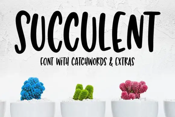
Tall bouncy uppercase handwriting
Succulent is a tall bouncy uppercase handwriting in black on white: narrow letters with uneven heights, a strong bounce across the line and a small companion line in the same face beneath.
Ideas for this font
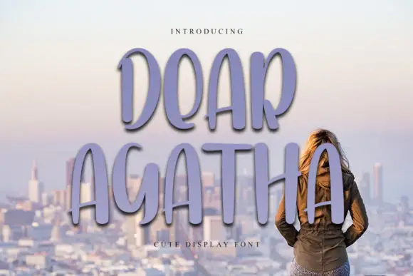
Tall rounded display capitals
Dear Agatha shows tall unjoined capitals with narrow oval bowls and softly rounded terminals, where the A, R and H stretch into long vertical proportions and the purple shadow sits behind the letters as part of the cover.
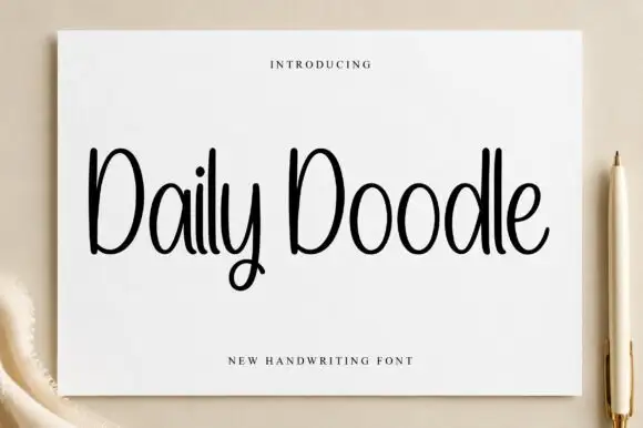
Narrow upright handwriting with tall ascenders and a soft even stroke
Daily Doodle is narrow upright handwriting in which the ascenders run tall, the stroke stays soft and even, and the letters stand apart at a gentle rhythm.
Ideas for this font
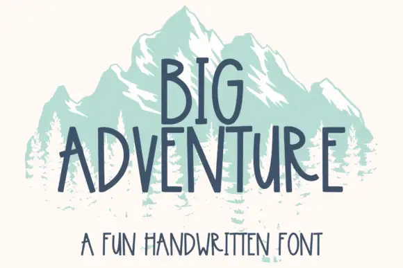
Tall handwritten capitals
Big Adventure shows tall separate capitals with narrow bowls and an angular A, where the G, T and R stand above an uneven baseline and a mountain illustration sits behind the lettering.
Ideas for this font
Same independent foundry
Allow optional Google Analytics to measure visits and catalogue actions. Your search words and notes are not included. Privacy & storage