Editorial Serif Anchor

Farmhouse Font + The Lumina Awesome
Anchors Farmhouse Font's fluid strokes with crisp Roman proportions on wedding suites, headers and packaging.
Inspect The Lumina Awesome specimenDisclosure: MakerFileHub may earn a commission from qualifying purchases via paid links on this page. How our links work.
Light flowing handwriting with a very long flat entry and exit
Farmhouse is light flowing handwriting whose word is framed by a very long flat entry and an exit that lifts at the tip, with small even letters in between on a level baseline.
Paid link
Get this fontProject & layout blueprintsAt-a-glance maker compatibility
Weld or Unite overlapping script joins into one continuous vector path before sending to the blade.
Visual anatomy & craft review
The entry stroke runs in from the left as a fine horizontal line at x-height before the f rises into a tall plain stem, and the letters after it stay small and even: the a and the r close their bowls, the m keeps two narrow arches, the h rises without a loop and the o and the s finish tightly. The exit runs out flat again and lifts slightly at the tip, so the word is bookended by two horizontal gestures. Weight is light and constant, the joins cross at a consistent height, and nothing tapers to a point except the very ends. The white gable of the house, the pale ground and the tracked captions are presentation; the script is the word.
Light · Flowing · Flat
Two-font hierarchy recipes
Tested contrast partners — pairing Farmhouse Font with grounded secondary typography.
Farmhouse Font + The Lumina Awesome
Anchors Farmhouse Font's fluid strokes with crisp Roman proportions on wedding suites, headers and packaging.
Inspect The Lumina Awesome specimen
Farmhouse Font + Lemon Milk Pro FTR
Keeps small-scale dates, URLs, nutrition facts and care instructions crisp and legible below script titles.
Inspect Lemon Milk Pro FTR specimenPractical applications
Concrete hierarchy, scale and production guidance tailored to Farmhouse Font’s stroke geometry.
The long flat tails let a single word act as a sign rather than a headline, and the light stroke keeps the mark calm on a painted board or a paper bag.
Hierarchy & layout recipe
Set the shop name at 22 cm on a 1.8 m board, keep the opening hours in a clean sans at 5 cm, and hold 15 cm of clearance so the flat tails can run their full length.
Pre-production check
Painting a light stroke on timber needs a steady hand; mask the tails with tape and check the ends lift cleanly before the sign is sealed.
The flat horizontal gestures mirror the horizon of a rural venue, and the light weight keeps a welcome sign quiet against a landscape.
Hierarchy & layout recipe
Set the greeting at 12 cm on a 600 by 800 mm board, set the names in the same face at 6 cm beneath, and leave 10 cm of margin at each end for the tails.
Pre-production check
Outdoor boards are read against the sky; check the sign in daylight and use a darker ink rather than thickening the lettering.
The quiet handwriting reads as a personal note from a host, and the flat tails fill a landscape card without extra decoration.
Hierarchy & layout recipe
Set the greeting at 18 pt on a 148 by 105 mm card, keep the booking details in a 7 pt sans along the foot, and leave the middle 60 mm clear for a handwritten line.
Pre-production check
A light stroke printed on a textured card can break; print one card on the actual stock and raise the size to 20 pt if the tails start to fray.
Technical & licence verification
Confirm included OTF/TTF/WOFF formats, full glyph tables and licence coverage on the live store page before batch production.
Closest visual alternatives
Matched across letterform anatomy, stroke behaviour and craft applications.
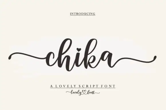
Round connected script with a heart dot and long tapering outer tails
Chika is a round connected script with a heavy even stroke, a heart instead of a dot on the i and long tapering tails that leave the word flat on both sides.
Ideas for this font
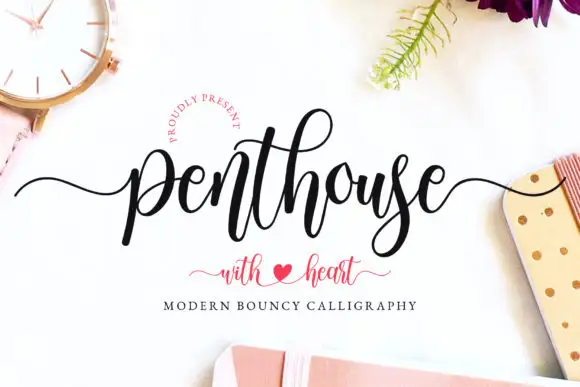
Display
Penthouse is a modern bouncy calligraphy script: tall loops, thick downstrokes and a baseline that rises and falls, with a swash tail and a heart drawn between the words.
Ideas for this font
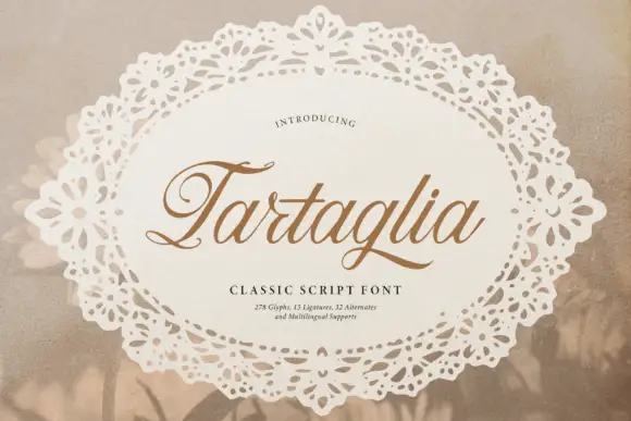
Slanted classic script with curled capitals
Tartaglia is a slanted classic script in gold-brown on a doily: high-contrast strokes, curled capitals with ball terminals and a ligature-rich alphabet, presented inside a lace oval.
Ideas for this font
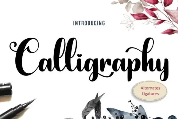
Heavy high-contrast looped calligraphy with swashed capitals and tight fit
Calligraphy is heavy high-contrast looped lettering in which the capitals carry wide swashes, the stems are thick and the joins are hairline, so a single word reads as a drawn flourish rather than a written line.
Ideas for this font
Allow optional Google Analytics to measure visits and catalogue actions. Your search words and notes are not included. Privacy & storage