Editorial Serif Anchor

Lilac and Linen + Askinо
Anchors Lilac and Linen's fluid strokes with crisp Roman proportions on wedding suites, headers and packaging.
Inspect Askinо specimenDisclosure: MakerFileHub may earn a commission from qualifying purchases via paid links on this page. How our links work.
Airy fine-pen architectural monoline handwritten font
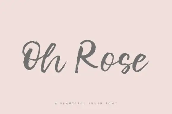
Lilac and Linen is an ultra-clean, slender monoline handwritten font blending tall open capitals with airy semi-connected pen lowercase.
Paid link
Get this fontProject & layout blueprintsAt-a-glance maker compatibility
Weld or Unite overlapping script joins into one continuous vector path before sending to the blade.
Visual anatomy & craft review
Lilac and Linen is an airy fine-pen architectural monoline handwritten face: a very light even stroke, wide open counters, tall ascenders and letters drawn as if by a fine technical pen with small lift gaps at the joins. The thin line is the whole character and it is the first thing to break on textured stock or at small sizes. It needs roughly 22 mm for the fine stroke and the lift gap to read, and it is best in one dark ink on smooth or coated paper, or a single ink on tracing-weight stock where the line stays continuous.
Minimal · Crisp · Calm
Two-font hierarchy recipes
Tested contrast partners — pairing Lilac and Linen with grounded secondary typography.
Lilac and Linen + Askinо
Anchors Lilac and Linen's fluid strokes with crisp Roman proportions on wedding suites, headers and packaging.
Inspect Askinо specimen
Lilac and Linen + Lemon Milk Pro FTR
Keeps small-scale dates, URLs, nutrition facts and care instructions crisp and legible below script titles.
Inspect Lemon Milk Pro FTR specimenPractical applications
Concrete hierarchy, scale and production guidance tailored to Lilac and Linen’s stroke geometry.
A fine-pen monoline reads as architectural lettering rather than a printed worksheet, which is what a design class wants over its benches. The stroke holds at 16 mm on a label, and one ink prints the sheets and the display in one pass.
Hierarchy & layout recipe
Planner sheet A4, header 16 mm with 5 mm lift clearance, boxes 60 x 40 mm, 12 mm margins. Bench label 105 x 40 mm, word 14 mm, 4 mm margins. Display 1200 x 400 mm, letters 160 mm, 20 mm margins.
Pre-production check
At 14 mm on a bench label the fine stroke lands under 0.3 mm and a laser printer breaks it into dots once the label is dusty. Raise labels to 20 mm and laminate them, and print one sheet before the class set.
A fine monoline gives an architecture feature a drawn header rather than a typeset one. The stroke holds at 22 pt against a serif body, and the open counters keep a long header airy on a white page.
Hierarchy & layout recipe
Header 22 pt with 6 mm lift clearance, standfirst 11/15 pt, body 9/13 pt over two columns of 82 mm, 18 mm margins and a 12 mm head. Caption 8/11 pt in a 40 mm outer-margin rail, 4 mm below the image.
Pre-production check
At 8 pt the caption's fine stroke drops out on uncoated stock and the line reads as pale marks. Set captions in the body face and keep the monoline at 18 pt and above, then proof one page at 1:1.
A fine monoline reads as a drawn mark rather than a designed logo, which is what an architecture practice wants on its letterhead. The stroke holds at 18 mm on a card, and one ink prints the card and the letterhead in one order.
Hierarchy & layout recipe
Card 85 x 55 mm, word 18 mm with 5 mm lift clearance, details 7/9 pt, 6 mm margins. Letterhead 210 x 297 mm, word 26 mm, 20 mm margins. Wrap band 200 x 40 mm, word 16 mm, 8 mm margins.
Pre-production check
On an 85 x 55 mm card the thin stroke prints grey and the name looks faded next to the details. Raise the card word to 24 mm, and check one card before the run.
Technical & licence verification
Confirm included OTF/TTF/WOFF formats, full glyph tables and licence coverage on the live store page before batch production.
Closest visual alternatives
Matched across letterform anatomy, stroke behaviour and craft applications.
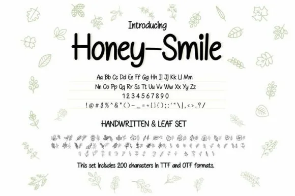
Neat tall handwritten print sans + botanical leaf dingbat bundle (OTF & TTF)
Honey–smile ('Honey-Smile') is a clean tall handwritten print sans bundled with matching botanical leaf illustrations across 200 characters (TTF & OTF)!
Ideas for this font
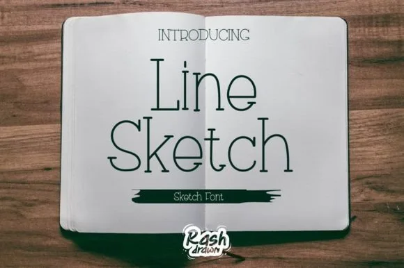
Thin monoline sketch serif
Line Sketch is a thin monoline serif in black on paper: tall narrow letterforms, hairlines of even weight, slab-ish serifs drawn with a slight wobble, and a hand-ruled feel that makes the two words look drawn with a fine pen rather than set from a font.
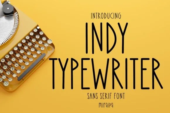
Tall condensed handwritten monoline sans serif (NOT a serif typewriter!)
Indy Typewriter is actually a tall, friendly monoline handwritten sans serif—zero serifs or mechanical slabs despite the 'Typewriter' name!
Ideas for this font
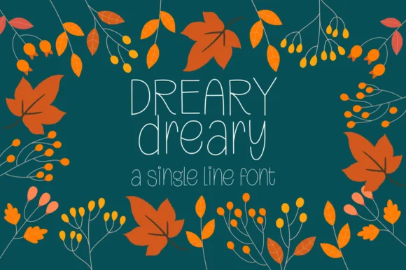
Tall slender autumn-craft monoline pen print
Dreary is a tall, airy monoline handwritten print font pairing narrow uppercase letters with rounded, long-stemmed lowercase.
Ideas for this font
Same independent foundry
Allow optional Google Analytics to measure visits and catalogue actions. Your search words and notes are not included. Privacy & storage