Editorial Serif Anchor

Sublimation Fall + Amor Hadena
Anchors Sublimation Fall's fluid strokes with crisp Roman proportions on wedding suites, headers and packaging.
Inspect Amor Hadena specimenDisclosure: MakerFileHub may earn a commission from qualifying purchases via paid links on this page. How our links work.
Tall skinny farmhouse handwritten print sans
Sublimation Fall is a tall, slender farmhouse handwritten print font (zero leaves attached—usable all year!) channeling classic pottery-mug minimalism.
Paid link
Get this fontProject & layout blueprintsAt-a-glance maker compatibility
Weld or Unite overlapping script joins into one continuous vector path before sending to the blade.
Visual anatomy & craft review
Sublimation Fall is a tall skinny farmhouse handwritten print sans: narrow upright stems with a light hand-made wobble, small lift gaps at the joins, blunt pen ends and a level baseline that keeps a long list readable. The skinny stroke is the weakest element in print and the wobble is what makes it read as written. It needs roughly 20 mm for the wobble and the lift gap to read, and it is best in one warm ink on kraft and cream, or a single dark colour where the thin stroke still carries.
Rae-Dunn-tall · Skinny-autumn · Cozy-print
Two-font hierarchy recipes
Tested contrast partners — pairing Sublimation Fall with grounded secondary typography.
Sublimation Fall + Amor Hadena
Anchors Sublimation Fall's fluid strokes with crisp Roman proportions on wedding suites, headers and packaging.
Inspect Amor Hadena specimen
Sublimation Fall + Noar
Keeps small-scale dates, URLs, nutrition facts and care instructions crisp and legible below script titles.
Inspect Noar specimenPractical applications
Concrete hierarchy, scale and production guidance tailored to Sublimation Fall’s stroke geometry.
A skinny farmhouse print reads as a hand-lettered board rather than a printed advert, which is what a harvest stand wants on a fence. The wobble holds at 90 mm on a board, and one warm ink prints the board, the cards and the crates in one order.
Hierarchy & layout recipe
Board 900 x 600 mm, word 120 mm with 10 mm lift clearance, items 26 mm, 25 mm margins. Price card 105 x 75 mm, item 18 mm, price 24 mm. Crate print 300 x 200 mm, word 60 mm, 20 mm margins.
Pre-production check
A 105 x 75 mm price card at 18 mm drops the skinny stroke under 0.3 mm and the item reads as a broken thread in low light. Raise the item to 24 mm, and check one card under the market lamp.
A skinny print reads as a written note rather than a printed acknowledgement, which is what a stall holder wants in the bag. The stroke holds at 22 mm on a card, and one ink prints the card, the label and the tag in one pass.
Hierarchy & layout recipe
Card A6, word 22 mm with 8 mm lift clearance, note 8/11 pt, 12 mm margins. Jar label 70 x 45 mm, word 12 mm, 4 mm die margin. Market tag 50 x 90 mm, word 12 mm with a 5 mm hole and 8 mm clear.
Pre-production check
A 70 x 45 mm jar label at 12 mm closes the lift gaps on wet-strength paper and the word reads as a bar. Raise the label to 16 mm, and check one labelled jar before the batch.
A narrow upright print fits a whole timetable in a small box, which is what a planner sheet actually needs. The wobble holds at 16 mm in a header, and one ink prints the sheets and the display in one pass.
Hierarchy & layout recipe
Planner sheet A4, header 16 mm with 4 mm lift clearance, boxes 60 x 40 mm, 12 mm margins. Classroom label 105 x 40 mm, word 14 mm, 4 mm margins. Display 1200 x 400 mm, letters 160 mm, 20 mm margins.
Pre-production check
At 14 mm on a label the wobble turns to dirt and the word looks stained after a term of handling. Raise labels to 20 mm and laminate them, and print one sheet before the class set.
Technical & licence verification
Confirm included OTF/TTF/WOFF formats, full glyph tables and licence coverage on the live store page before batch production.
Closest visual alternatives
Matched across letterform anatomy, stroke behaviour and craft applications.
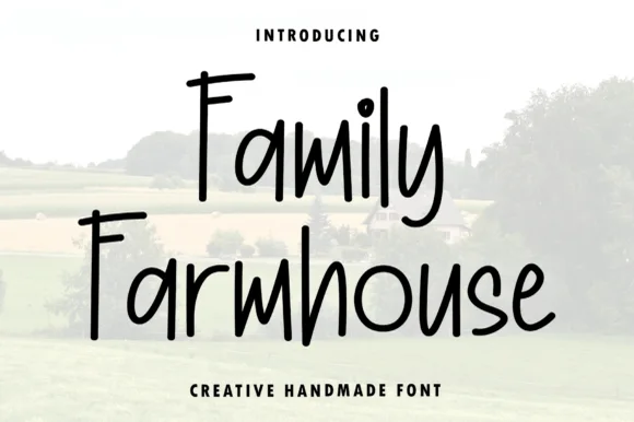
Tall condensed hand-printed farmhouse marker font
Family Farmhouse is a tall, narrow hand-printed marker typeface with long vertical stems, gently bounced baselines, and clean print legibility.
Ideas for this font
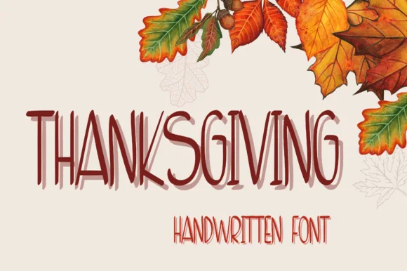
Tall layered handwriting
Thanksgiving is a tall handwriting face in dark red on cream: narrow letters drawn with a light pen, a second offset layer behind each word in a paler tone, and a smaller companion line beneath, framed by watercolour autumn leaves, so the pair reads as a hand-written seasonal card.
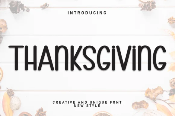
Tall quirky creative display
Thanksgiving is a tall creative display in near-black on a pale wood ground: narrow letters with curled details on the T and the G, small inward flicks on the stems, and an uneven but upright rhythm, with autumn leaves at the edges, so the pair reads as a modern seasonal card.
Ideas for this font
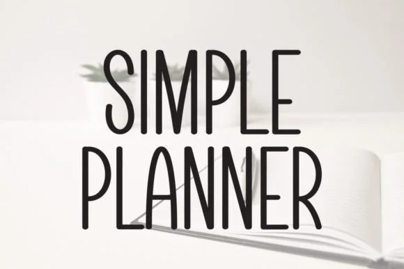
Tall skinny minimalist monoline planner caps & sans
Simple Planner is a tall, slender minimalist handwritten sans packing long headings neatly into narrow planner columns and spine labels.
Ideas for this font
Same independent foundry
Allow optional Google Analytics to measure visits and catalogue actions. Your search words and notes are not included. Privacy & storage