High-Contrast Display Serif

The Sunny Field + Mewah
Pairs sculptural editorial warmth with The Sunny Field's clean modern geometry.
Inspect Mewah specimenDisclosure: MakerFileHub may earn a commission from qualifying purchases via paid links on this page. How our links work.
Rustic serif paired with a light script in a farmhouse treatment
The Sunny Field pairs a rustic serif in spaced capitals with a light script above it, so a market sign can carry a soft welcome line and a firm name beneath.
Paid link
Get this fontProject & layout blueprintsAt-a-glance maker compatibility
Fine grain and micro-texture excel in 300 DPI print, sublimation, and screen print rather than small vinyl weeding.
Visual anatomy & craft review
The serif half is a modest text roman with slightly uneven serifs and a moderate contrast, set in spaced capitals so four words fill a wide plate without crowding. The script half is a light connected hand with tall loops and a gentle slant, and in the sample it carries the welcome line and the upper label while the serif carries the market name. Because both halves are light, the pair reads as printed stationery rather than as a signboard, which is the register a farm shop or a market stall wants. The serif holds at small sizes, and the script supplies the personal note. The striped ground, the botanical line drawings, the soft oval panel and the small caption are presentation; the duo is the lettering.
Rustic · Serif · Paired
Two-font hierarchy recipes
Tested contrast partners — pairing The Sunny Field with grounded secondary typography.
The Sunny Field + Mewah
Pairs sculptural editorial warmth with The Sunny Field's clean modern geometry.
Inspect Mewah specimen
The Sunny Field + Farmhouse
Introduces organic movement on pull-quotes, signatures and gift tags.
Inspect Farmhouse specimenPractical applications
Concrete hierarchy, scale and production guidance tailored to The Sunny Field’s stroke geometry.
The rustic serif carries the shop name at a distance while the script adds a welcome line, so one sign covers both registers at 12 cm and 6 cm.
Hierarchy & layout recipe
Set the shop name in the serif at 12 cm on a 900 by 500 mm board, set the welcome line in the script at 6 cm above it, and leave 12 cm of margin so both stay on the board.
Pre-production check
A light script painted above a serif can look faint outdoors; check the sign in daylight and use a darker ink rather than a heavier stroke.
The pair suits a venue with a farmhouse tone, and the serif keeps the names legible at 10 cm while the script softens the greeting.
Hierarchy & layout recipe
Set the greeting in the script at 7 cm on a 700 by 500 mm board, set both names in the serif at 10 cm beneath, and leave 12 cm of margin so the serif letters stay inside the frame.
Pre-production check
Two light faces on one board can look unfinished; check the sign at full size and increase the serif weight rather than the script size.
The serif stays readable at 9 pt on a small label while the script signs it at 11 pt, which is what a rustic favour needs.
Hierarchy & layout recipe
Set the greeting in the script at 11 pt on a 60 by 40 mm bag label, set the names in the serif at 9 pt beneath, and leave 4 mm of margin so the ascenders stay inside the cut.
Pre-production check
Small rustic labels can look busy with two faces; check the print at final size and drop the serif line if the script needs more room.
Technical & licence verification
Confirm included OTF/TTF/WOFF formats, full glyph tables and licence coverage on the live store page before batch production.
Closest visual alternatives
Matched across letterform anatomy, stroke behaviour and craft applications.
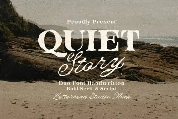
Textured serif capitals and looping script
Quiet Story is a duo on a weathered photograph: heavy serif capitals with a printed texture, and a looping script beneath in the same cream ink, with a small script credit at the foot.
Ideas for this font
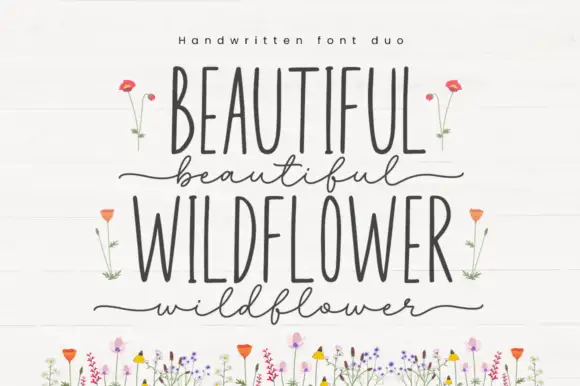
Very narrow upright capitals paired with a fine lowercase script
Beautiful Wildflower Duo is a two-cut pair in which very narrow upright capitals set the plain line and a fine lowercase script runs beneath with long outer strokes, so a card can hold two registers in one soft tone.
Ideas for this font
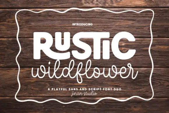
Playful sans and casual script
Rustic Wildflower is a duo in white on a dark wood board: a fat rounded sans for the first word with an open R and a squared S, and a light connected script for the second, both inside a hand-drawn wavy border, with a tracked line between them naming the pair.
Ideas for this font
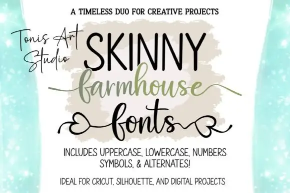
Narrow tall capitals paired with a heart-tail script and a swash line
Farmhouse Script and Skinny Farmhouse pair a very narrow tall capital alphabet with a heart-tailed script, so a sign can carry a slim headline and a softer second line in one hand.
Same independent foundry
Allow optional Google Analytics to measure visits and catalogue actions. Your search words and notes are not included. Privacy & storage