Editorial Serif Anchor

Farmhouse + Brenco
Anchors Farmhouse's fluid strokes with crisp Roman proportions on wedding suites, headers and packaging.
Inspect Brenco specimenDisclosure: MakerFileHub may earn a commission from qualifying purchases via paid links on this page. How our links work.
Bouncing tail script with long entry and exit swashes
Farmhouse is a bouncing tail script in which the letters sit at different heights, the strokes swell on the downstroke and long swashes enter and leave the word, so a name reads as hand lettering on a painted board.
Paid link
Get this fontProject & layout blueprintsAt-a-glance maker compatibility
Weld or Unite overlapping script joins into one continuous vector path before sending to the blade.
Visual anatomy & craft review
The f rises into a tall loop, the a closes a round bowl, the r finishes a light arm, the m keeps three even shoulders, the h climbs a tall stem and the e turns a light eye, all at a brush contrast with a bouncing baseline and swashes drawn at both ends of the word. The bounce is the character: the letters shift up and down around a nominal line, which is why the sample sets one name across a wide board with room for the swashes. Because the downstrokes are heavy, the face holds from 24 pt and prints on most stocks; the swash tails need margin on both sides. The white board, the arch of small caps above and the credit below are presentation; the black script name is the face.
Farmhouse · Bouncy · Swash
Two-font hierarchy recipes
Tested contrast partners — pairing Farmhouse with grounded secondary typography.
Farmhouse + Brenco
Anchors Farmhouse's fluid strokes with crisp Roman proportions on wedding suites, headers and packaging.
Inspect Brenco specimen
Farmhouse + Borsen
Keeps small-scale dates, URLs, nutrition facts and care instructions crisp and legible below script titles.
Inspect Borsen specimenPractical applications
Concrete hierarchy, scale and production guidance tailored to Farmhouse’s stroke geometry.
The bouncing script gives a painted sign its hand-made warmth, and the entry swash fills the long side of a wide board at 60 mm.
Hierarchy & layout recipe
Paint a 900 by 300 mm board: set the name at 60 mm, let the entry swash run 90 mm to the left, and keep 35 mm of border so neither swash is cut by the frame.
Pre-production check
A swash painted to the frame edge looks cut; check the board and keep both tails 30 mm inside the outer line.
The bounce and the tails suit a small shop identity, and the heavy strokes stay solid at 20 pt on a kraft label in one ink.
Hierarchy & layout recipe
Print a 70 by 45 mm label: set the shop name at 20 pt, set the address in a 6 pt sans beneath, and keep 5 mm from the die so the exit swash stays whole.
Pre-production check
An exit swash cut by the die looks broken; check the imposed label and centre the name on the swash rather than the stems.
The bouncing script gives a printed harvest card a written feel, and the bounce stays legible at 30 pt on a textured card.
Hierarchy & layout recipe
Print an A6 card: set the greeting at 30 pt in the upper half, set the date in a 9 pt caps serif beneath, and keep 14 mm of margin so the tails sit inside the trim.
Pre-production check
A heavy script on a textured card fills its joins; check the printed card and keep the greeting at 30 pt or above.
Technical & licence verification
Confirm included OTF/TTF/WOFF formats, full glyph tables and licence coverage on the live store page before batch production.
Closest visual alternatives
Matched across letterform anatomy, stroke behaviour and craft applications.
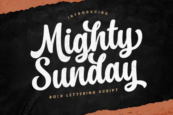
Bold lettering script with heavy looping capitals and a tight stacked fit
Mighty Sunday is a bold lettering script in which the capitals loop heavily, the strokes stay fat through the joins and two stacked words lock together into a single block.
Ideas for this font

Light lowercase script with long outer tails and a low even stroke
Abigail is a light lowercase-only script in which the word sits low on the line and both ends run out as long flat tails, so a name reads as a single signed line rather than as a set of letters.
Ideas for this font
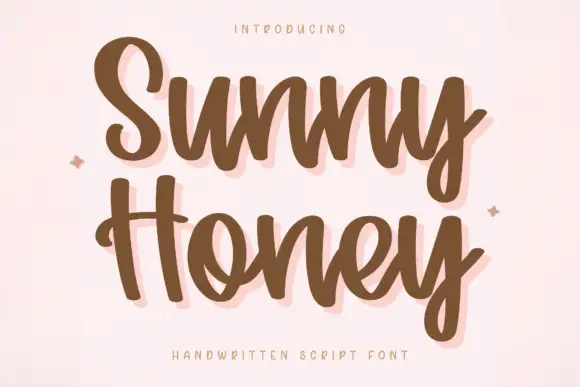
Bouncy handwritten script with a soft shadow
Sunny Honey is a bouncy handwritten script in cocoa brown on blush pink: fat even strokes, a pronounced bounce between letters and a soft pale shadow behind the whole word.
Ideas for this font
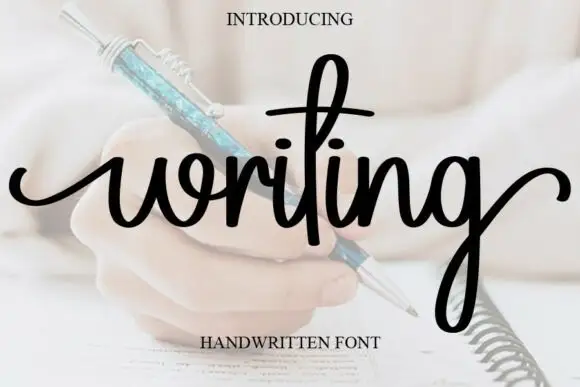
Looped handwriting with a tall ascender
Writing is a looped handwriting in black over a pale photograph of a hand with a pen: tall loops on the ascenders, small open bowls and a light even stroke, with a deep descender on the g.
Ideas for this font
Same independent foundry
Allow optional Google Analytics to measure visits and catalogue actions. Your search words and notes are not included. Privacy & storage