High-Contrast Display Serif

Farmhouse Breakfast Duo + Askinо
Pairs sculptural editorial warmth with Farmhouse Breakfast Duo's clean modern geometry.
Inspect Askinо specimenDisclosure: MakerFileHub may earn a commission from qualifying purchases via paid links on this page. How our links work.
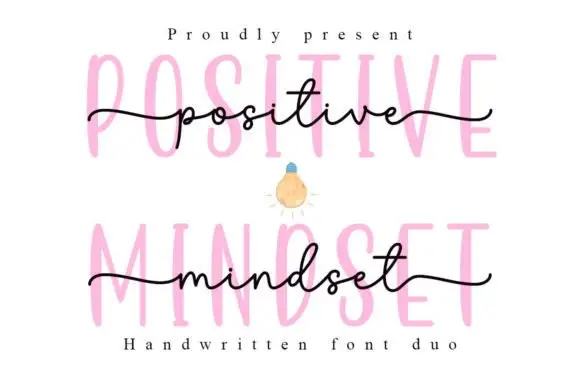
Long-tailed handwritten script layered over a faint tall printed line
Farmhouse Breakfast Duo sets a long-tailed handwritten script across a faint tall printed word, so the same phrase reads twice in the sample — once as a pen line and once as a ghosted block behind it.
Paid link
Get this fontProject & layout blueprintsAt-a-glance maker compatibility
Cut solid base, outline, and shadow layers in separate vinyl colors and align on registration marks.
Visual anatomy & craft review
The printed half is a tall condensed face with thin strokes and wide spacing, set very light so it reads as a background texture rather than as text. The script half is a handwritten monoline with wide open loops, a long entry flourish on the f and a tail on the last letter that runs past the word, which is what gives the sample its horizontal sweep. Because the script stroke is thin and the printed line is lighter still, the pair works as a layered pattern where one line carries the message and the other carries the shape. Ends taper and rise slightly, so the script never looks ruled. The cream and blush ground, the teapot, the gingham, the pie and the small caption are presentation; the duo is the two layers.
Layered · Handwritten · Faint
Two-font hierarchy recipes
Tested contrast partners — pairing Farmhouse Breakfast Duo with grounded secondary typography.
Farmhouse Breakfast Duo + Askinо
Pairs sculptural editorial warmth with Farmhouse Breakfast Duo's clean modern geometry.
Inspect Askinо specimen
Farmhouse Breakfast Duo + Hello Honey
Introduces organic movement on pull-quotes, signatures and gift tags.
Inspect Hello Honey specimenPractical applications
Concrete hierarchy, scale and production guidance tailored to Farmhouse Breakfast Duo’s stroke geometry.
The layered script over a ghosted block gives a welcome sign depth without a second colour, and the long tail spans a wide board at 9 cm.
Hierarchy & layout recipe
Paint on a 700 by 450 mm board: lay the ghosted block word at 16 cm first, paint the script over it at 9 cm, and leave 10 cm of bare board at each side so the tail finishes on the panel.
Pre-production check
Two painted layers of the same word can turn to mud; check the board from three metres and lighten the block layer rather than the script.
The script supplies the headline and the faint block supplies texture behind it, so a food spread gets depth without extra artwork at 40 pt.
Hierarchy & layout recipe
Set the feature header at 40 pt in the script on a 130 mm measure, set the ghosted word behind it at 96 pt at 15 percent tint, and hold 12 mm below the tail before the standfirst.
Pre-production check
A light tint behind a thin script can swallow the strokes; check the press proof and drop the tint by five percent before increasing the script weight.
The long script tail suits a narrow label, and the light stroke keeps a small favour tag from looking heavy at 11 pt while the ghosted second word adds depth behind it.
Hierarchy & layout recipe
Print on a 60 by 35 mm tag: set the greeting at 11 pt in the script, keep the date in a 5 pt sans on the second line, and leave 5 mm at the right end so the flourish stays inside the cut.
Pre-production check
A tail printed to the very edge of a die looks clipped; check the die line against the artwork and pull the line in by 2 mm before printing.
Technical & licence verification
Confirm included OTF/TTF/WOFF formats, full glyph tables and licence coverage on the live store page before batch production.
Closest visual alternatives
Matched across letterform anatomy, stroke behaviour and craft applications.
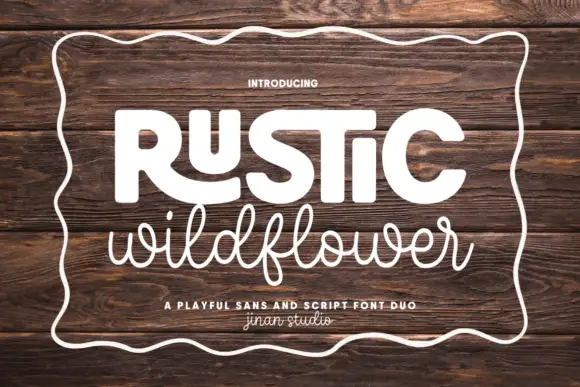
Playful sans and casual script
Rustic Wildflower is a duo in white on a dark wood board: a fat rounded sans for the first word with an open R and a squared S, and a light connected script for the second, both inside a hand-drawn wavy border, with a tracked line between them naming the pair.
Ideas for this font
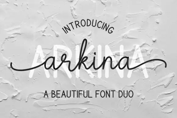
Tall sans capitals with a low looping script duo
Arkina Duo layers a very low looping connected script over tall narrow capitals that read as engraved lettering pressed into plaster, with entry strokes starting well left of the first letter.
Ideas for this font
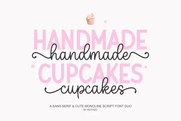
Bold sans serif paired with a monoline script with curled outer tails
Handmade Cupcakes pairs a bold sans serif in capitals with a light monoline script whose tails curl at both ends, so a label can carry a firm product word and a soft handwritten line.
Ideas for this font
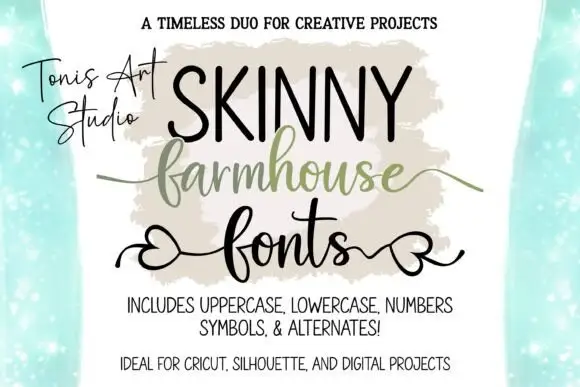
Narrow tall capitals paired with a heart-tail script and a swash line
Farmhouse Script and Skinny Farmhouse pair a very narrow tall capital alphabet with a heart-tailed script, so a sign can carry a slim headline and a softer second line in one hand.
Same independent foundry
Allow optional Google Analytics to measure visits and catalogue actions. Your search words and notes are not included. Privacy & storage