 #1 · Best Overall
Autumn in Thanksgiving
Warm thick marker print with upright letters and even stroke weight
Get fontPaid link
Read review ↓Disclosure: MakerFileHub may earn a commission from qualifying purchases via paid links on this page. How our links work.
Harvest scripts, pumpkin detail & farmhouse print
Harvest lettering works best when the warmth comes from the drawing rather than the decoration. Autumn in Thanksgiving and Sweet Pumpkin carry a thick marker and brush-pen warmth, Thanksgiving and Warm Thanksgiving keep the farmhouse print register, and Happy Thanksgiving and Autumn Monogram add botanical pumpkin and acorn detail. Pumpkin Embroidery and Autumn Embroidery supply the slanted script option.
Quick verdict
Autumn in Thanksgiving is the most versatile harvest print, Sweet Pumpkin covers the brush script role, and Happy Thanksgiving is the pick when botanical detail carries the design. Autumn Monogram handles personalised table settings.
Quick answer
Short on time? Start with our three highest-rated Thanksgiving & harvest standouts before scrolling the full breakdown.
#1 · Best OverallWarm thick marker print with upright letters and even stroke weight
 #2 · Runner-Up Pick
 #3 · Editor's Choice
We kept 19 of 97 candidates, a narrow pool because the theme is specific. Judged on warmth at 2 inch sign scale, whether botanical elements are attached, and how the face reads in a muted autumn palette without losing contrast.
Side-by-side summary
Compare specimens, OpenType/PUA traits and primary project roles side by side.
| Rank & Font | Style & File Specs | Best Project Fit | Store Listing |
|---|---|---|---|
| HandwrittenWarm | Thanksgiving menu card, gratitude jar label or kids' placemat | Get fontPaid link | |
| HandwrittenCozy-marker | Stenciled walnut serving tray, Cricut tier-tray sign & apron | Get fontPaid link | |
| HandwrittenTall-skinny | Rae-Dunn-style 'GOBBLE' / 'GRATEFUL' mug & canister decal | Get fontPaid link | |
| HandwrittenRegular-plus-Outline | 'Pumpkin Spice Season' glass-can wrap, mug & teacher tee | Get fontPaid link | |
| Sans serifPUA encoded · File formats | Apparel capsule tag ('AUTUMN COLLECTION'), tote & lookbook | Get fontPaid link |
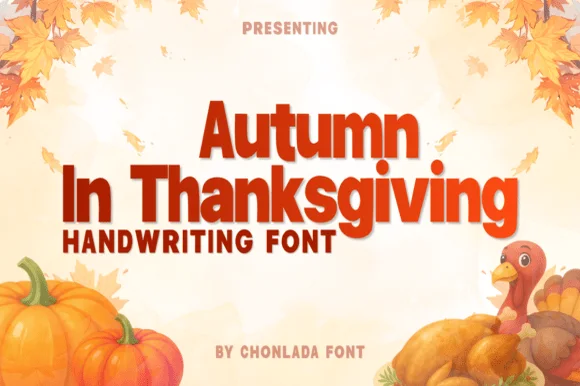
#1 · Best OverallAutumn in Thanksgiving is a warm thick marker print in which the letters stand upright, the stroke stays heavy and even and the counters remain open, so a word reads as something written large with a marker on a card.
The capital A carries a low bar and splayed stems, the u holds a deep bowl, the t crosses with a fat bar, the m keeps three even arches and the n a full shoulder, all at a heavy even weight with rounded ends and a slight forward lean. Nothing connects, so the face behaves like a print rather than a script, and the open counters keep it legible at 18 pt on a label as well as at 60 mm on a sign. The round dot on the i and the simple forms are what make it read as marker rather than as a bold sans. The autumn leaves, the pumpkin, the turkey illustration, the orange ink are presentation; the lettering is the two words plus the small caption.
Thanksgiving menu card, gratitude jar label or kids' placemat — Set in warm rust, espresso or mustard tones with relaxed line spacing.
Zero overlapping loops — cuts and weeds easily with no welding required.
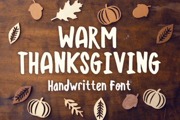
#2 · Runner-Up PickWarm Thanksgiving is actually a stout, disconnected handwritten marker print font (not a flowing script)—built for super-easy Cricut cutting!
Warm Thanksgiving is a stout, disconnected marker print in mixed case with thick rounded strokes, wide counters and a friendly uneven rhythm that reads as chalk on a board or a marker on a kraft card. Because the letters do not join and the weight is even, the face weeds quickly in vinyl and prints at 12 mm on a tag, while the thick strokes still hold at 90 mm on a porch sign. It needs a warm ground to look intentional, and it is a craft, card and label face rather than a text face.
Stenciled walnut serving tray, Cricut tier-tray sign & apron — Stack 2 uppercase rows (64 pt) over 1 mixed-case subline (38 pt) in warm cream over stained walnut.
Zero cursive welding needed—cuts cleanly all the way down to 0.55 inches on Cricut vinyl, stencils, and cardstock!
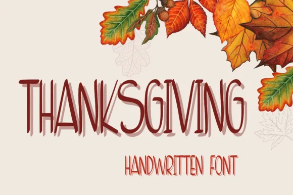
#3 · Editor's ChoiceThanksgiving is a tall handwriting face in dark red on cream: narrow letters drawn with a light pen, a second offset layer behind each word in a paler tone, and a smaller companion line beneath, framed by watercolour autumn leaves, so the pair reads as a hand-written seasonal card.
The two words are stacked and the drawing is everyday handwriting scaled up: the strokes are even and light, the letters are narrow, and the terminals are blunt, which keeps the phrase readable while looking written. The second layer is the decorative device: a copy of the same words sits behind at a small offset in a lighter tone, which gives the lockup depth without a shadow filter. A companion line in a smaller weight of the same hand names the category, so the hierarchy stays inside one voice. The ground is a warm cream with watercolour leaves and acorns at the corners, and the two inks are close in value, which is what makes a seasonal card feel printed rather than designed.
Rae-Dunn-style 'GOBBLE' / 'GRATEFUL' mug & canister decal — Center 1 uppercase word at 2.5–3.5 inches tall in matte black, espresso, or burgundy vinyl on cream ceramic.
Smooth, narrow disconnected strokes weed cleanly on Cricut permanent Oracal 651 down to 0.6 inches!
 #4 · Top Maker Utility
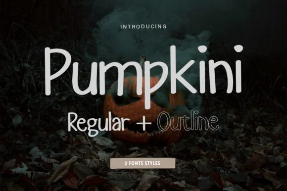
Pumpkini is a neat, rounded 2-style handwritten print family ('Regular + Outline') with zero pumpkin clipart attached—usable for autumn AND year-round!
Pumpkini is a two-cut rounded upright print sans: a regular hand-printed cut and a matching outline cut on the same plump skeleton, with an even stroke, generous round bowls and small lift gaps at the joins. The pair lets a word be layered, and the outline is what closes first at small sizes. It needs roughly 22 mm for the rounded bowl and the lift gap to read, and it is best in one bright ink on white, or a two-colour build where the outline takes the second colour.
'Pumpkin Spice Season' glass-can wrap, mug & teacher tee — Set main words in solid Pumpkini Regular (72 pt) and highlight 1 accent word in Pumpkini Outline!
Solid Regular cuts and weeds in seconds on Cricut Oracal 651 and HTV down to 0.55 in; Outline draws crisply with Cricut Pens!
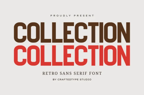 #5 · Standout Silhouette
Collection is a crisp, medium-condensed retro grotesk (PUA, OTF & TTF) with clean flat terminals and balanced open counters.
Collection is a condensed grotesk drawn from nineteen-seventies athletic and editorial lettering: narrow stems, flat shoulders, a tall x-height, a slightly squared bowl and a small flare where a stem meets the curve. It ships with PUA alternates as OTF and TTF, and the alternates mostly change the flare rather than the skeleton. It needs roughly 20 mm for the flare and the squared bowl to read, and it is best in one dark ink on white or on a warm sand stock, where the narrow stems stay crisp.
Apparel capsule tag ('AUTUMN COLLECTION'), tote & lookbook — Stack the same word 2 or 3 times in espresso brown, terracotta red, and warm gold at 72–135 pt.
100% smooth, zero-grunge geometric paths cut and weed in seconds on Cricut HTV and Oracal 651 down to 0.55 inches!
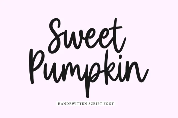 #6
Sweet Pumpkin is a chunky upright brush-pen script in which the letters stay vertical, the stroke is heavy and even, and the counters remain open enough to read at small sizes.
The capital S opens as a broad crescent and the second word's capital P rises into a short stem, and the letters between them keep a fat, upright construction: the w and the e close loose bowls, the t is crossed low with a short bar, the p drops a straight descender and the u and the m hold wide even arches. Unlike a slanted brush script, nothing leans, which makes the phrase read as written on a card rather than painted on a board. Weight is heavy and constant with rounded ends, and the counters stay open because the letters are drawn wide rather than crowded. The pale ground and the single serif caption are presentation; the script is the two words.
Fall market mug, tumbler or tote transfer — Stack two short Title Case words tightly at centre for punchy apparel or mug layouts.
Ideal for Cricut and Silhouette vinyl — remember to Weld overlapping script connections before cutting.
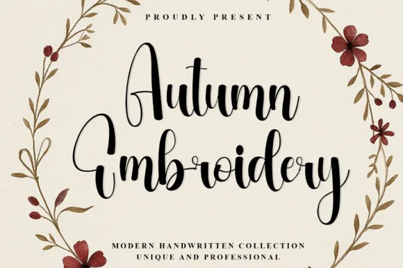 #7
Autumn Embroidery is a tall, expressive modern calligraphy script featuring soaring narrow A/E/b/d loops and cozy fall bounce.
Autumn Embroidery is a tall modern calligraphy script with soaring ascending loops on the E, b and d, a pointed arch A and a pronounced bouncy baseline that rises and falls within a single word. Stems are shaded thick on the downstroke and hairline on the exit, so the face needs a size that can hold contrast, roughly 18 mm and up in print. The tall proportions stack a party title into a narrow column, and the loose connections let a short greeting look written by hand rather than assembled letter by letter.
Fall porch pillow, pumpkin-patch tote & Thanksgiving menu — Stack 2 centered title-case words at 54–92 pt with 1.00 leading above wide-tracked serif subcopy.
Weld all touching cursive connectors before cutting HTV or stencil vinyl; medium brush strokes weed cleanly at 1 in+.
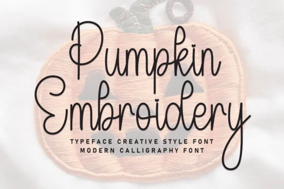 #8
Pumpkin Embroidery is a tall, slender monoline handwritten script—rendered as smooth pen lines over a felt patch photo rather than stitched thread.
Pumpkin Embroidery is a slender tall-looped handwritten autumn cursive: a fine even pen stroke, very high ascenders that loop twice, a shallow slant and long tapered descenders that drop well below the baseline. The loops grow the word tall and the descenders close the line below, so stacked text needs extra leading. It needs roughly 26 mm for the double loop and the fine stroke to read, and it is best in one warm ink on smooth card, or a single dark colour on kraft where the thin stroke still carries.
Hand-embroidery transfer pattern, fall card & gift tag — Print or pen-draw two stacked words at 4 inches wide onto water-soluble stabilizer for fall sweaters or hoops.
Because the stroke is fairly fine, prefer Cricut Pen drawing, embroidery tracing, or print over small blade-cut vinyl.
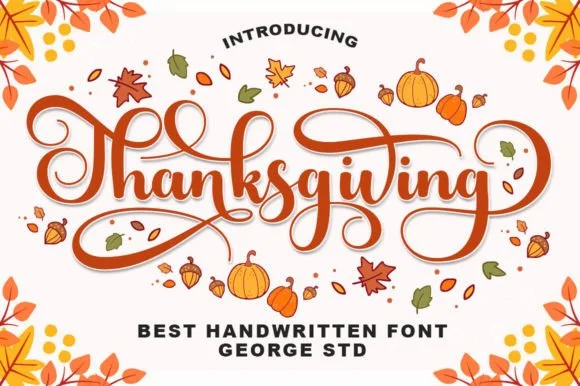 #9
Thanksgiving (by George Studio) is a medium-bold, bouncy brush calligraphy script accented by spiraled terminal curls and sweeping crossbar loops.
Thanksgiving is a warm bouncy brush calligraphy with spiralled terminal curls: a loaded brush stroke on a shallow slant, joined letters, a soft bounce and exits that spiral into a tight curl at the end of a line. The spirals are the design and they close first at small sizes, and the bounce grows the word vertically. It needs roughly 26 mm for the spiral and the brush edge to read, and it is best in one warm ink on cream and kraft, or a fine gold on a dark ground where the curls print as bright lines.
Thanksgiving host platter, pie box sticker & kitchen towel — Center 'Thanksgiving' or 'Gather & Give Thanks' at 5–8 inches wide, framing the outer spiral curls with small leaf accents.
Weld all cursive joins before cutting HTV or permanent vinyl, and peel slowly around the fine inner spiral curl tips.
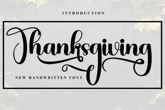 #10
Thanksgiving (by Inermedia Studio) is a heavy, structured brush-calligraphy script featuring diamond-shaped i-dots and chiseled broad-nib strokes.
Thanksgiving is a bold gothic-calligraphy brush script with diamond i-dots: a wet loaded stroke, connected letters, a steep slant and small diamond-shaped dots that sit above the x-height. The brush edge gives the face its texture and the diamonds are the finest element, so they vanish first at small sizes. It needs roughly 26 mm for the brush edge and the diamond dot to read, and it is best in one deep ink on cream and kraft, or a single dark red on a buff sheet where the diamonds stay sharp.
Framed dining-room wood sign, charger plate & welcome mat — Center a single bold word inside a rectangular border frame on stained wood or coir doormat stencils.
Weld overlapping cursive strokes before cutting stencil mylar or HTV; broad stems and diamond dots weed cleanly.
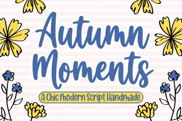 #11
Autumn Moment is a broad connected script in which the capitals rise well above the x-height, the stroke stays heavy and the joins cross at a consistent low point.
The capital A opens as a tall looped form that climbs above the cap line before the word settles, and the capital M of the second word repeats that height. Between them the lowercase stays small and round: the u and the t close tight bowls, the m holds three even arches, the e loops back and the n keeps a wide shoulder. Weight is heavy and constant, joins carry the same weight as the stems and the terminals are rounded, so the phrase reads as a printed sign rather than a fine calligraphy. The ends finish in long flat tails on both sides, which lets a two-word phrase fill a wide panel. The pink stripes, the drawn flowers and the small banner caption are presentation; the script is the two words.
An autumn gathering invitation — Stack the two main words above a plain date-and-place block, leaving tall initials clear of any corner flower illustration.
Try the actual title and proof tight joins at card size.
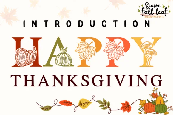 #12
Happy Thanksgiving (by PraewDesigns / Season Fall Leaf) is an illustrated harvest display serif (NOT a script) wrapping pumpkins, maple leaves, mushrooms, and cornucopias around Roman capitals!
Happy Thanksgiving is a botanical harvest serif in which the letters are illustrated with pumpkins, cornucopias and vine leaves: the bowls fill with fruit, the stems carry curling vines and the serifs finish as small leaves. The illustration sits inside the letter, so the counters must stay open, and the leaf serifs are the finest element. It needs roughly 34 mm for the fruit and the leaf serifs to read, and it is best in one warm ink on cream and kraft, or a two-colour build where the fruit takes a second spot colour.
Thanksgiving dinner menu header, pie-box label & invite — Set 1 short uppercase focal word huge (72–130 pt) in warm russet, ochre, and olive above clean Roman serif subheaders.
Fine botanical leaf veins inside each letter require flat printing, sublimation towels, or Print-Then-Cut stickers—never weed vinyl!
 #13
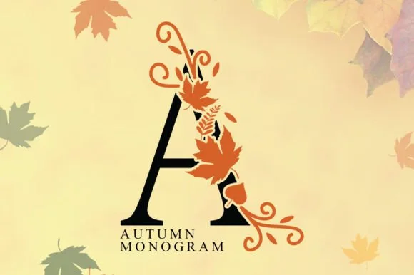
Autumn Monogram entwines classic serif capitals with swirling harvest vines, acorns, and maple leaves.
Autumn Monogram entwines classic Roman serif capitals with swirling harvest vines, acorns and maple leaves, so the monogram is an illustrated mark rather than a letter with a decoration attached. Each letter is composed with its ornament balanced on the right leg, which means a single initial reads complete on its own and two initials need spacing to avoid collision. Line weight is even, so the mark engraves and cuts predictably, and it needs roughly 35 mm for the leaves to read as leaves.
Thanksgiving linen napkin (sublimation), doormat & porch flag — Set 1 large 5-inch family initial ('H', 'M', 'S') in black + burnt orange above wide-tracked Roman surname caps.
If cutting two-color HTV/vinyl, scale to 3.5 in+ tall; for mugs, towels, and flags, sublimation and DTF are super fast!
 #14
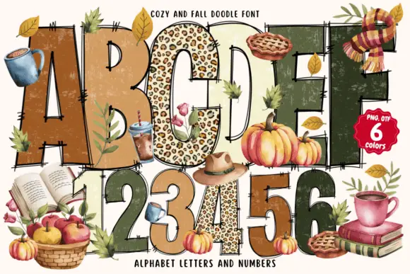
Cozy and Fall Doodle fills fat block letters with autumn textures, from leopard spots to plaid and deep green, and drapes seasonal doodles over the alphabet: a mug, a pie, apples, books and a scarf.
The cover shows the full alphabet across two rows plus a row of digits, each letter a different colour and fill, some spotted, some striped, some plain, with hand-drawn objects leaning against the strokes. Fills are printed textures rather than vector patterns, so the interiors read as fabric swatches. The decoration is what sells the set: six colourways and a large doodle library ship with the letters, and the pieces are meant to be combined. Because it is a colour font with heavy interiors, a word holds as a shape at poster size and shows the textures only when it is printed large.
An autumn reading club notice — Place the title high on cream with a plain olive meeting list below and one empty margin for a separately sourced leaf image.
Check the chosen pattern variant and small scratch details at final size.
 #15
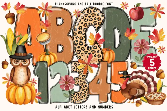
Thanksgiving and Fall Doodle draws fat autumn letters in five colours, fills them with knitted, plaid and leopard textures, and hangs leaves, pumpkins and a turkey around the shapes.
ABCDE and the numerals 12345 fill the preview in five flat seasonal colours, each letter carrying a printed texture inside it: a knitted weave, a plaid, a leopard spot, a leaf pattern and a plain grunge wash. Around and between the letters sit drawn autumn pieces, a pilgrim owl with a buckle hat on a pumpkin, a roast turkey with a fan of tail feathers, a pie, acorns, corn, apples, maple leaves and a sprig of berries. The letters are heavy and slightly irregular, with soft corners and a thin highlight along one edge, so they read as cut paper decorated on top. A caption at the top names the set, a badge at the right states PNG, OTF and five colours, and a line at the foot names the contents. Because the fills are pictures, the letter shapes stay clear at a distance and the texture only appears close up, which is a good combination for place cards, bunting and food-market signage.
A community harvest table board — Put the heading on cream above a plain white contribution list, with location and time in dark green at the bottom.
Confirm the chosen alphabet variant and separately included harvest illustrations.
 #16
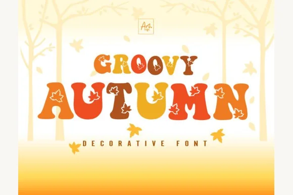
Groovy Autumn blends plump 1970s retro letterforms with crisp maple-leaf cutouts set into the counters, so a fall banner reads as seasonal without a separate illustration beside it.
The bodies stay plump and round, the leaf shapes cut cleanly through the middle of the letters and the curves carry the bell-bottom weight of the period. The inlaid leaf is the character: the season lives inside the letterform rather than behind it, which is why the sample needs no other artwork. Cutouts this fine need room, so check every leaf at the intended size and keep 34 pt before the vein details close up. The leaf veins are finer than the outline, so they close first: below about 34 pt the leaf reads as a plain blob, and on vinyl the inlay needs a 3 mm bridge to survive weeding.
Fall festival banner, pumpkin-patch tee or harvest mug — Set in warm burnt orange, mustard and espresso palettes.
Cut at 2"+ height on HTV so interior maple-leaf edges weed cleanly, or use sublimation/DTF.
 #17
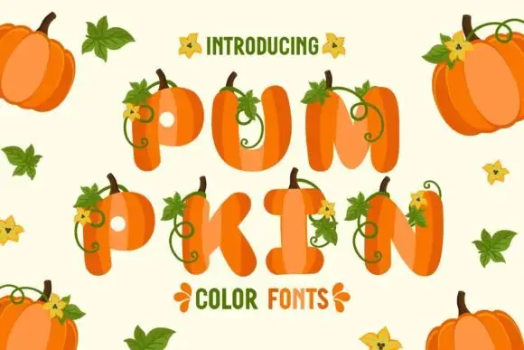
Pumpkin is a colour font in which every letter is a ribbed pumpkin: an orange rounded shape with a curved stem on top, a curling vine and a small yellow flower growing out of the shoulder.
pum over pkin fills the card, and each letter is built as a pumpkin seen from the side, with four or five pale ribs, a dark stem that curves to the right, a thin green vine curling away and a yellow flower with a dark centre attached to the vine. The letters are lower case in the first row and upper case in the second, so the set can be judged at two proportions, and the fill is a warm orange with a lighter highlight along one rib. Around the words pumpkins of two sizes, maple leaves and loose flowers sit on the pale ground. A caption at the top introduces the set and a line under the second row names it. It is a colour face that depends on the drawing rather than the skeleton, so it works in short words at a large size and gets crowded in long ones.
A pumpkin-patch invitation title — Place PUMPKIN across a plain cream invitation with a simple green date panel below.
Verify colour rendering and source any large pumpkin illustrations separately.
 #18
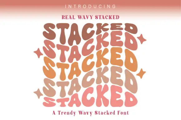
Real Wavy Stacked repeats a rounded uppercase word through six tightly stacked rows, where the letters rise and fall on undulating baselines, each row takes a different warm tone from brown through orange to pink, and the repeated S and D forms build a rippling outer edge.
The bodies stay rounded and heavy, the baselines wave, the rows stack close and the colours shift down the column. That repetition is the character: the block works as a shape first and a word second, which is why the sample repeats one word instead of writing a phrase. Four star marks sit beside the outer edges. Keep 44 pt so the letters stay distinct, leave 6 mm between baselines for the wave and check the outer edge of the last letter, since the ripple is what will be trimmed first.
A wavy party-poster title — Build a small number of deliberate repetitions above a plain information panel; leave gaps between colour layers.
Check the actual layout rather than assuming the font repeats or colours text automatically.
 #19
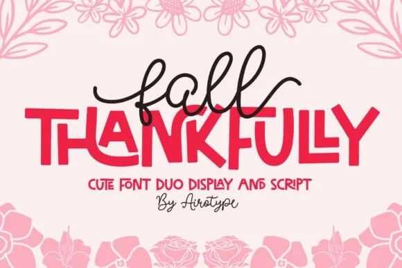
Fall Thankfully pairs a looping monoline cursive script with a heavy, interlocking all-caps sans display face.
Fall Thankfully is a duo of a monoline tail script and a bouncy all-caps sans: the script runs an even stroke that finishes every word with a long lifted tail, while the sans is a chunky capital set whose baseline hops so a short line looks hand-set. The pair is built for autumn market goods, where one line is written and one is printed. The script tail is the finest element and it closes into a dot when reduced. The script needs roughly 28 mm and the sans 24 mm for their detail to read.
Thanksgiving host apron & kitchen tea towel — Set the main family or harvest word in the heavy sans at 2.5 in cap height, then tuck a 1-word script lead-in slightly overlapping the upper-left letters.
Weld the overlapping script loops before cutting HTV, and peel away from the narrow 'f' and 'l' ascender counters slowly.
Practical buyer checklist
Key cutting, printing and pairing answers before choosing a Thanksgiving & harvest typeface.
Scripts at 16 to 20 pt for the name and a small print face for the dish label. Avoid botanical illustrations on place cards, since the detail disappears at that size and the card has to be read across a table.
Only if the illustration is attached to the letter. Detached leaves and acorns become islands on the mat. For cut signs, choose a solid script or print, and add the botanical element as a separate cut shape.
Keep at least 4.5:1 contrast between text and background. Cream on rust works; cream on mustard usually does not. Test by photographing the piece in the same warm indoor light it will be used in.
The print and script faces are, since many are simply warm handwriting. Anything with pumpkins, acorns or explicit holiday words is seasonal, so buy one general face and one seasonal display for the six-week window.
Keep exploring
Explore adjacent maker roundups or check our practical pre-production checklists.
26 curated fonts · Previews & pairings
27 curated fonts · Previews & pairings
29 curated fonts · Previews & pairings
28 curated fonts · Previews & pairings
Guides: Invitation font checklist · Vinyl & cutting checklist · How to pair script & sans fonts
Allow optional Google Analytics to measure visits and catalogue actions. Your search words and notes are not included. Privacy & storage