Neutral Sans Workhorse

Monsante + Furion
Lets Monsante own the focal silhouette while handling secondary copy, sizing and subheads cleanly.
Inspect Furion specimenDisclosure: MakerFileHub may earn a commission from qualifying purchases via paid links on this page. How our links work.
1920s Art Deco double-line inline geometric display
Monsante is a tall, geometric 1920s Art Deco display typeface built from crisp parallel double-line inline strokes and low-waisted crossbars.
Paid link
Get this fontProject & layout blueprintsAt-a-glance maker compatibility
Sturdy stroke walls and open counters weed cleanly on adhesive vinyl, HTV apparel film, and cut cardstock.
Visual anatomy & craft review
Monsante is a nineteen-twenties Art Deco double-line inline geometric display: wide squared letters built from two parallel strokes with a hairline gap, sharp mitred corners and a strict symmetry that reads as a hotel facade sign. The gap between the lines is the design and it closes into one stroke when the face is reduced. It needs roughly 32 mm for the double line to read, and it is best in one fine metallic on a dark ground, or one ink on a pale ground where the gap stays open.
Gatsby · Architectural · Glamorous
Two-font hierarchy recipes
Tested contrast partners — pairing Monsante with grounded secondary typography.
Monsante + Furion
Lets Monsante own the focal silhouette while handling secondary copy, sizing and subheads cleanly.
Inspect Furion specimen
Monsante + Marquis - Elegant Modern Serif
Grounds bold display lettering with classic typographic authority on posters, badges and apparel.
Inspect Marquis - Elegant Modern Serif specimenPractical applications
Concrete hierarchy, scale and production guidance tailored to Monsante’s stroke geometry.
A double-line Deco face gives a formal wedding a lettered plate rather than a script. The gap holds at 30 pt on an invitation, and one fine ink keeps it open on smooth card.
Hierarchy & layout recipe
Invitation 130 x 180 mm, names 30 pt with 10 mm line clearance, details 9/13 pt, 18 mm margins. Menu 120 x 210 mm, header 18 pt, courses 9/12 pt. Table card 90 x 50 mm, name 12 pt, 4 mm margins.
Pre-production check
At 12 pt on a table card the double line merges into one and the name reads as a plain stroke. Raise table cards to 18 pt, and proof one card before the set.
A Deco geometric display reads as a lettered facade rather than a corporate logo, which is what a small hotel wants in its lobby. The gap holds at 40 mm on a plate, and one metallic prints the plate and the cards in one order.
Hierarchy & layout recipe
Directory plate 300 x 80 mm, word 40 mm with 8 mm line clearance, 10 mm margins. Card 85 x 55 mm, word 26 mm, 6 mm margins. Letterhead 210 x 297 mm, word 30 mm, 20 mm margins.
Pre-production check
A 300 x 80 mm plate at 40 mm closes the gap into one stroke and the mark reads as a plain bar. Raise the plate to 50 mm or keep the gap at 1.5 mm, and check one plate before the run.
A Deco double-line display turns a design issue into a facade cover. The gap holds at 84 pt on a coated cover, and one metallic keeps it open against a dark ground.
Hierarchy & layout recipe
Cover 210 x 297 mm, title 84 pt with 12 mm line clearance, cover lines 10/14 pt over two columns of 82 mm, 18 mm margins and a 12 mm head. Opener 56 pt. Folio mark 12 mm.
Pre-production check
At 12 mm on the folio mark the gap closes and the mark reads as a smudge. Use a single line on the folio, and proof one spread at 1:1.
Technical & licence verification
Confirm included OTF/TTF/WOFF formats, full glyph tables and licence coverage on the live store page before batch production.
Closest visual alternatives
Matched across letterform anatomy, stroke behaviour and craft applications.
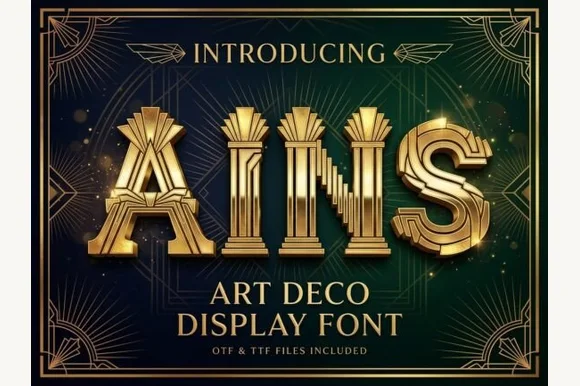
Fluted Art-Deco pillar & theater-marquee display (OTF & TTF)
Ains is a grand 1920s Art Deco display font carving vertical architectural column flutes down the center of wide geometric capitals (OTF & TTF).
Ideas for this font
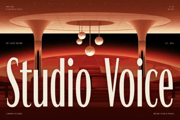
Condensed brutalist sans with tall stems and flat terminals
Studio Voice is a condensed brutalist sans in which the stems run very tall, the terminals stay flat and the counters squeeze to narrow slots, so a two-word title reads as a gallery graphic rather than as a headline.
Ideas for this font
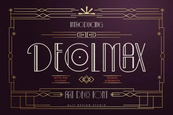
Slender dual-line Parisian Art Deco font (635 glyphs + bonus dingbats)
Decolmax is a rich 635-glyph Art Deco display suite combining slender open-inline capitals, interlocking ligatures, and bonus geometric dingbats!
Ideas for this font
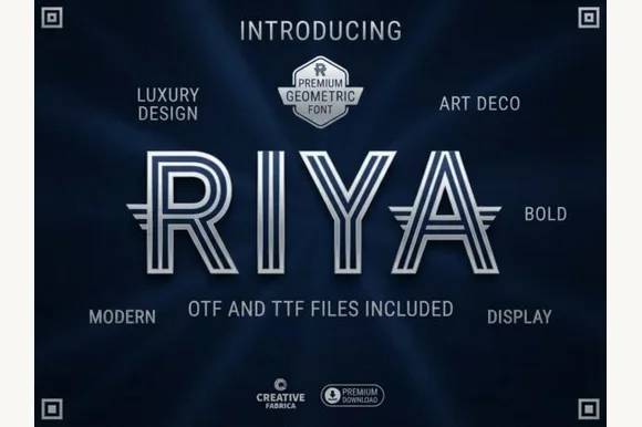
Triple-line striped geometric Art Deco labyrinth display (OTF & TTF)
Riya is an architectural geometric Art Deco display font constructed from three parallel concentric ribbon lines with wing extensions (OTF & TTF).
Ideas for this font
Same independent foundry
Allow optional Google Analytics to measure visits and catalogue actions. Your search words and notes are not included. Privacy & storage