Editorial Serif Anchor

Indy Typewriter + Gorga
Anchors Indy Typewriter's fluid strokes with crisp Roman proportions on wedding suites, headers and packaging.
Inspect Gorga specimenDisclosure: MakerFileHub may earn a commission from qualifying purchases via paid links on this page. How our links work.
Tall condensed handwritten monoline sans serif (NOT a serif typewriter!)
Indy Typewriter is actually a tall, friendly monoline handwritten sans serif—zero serifs or mechanical slabs despite the 'Typewriter' name!
Paid link
Get this fontProject & layout blueprintsAt-a-glance maker compatibility
Fine grain and micro-texture excel in 300 DPI print, sublimation, and screen print rather than small vinyl weeding.
Visual anatomy & craft review
Indy Typewriter is a tall condensed monoline handwritten sans with rounded stroke ends, airy spacing and no serifs at all despite the name, so a heading reads as neat hand printing rather than typing. The even monoline keeps it legible at 9 pt in a narrow column, and the condensed stance fits a long label in a small space. It needs roughly 14 pt for the rounded ends to read, and it is best in ink black on cream or in one pale ink on dark card.
Tall-hand-sans · Narrow-clean · Modern-casual
Two-font hierarchy recipes
Tested contrast partners — pairing Indy Typewriter with grounded secondary typography.
Indy Typewriter + Gorga
Anchors Indy Typewriter's fluid strokes with crisp Roman proportions on wedding suites, headers and packaging.
Inspect Gorga specimen
Indy Typewriter + Prime Nordic
Keeps small-scale dates, URLs, nutrition facts and care instructions crisp and legible below script titles.
Inspect Prime Nordic specimenPractical applications
Concrete hierarchy, scale and production guidance tailored to Indy Typewriter’s stroke geometry.
A neat condensed hand print reads as a label written by the maker, which is what a small studio prints on a box. The narrow stance fits an ingredient or material list on a 40 mm edge, and one ink keeps the range cheap.
Hierarchy & layout recipe
Label 60 x 40 mm, name 9 mm, material 5 pt, 3 mm die margin. Carton 60 x 140 x 30 mm, name 18 mm, spec 5 pt, 8 mm margins. Card 85 x 55 mm, name 9 mm, 5 mm margins.
Pre-production check
A 5 pt material line in a condensed monoline on a carton edge closes its counters and reads as a dotted rule. Keep fine print at 6.5 pt, and check one assembled carton.
Hand-printed condensed caps read as a working notebook, which is what a design feature uses for a working page. The narrow forms fit a long heading in a 60 mm column, and the even weight stays clean at 9 pt.
Hierarchy & layout recipe
Page 148 x 210 mm, heading 40 pt, index 9 pt on an 11 pt leading, 15 mm margins. Spread 420 x 297 mm, header 60 mm, columns 82 mm. Planner 210 x 297 mm, heads 16 pt, entries 9 pt.
Pre-production check
An index set at 9 pt in a hand-printed face loses alignment between entries and page numbers. Set the index in a companion sans, and check one printed page at final size.
A friendly condensed hand print reads as a planner a school hands out, which is what a term diary needs. The tall forms fit a long subject name on a 60 mm label, and the monoline survives a photocopy at 9 pt.
Hierarchy & layout recipe
Planner 148 x 210 mm, cover title 32 pt, lines 8 mm apart with 9 pt labels, 15 mm margins. Label 60 x 40 mm, name 9 mm, 3 mm margins. Notice A4, header 24 pt, body 11/15 pt, 20 mm margins.
Pre-production check
A school copier at 300 dpi renders a 0.3 mm monoline as a dotted line and the planner looks damaged. Print from vector PDF at 600 dpi, and check one copy on the classroom machine.
Technical & licence verification
Confirm included OTF/TTF/WOFF formats, full glyph tables and licence coverage on the live store page before batch production.
Closest visual alternatives
Matched across letterform anatomy, stroke behaviour and craft applications.
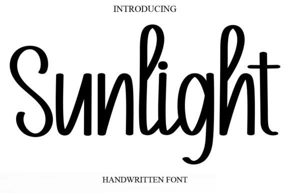
Tall condensed bouncy upright marker font
Sunlight is a tall, clean upright marker handwritten font with rounded loops and semi-connected farmhouse bounce.
Ideas for this font
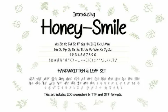
Neat tall handwritten print sans + botanical leaf dingbat bundle (OTF & TTF)
Honey–smile ('Honey-Smile') is a clean tall handwritten print sans bundled with matching botanical leaf illustrations across 200 characters (TTF & OTF)!
Ideas for this font
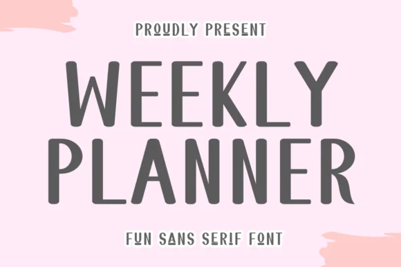
Tall quirky rounded sans
Weekly Planner is a tall rounded sans in grey on pink: narrow upright letters with rounded terminals, an open R leg, a bowed W and a curled L, presented in two stacked lines with a tracked caption beneath, so the pair reads as a planner cover rather than a neutral sans.
Ideas for this font
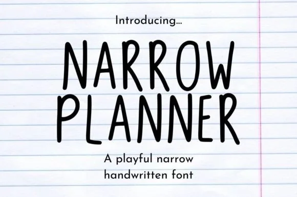
Narrow handwritten caps
Narrow Planner is a narrow handwritten face in black on ruled paper: tall condensed capitals drawn with a wobbly monoline stroke, uneven letter heights, and a lowercase that reads as the same hand at a normal width.
Ideas for this font
Same independent foundry
Allow optional Google Analytics to measure visits and catalogue actions. Your search words and notes are not included. Privacy & storage