High-Contrast Display Serif

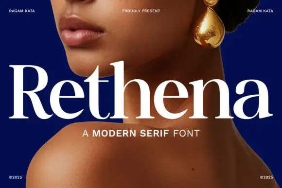
Kilgar + Mewah
Pairs sculptural editorial warmth with Kilgar's clean modern geometry.
Inspect Mewah specimenDisclosure: MakerFileHub may earn a commission from qualifying purchases via paid links on this page. How our links work.
Bold sculpted-inktrap brutalist condensed display sans
Kilgar is a bold modern condensed sans carving dramatic, sculptural inktrap wedges into the intersections of 'K', 'L', 'G', 'A', and 'R'!
Paid link
Get this fontProject & layout blueprintsAt-a-glance maker compatibility
Sturdy stroke walls and open counters weed cleanly on adhesive vinyl, HTV apparel film, and cut cardstock.
Visual anatomy & craft review
Kilgar is a bold condensed sans with sculptural inktrap wedges cut into the intersections of letters like K, L, G, A and R, so the joins read as carved V-cuts rather than printed corners. The stems are massive and the compression is strong, which fits a long title into a narrow panel, and the traps are the only fine detail, so they close below about 25 mm. It is a poster, signage and apparel face, at its best in one flat colour on a bright ground with a hard silhouette.
Deep-inktraps · Acid-chartreuse · Avant-garde
Two-font hierarchy recipes
Tested contrast partners — pairing Kilgar with grounded secondary typography.
Kilgar + Mewah
Pairs sculptural editorial warmth with Kilgar's clean modern geometry.
Inspect Mewah specimen
Kilgar + Simple Handwriting
Introduces organic movement on pull-quotes, signatures and gift tags.
Inspect Simple Handwriting specimenPractical applications
Concrete hierarchy, scale and production guidance tailored to Kilgar’s stroke geometry.
Inktrap wedges read as a machined cut, which is what a brutalist brand wants on a product face. Condensed width fits a long name on a narrow carton panel.
Hierarchy & layout recipe
Sign 900 x 300 mm, word 160 mm, 50 mm margins and 20 mm from the frame. Carton 55 x 140 x 30 mm, name 22 pt, legal 5.5/7.5 pt, 8 mm margins. Shirt print 260 x 140 mm, word 55 mm, 40 mm from the collar.
Pre-production check
Inktraps under 1 mm close on a coated carton at 22 pt and the letters look blunt. Keep the trap at 1.5 mm at delivery size, and check one printed carton before the run.
Carved joins give a cover an engineered look without a photograph. Condensed stems stack a long title in a single column at 200 mm.
Hierarchy & layout recipe
Poster A2, word 300 mm, details 22/28 pt, 30 mm margins and 20 mm clear of the frame. Cover 210 x 297 mm, title 120 pt, cover lines 11/15 pt, 20 mm margins. Masthead 220 x 40 mm, 60 pt across the head trim.
Pre-production check
A heavy condensed title on a digital press shows roller ghosting at full coverage. Check one printed proof at 100 percent, and reduce coverage to a 90 percent tint if the fill looks uneven.
Hard silhouettes read at distance under stage light, which is where a festival sign has to work. One ink keeps a long banner affordable.
Hierarchy & layout recipe
Gate sign 900 x 400 mm, word 160 mm, 60 mm margins. Wristband 250 x 25 mm, word 7 mm, 3 mm fold clearance. Banner 2000 x 600 mm, word 340 mm, 120 mm margins.
Pre-production check
Woven wristbands cannot hold an inktrap and the letter becomes a plain bar. Use the solid glyph on the band, and check one woven proof at 1:1 before the event order.
Technical & licence verification
Confirm included OTF/TTF/WOFF formats, full glyph tables and licence coverage on the live store page before batch production.
Closest visual alternatives
Matched across letterform anatomy, stroke behaviour and craft applications.
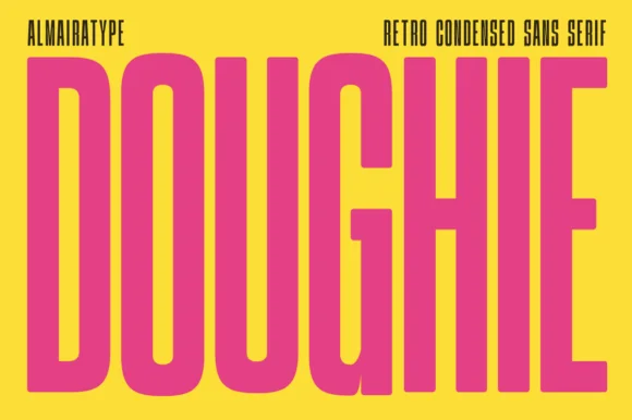
Ultra-tall 5:1 pillar-condensed retro poster sans
Doughie is an ultra-tall, compressed retro condensed sans stretching rounded-corner vertical pillars edge-to-edge across posters and packaging!
Ideas for this font
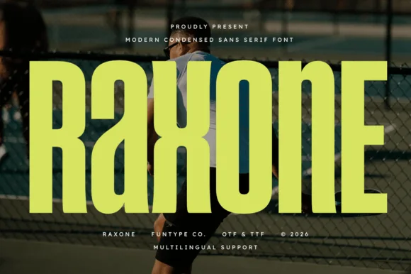
Heavy notched-joint athletic court condensed sans (OTF, TTF & Multilingual)
Raxone is a heavy, muscular condensed sans featuring subtle architectural waist notches on 'R', 'a', 'x', and 'n' for modern sports & streetwear (OTF/TTF).
Ideas for this font
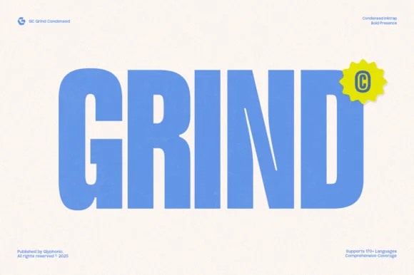
Heavy condensed inktrap display sans
Gc Grind is a bold condensed sans-serif engineered with subtle corner inktraps and flat industrial curves across 170+ languages.
Ideas for this font

8-weight + Variable contemporary condensed grotesk (170+ languages)
Bargain Condensed is a full 8-weight + Variable (100–800) condensed grotesk sans supporting uppercase, lowercase, and 170+ languages.
Ideas for this font
Same independent foundry
Allow optional Google Analytics to measure visits and catalogue actions. Your search words and notes are not included. Privacy & storage