Modern Grotesque Body

Cordavia Bold Swash + Modern Limited
Creates crisp high-hierarchy contrast beneath Cordavia Bold Swash headlines across menus, websites and labels.
Inspect Modern Limited specimenDisclosure: MakerFileHub may earn a commission from qualifying purchases via paid links on this page. How our links work.
Playful slab serif with heart-dotted i & heart-tipped swashes
Cordavia Bold Swash is a warm, slightly condensed slab serif crowned with decorative canopy swashes, baseline curls, and solid heart i-dots.
Paid link
Get this fontProject & layout blueprintsAt-a-glance maker compatibility
Weld or Unite overlapping script joins into one continuous vector path before sending to the blade.
Visual anatomy & craft review
Cordavia Bold Swash is a playful slab serif with heart details: heavy unbracketed slabs, open counters, a small heart replacing the dot on the i and swashes that finish in a heart tip at the entry and exit of a word. The hearts are the design and they close into dots as soon as the face is reduced. It needs roughly 28 mm for the heart and the slab to read, and it is best in two soft inks on white, or one ink plus paper where the hearts print as knockouts.
Romantic · Sturdy · Craft-friendly
Two-font hierarchy recipes
Tested contrast partners — pairing Cordavia Bold Swash with grounded secondary typography.
Cordavia Bold Swash + Modern Limited
Creates crisp high-hierarchy contrast beneath Cordavia Bold Swash headlines across menus, websites and labels.
Inspect Modern Limited specimen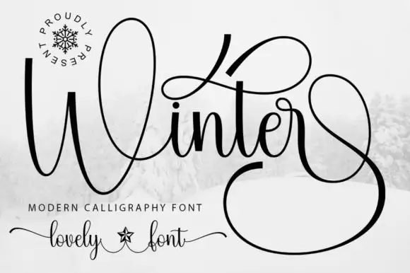
Cordavia Bold Swash + Winter
Adds a warm human signature touch for 1-to-3-word callouts without competing against structured serif capitals.
Inspect Winter specimenPractical applications
Concrete hierarchy, scale and production guidance tailored to Cordavia Bold Swash’s stroke geometry.
A heart-tipped slab gives an informal wedding a printed invitation with a drawn flourish rather than a script. The hearts hold at 28 pt, and two soft inks print the invitation and the menu in one order.
Hierarchy & layout recipe
Invitation 130 x 180 mm, names 28 pt with 12 mm swash clearance, details 9/13 pt, 18 mm margins. Menu 120 x 210 mm, header 18 pt, courses 9/12 pt. Place card 90 x 50 mm, name 14 pt, 4 mm margins.
Pre-production check
At 14 pt on a place card the heart tip closes into a comma and the name reads as a typo. Raise place cards to 18 pt, and proof one card before the suite.
A heart-tipped slab carries the sentiment in the swash rather than a printed motif. The hearts hold at 26 mm on a card, and two soft inks print the card, the seal and the band in one pass.
Hierarchy & layout recipe
Card A6, greeting 26 mm with 10 mm swash clearance, note 8/11 pt, 12 mm margins. Seal label 38 mm round, word 7 mm, 3 mm die margin. Ribbon band 200 x 30 mm, word 9 mm, 5 mm margins.
Pre-production check
A 38 mm seal at 7 mm loses the heart entirely under wax. Use an initial only on the seal, and pour one seal before the batch.
A heart-dotted slab reads as a hand-drawn spring poster rather than a modern flyer. The hearts hold at 90 mm on a poster, and two soft inks print the poster and the stall cards in one pass.
Hierarchy & layout recipe
Poster A3, word 90 mm with 12 mm swash clearance, details 28 mm, 18 mm margins. Stall card 105 x 75 mm, word 20 mm, 5 mm margins. Bag label 90 x 50 mm, word 16 mm, 5 mm margins.
Pre-production check
On a 90 x 50 mm bag label at 16 mm the hearts close into dots and the word reads as a dotted bar. Raise the label word to 22 mm, and print one label before the batch.
Technical & licence verification
Confirm included OTF/TTF/WOFF formats, full glyph tables and licence coverage on the live store page before batch production.
Closest visual alternatives
Matched across letterform anatomy, stroke behaviour and craft applications.
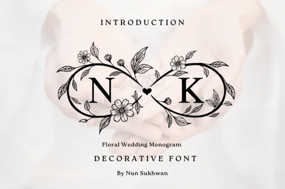
Crisp black botanical infinity-loop (∞) wedding monogram
Floral Wedding Monogram frames two serif initials inside a high-contrast black botanical infinity loop joined by a center heart.
Ideas for this font
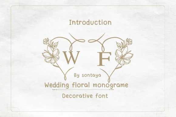
Split-heart botanical wedding monogram system
Wedding Floral Monogram is a paired decorative monogram alphabet where left and right floral half-arches join two initials into one heart wreath.
Ideas for this font
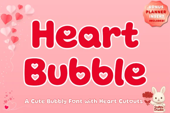
Plump kawaii bubble display with heart-shaped counters
Heart Bubble is a cheerful rounded bubble display font where enclosed letter counters and i-dots are shaped as crisp upright hearts.
Ideas for this font
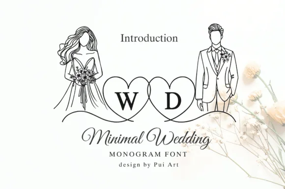
Fine monoline script with a monogram frame
Minimal Wedding is a fine monoline script paired with thin monogram capitals inside two overlapping heart outlines: hairline strokes, a long flourish under the W, and a drawing of a bride and groom in single-weight line art beside it.
Ideas for this font
Same independent foundry
Allow optional Google Analytics to measure visits and catalogue actions. Your search words and notes are not included. Privacy & storage