Neutral Sans Workhorse

Horizon Rover + Noar
Lets Horizon Rover own the focal silhouette while handling secondary copy, sizing and subheads cleanly.
Inspect Noar specimenDisclosure: MakerFileHub may earn a commission from qualifying purchases via paid links on this page. How our links work.
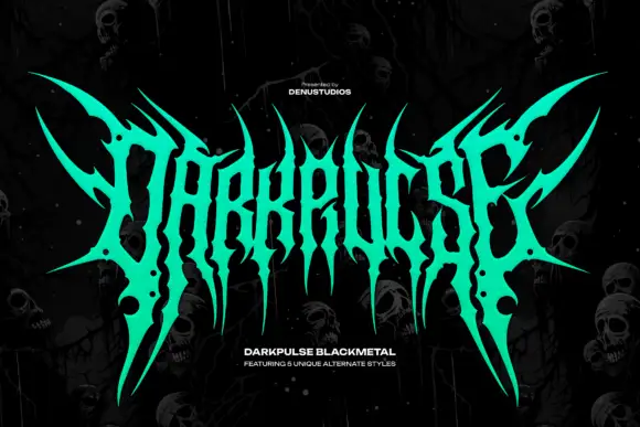
Wide black-metal capitals with long spikes and hooked shoulders
Horizon Rover draws black metal lettering: tall letterforms built from sharp spikes, hairline joins and diamond finials, so a two-word title reads as a logo stamped on a record sleeve.
Paid link
Get this fontProject & layout blueprintsAt-a-glance maker compatibility
Sturdy stroke walls and open counters weed cleanly on adhesive vinyl, HTV apparel film, and cut cardstock.
Visual anatomy & craft review
HORIZON over ROVER fills the frame in white on a dark backdrop of figures and fog, the H built from thin diagonal strokes that end in points and the R carrying a spike above the bowl. The joins thin almost to nothing, which is what gives the style its menace, and the counters stay narrow. Two tracked captions sit below, one naming the face and one naming the foundry, plus a short note about alternates. It is a display style with real fragility: the hairline joins vanish at small sizes and in low-resolution output, so it belongs on posters, sleeves and merchandise, not on labels.
Wide black-metal capitals with long spikes and hooked shoulders
Two-font hierarchy recipes
Tested contrast partners — pairing Horizon Rover with grounded secondary typography.
Horizon Rover + Noar
Lets Horizon Rover own the focal silhouette while handling secondary copy, sizing and subheads cleanly.
Inspect Noar specimen
Horizon Rover + Cronelo
Grounds bold display lettering with classic typographic authority on posters, badges and apparel.
Inspect Cronelo specimenPractical applications
Concrete hierarchy, scale and production guidance tailored to Horizon Rover’s stroke geometry.
The spiked lettering sets the genre before a reader sees the line-up, and the white on dark holds across a dimly lit venue.
Hierarchy & layout recipe
Print a 420 by 594 mm poster: set the band name at 140 pt across two rows, keep 32 mm of clear ground beneath before the date at 20 pt, and keep 30 mm of border so the spikes stay inside the sheet.
Pre-production check
Hairline joins break at large format; check the output file at the printer's resolution first.
The lettering is the graphic idea on a cover, and the two rows fill the frame without a photograph or a second element behind them.
Hierarchy & layout recipe
Print a 200 by 250 mm cover: set the title at 90 pt across two rows, keep 24 mm of clear ground beneath before the standfirst at 11 pt, and keep 20 mm of margin from the trim on every side.
Pre-production check
Fine points can drop out in offset; check a proof on the chosen paper before the run. Check one finished piece before the rest are produced.
One word in this style reads as a print rather than a brand, and the heavy silhouette survives a screen print on cotton.
Hierarchy & layout recipe
Print an A3 tee front: set the name at 90 pt across one row, keep 26 mm of clear ground beneath before the season at 14 pt, and keep 30 mm from the art to the collar seam for the screen frame.
Pre-production check
Thin joins fill on a coarse mesh; check a test print before the shirt run. Get a physical proof from the printer before the run.
Technical & licence verification
Confirm included OTF/TTF/WOFF formats, full glyph tables and licence coverage on the live store page before batch production.
Closest visual alternatives
Matched across letterform anatomy, stroke behaviour and craft applications.
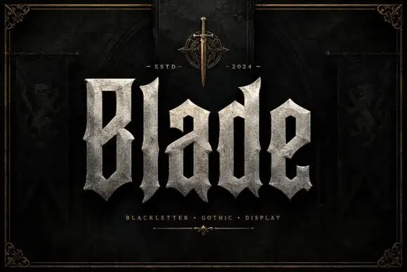
Broad faceted blackletter with deep angular counters
Blade is a heavy blackletter display face whose strokes look carved from granite: thick stems, chiselled counters, weathered edges and a fill that reads as stone rather than ink.
Ideas for this font
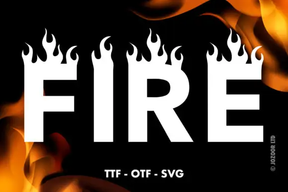
Heavy plain capitals topped by tall curling flame silhouettes
Fire is a heavy block display face in which the top of every stem opens into a row of drawn flames, so a word looks like it is burning along its upper edge.
Ideas for this font
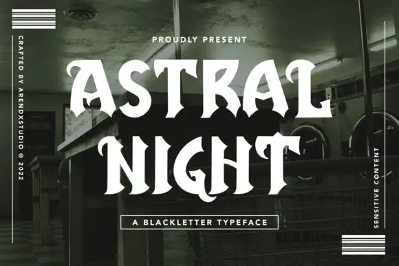
Open high-contrast capitals with curled tips and angular interruptions
Astral Night is a blackletter display face drawn with rounded joins and softened corners: the broken strokes are there, but the angles are sanded down, so the word looks hand-brushed rather than cut.
Ideas for this font
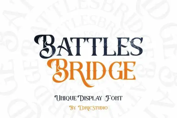
Contrasting display serifs with curled capitals and extended legs
Battlesbridge pairs dark BATTLES with orange BRIDGE in a compact two-row composition, where large curled B forms, pointed serif ends and a long sweeping R leg make the title ornamental without becoming a connected script, while fine lines cross parts of the letters and add a second detail scale.
Ideas for this font
Same independent foundry
Allow optional Google Analytics to measure visits and catalogue actions. Your search words and notes are not included. Privacy & storage