Modern Grotesque Body

Atomic Rust + Modern Limited
Creates crisp high-hierarchy contrast beneath Atomic Rust headlines across menus, websites and labels.
Inspect Modern Limited specimenDisclosure: MakerFileHub may earn a commission from qualifying purchases via paid links on this page. How our links work.
Victorian custom-motorcycle & heritage tattoo display serif
Atomic Rust is an all-caps Victorian heritage serif armed with median stem thorns, curled swash legs, and classic garage-emblem swagger.
Paid link
Get this fontProject & layout blueprintsAt-a-glance maker compatibility
Sturdy stroke walls and open counters weed cleanly on adhesive vinyl, HTV apparel film, and cut cardstock.
Visual anatomy & craft review
Atomic Rust is a Victorian heritage display serif crossed with custom-motorcycle lettering: heavy stems with a thin inner line, exaggerated bracketed serifs that flare into small scrolls, and a small pinched waist on some strokes that reads as hand-painted enamel. The inner line and the scrolls are the finest elements and both close when the face is reduced. It needs roughly 32 mm for the inner line and the scroll to read, and it is best in one fine metallic on a dark ground, or a dense ink on cream with a spot varnish.
Victorian-biker · Spurred · Heritage
Two-font hierarchy recipes
Tested contrast partners — pairing Atomic Rust with grounded secondary typography.
Atomic Rust + Modern Limited
Creates crisp high-hierarchy contrast beneath Atomic Rust headlines across menus, websites and labels.
Inspect Modern Limited specimen
Atomic Rust + Honey
Adds a warm human signature touch for 1-to-3-word callouts without competing against structured serif capitals.
Inspect Honey specimenPractical applications
Concrete hierarchy, scale and production guidance tailored to Atomic Rust’s stroke geometry.
A Victorian heritage serif with scrolls reads as hand-painted enamel rather than a modern logo, which is what a bike shop wants on a tank. The inner line holds at 30 mm on a decal, and one metallic prints the decal and the cards in one order.
Hierarchy & layout recipe
Tank decal 150 x 80 mm, word 34 mm with 8 mm scroll clearance, 10 mm margins. Card 85 x 55 mm, word 16 mm, 5 mm margins. Window decal 400 x 200 mm, word 60 mm, 25 mm margins.
Pre-production check
A 400 x 200 mm window decal at 60 mm traps air under the scroll curves and the vinyl lifts at the tails. Use a wet-apply method, and apply one decal before the run.
A Victorian display serif gives a heritage feature a hand-painted header rather than a styled headline. The scrolls hold at 56 pt on a coated page, and one metallic keeps the inner line crisp.
Hierarchy & layout recipe
Opener 210 x 297 mm, title 56 pt with 10 mm scroll clearance, standfirst 11/15 pt, body 9/13 pt over two columns of 82 mm, 18 mm margins. Drop cap 96 pt. Pull quote 36 pt.
Pre-production check
At 36 pt on the pull quote the inner line fills and the quote reads as a solid block. Keep the face at 48 pt and above, and proof one spread at 1:1.
A Victorian bill serif reads as a printed country poster rather than a modern flyer. The scrolls hold at 100 mm on a poster, and one ink prints the poster and the prize labels in one pass.
Hierarchy & layout recipe
Poster A2, word 100 mm with 12 mm scroll clearance, details 34 mm, 20 mm margins. Tent sign 600 x 400 mm, word 90 mm, 25 mm margins. Prize label 90 x 60 mm, word 16 mm, 5 mm margins.
Pre-production check
A 90 x 60 mm prize label at 16 mm fills the scroll and the word reads as a stain. Raise the label word to 22 mm, and print one label before the batch.
Technical & licence verification
Confirm included OTF/TTF/WOFF formats, full glyph tables and licence coverage on the live store page before batch production.
Closest visual alternatives
Matched across letterform anatomy, stroke behaviour and craft applications.
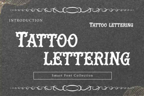
Letterpress tattoo lettering
Tattoo Lettering is a decorative plate in cream on charcoal: a swollen display alphabet with notched spurs and heavy serifs, set in two lines with a thin ornamental rule above and below, a small tracked label at the left and a boxed note at the foot naming the collection.
Ideas for this font

Bold letterpress-inked vintage editorial serif
Worldstar is a bold vintage editorial serif (NOT casual handwriting!) featuring warm bracketed curves and subtle antique letterpress edge ink.
Ideas for this font
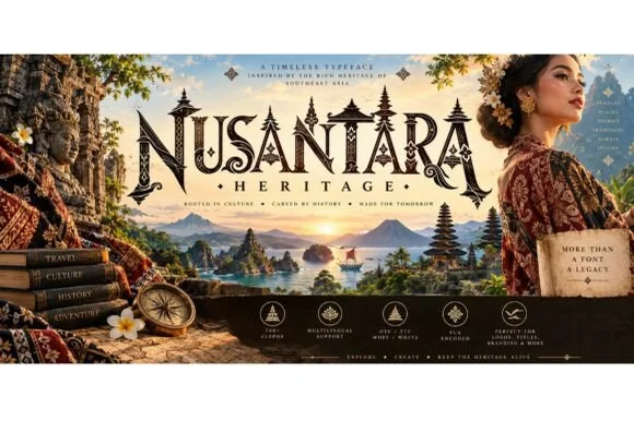
Carved Southeast-Asian temple & batik ornamental serif
Nusantara Heritage is an ornate cultural display serif inspired by Indonesian archipelago temple carvings, tropical flora, and traditional craft motifs.
Ideas for this font
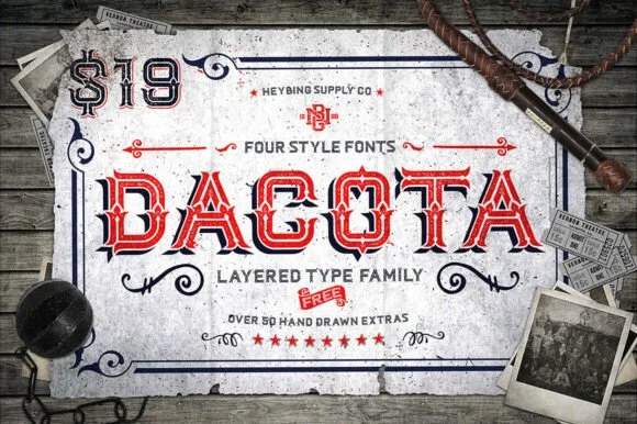
4-style layered Western saloon Tuscan family + 50+ extras
Dacota is a 4-style layered American West Tuscan serif family bundled with 50+ hand-drawn Western banners, ropes, and flourishes.
Ideas for this font
Allow optional Google Analytics to measure visits and catalogue actions. Your search words and notes are not included. Privacy & storage