Modern Grotesque Body

Rowancrest + Bielchon
Creates crisp high-hierarchy contrast beneath Rowancrest headlines across menus, websites and labels.
Inspect Bielchon specimenDisclosure: MakerFileHub may earn a commission from qualifying purchases via paid links on this page. How our links work.
Victorian heritage display serif with ball terminals & swashes
Rowancrest is a sturdy Victorian retro display serif distinguished by plump ball terminals, bracketed slab-like serifs, and swash tails.
Paid link
Get this fontProject & layout blueprintsAt-a-glance maker compatibility
Sturdy stroke walls and open counters weed cleanly on adhesive vinyl, HTV apparel film, and cut cardstock.
Visual anatomy & craft review
Rowancrest is a sturdy Victorian display serif with wide Roman proportions, bracketed slab-like serifs and plump ball terminals that curl the C and S into a small flourish. Swash tails extend past the word, so a layout needs space at the end of each line, and the weight is heavy enough that the face holds at 12 mm on a label while still reading as ornate at 90 mm. Because the ornament sits on the terminals, the counters stay open, which is why a Victorian revival of this weight remains legible in a short heading.
Victorian · Heritage · Ball-terminal
Two-font hierarchy recipes
Tested contrast partners — pairing Rowancrest with grounded secondary typography.
Rowancrest + Bielchon
Creates crisp high-hierarchy contrast beneath Rowancrest headlines across menus, websites and labels.
Inspect Bielchon specimen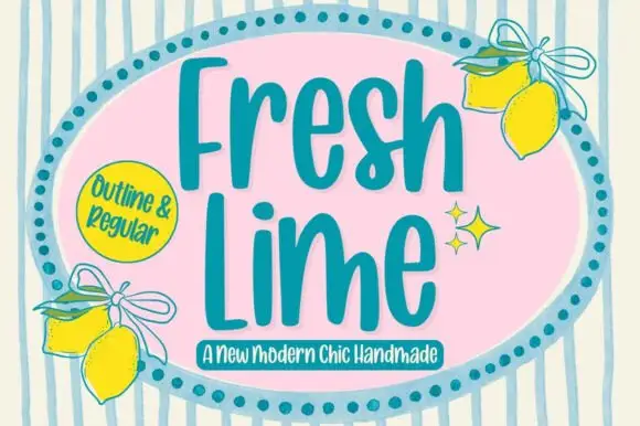
Rowancrest + Fresh Lime
Adds a warm human signature touch for 1-to-3-word callouts without competing against structured serif capitals.
Inspect Fresh Lime specimenPractical applications
Concrete hierarchy, scale and production guidance tailored to Rowancrest’s stroke geometry.
Ball terminals and bracketed slabs read as a press-printed label rather than a modern seasonal graphic, which suits an orchard selling its own fruit. The heavy weight holds on a 60 mm jar label where a light serif would vanish.
Hierarchy & layout recipe
Poster A2, title 200 mm with 20 mm swash allowance each side, details 20/26 pt, 30 mm margins. Box label 120 x 80 mm, word 22 mm, 20 mm margins. Jar label 60 x 45 mm, word 10 mm, 3 mm top arc.
Pre-production check
Jar labels go through a water bath and uncoated stock delaminates at the edge. Use a synthetic label with permanent adhesive, and test one sealed jar through a full cycle before printing the batch.
A Victorian display serif gives a small producer the provenance of an old label without a distressed texture. Wide Roman proportions fill a bottle face without extra ornament.
Hierarchy & layout recipe
Label 80 x 110 mm, name 20 mm, abv 4.5 pt, 5 mm top arc and 6 mm swash clearance. Carton 60 x 130 x 30 mm, name 16 mm. Stamp 45 x 25 mm, word 7 mm, 2 mm relief border.
Pre-production check
Foil on a legacy-style label bridges the ball terminals at 20 mm and the curl becomes a solid dot. Specify a flat foil die with no fine detail, or print the name in ink and keep the foil for a rule.
Bracketed slabs read as a title set on a cylinder press, which is the reference for a heritage publication. Open counters keep a 16 pt standfirst legible under an ornamented title.
Hierarchy & layout recipe
Cover 210 x 297 mm, title 80 pt with swash allowance, standfirst 12/17 pt, 20 mm margins. Catalogue 190 x 245 mm, chapter openers 30 pt, body 10/15 pt. Poster 500 x 700 mm, title 220 mm, imprint 18/24 pt.
Pre-production check
A web-offset signature on coated stock makes a heavy Victorian serif look glossy and modern; on uncoated it looks right. Choose the stock first, then adjust the weight, and compare one printed proof of each.
Technical & licence verification
Confirm included OTF/TTF/WOFF formats, full glyph tables and licence coverage on the live store page before batch production.
Closest visual alternatives
Matched across letterform anatomy, stroke behaviour and craft applications.
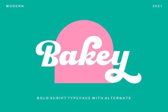
Heavy 1960s bakery & Packaging script
Bakey is a bold, upright 1960s/70s packaging script with thick syrupy downstrokes, plump bowls, and upturned retro tails.
Ideas for this font
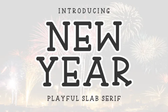
Tall hand-drawn rounded playful slab serif
New Year (by Letterayu) is a clean, hand-drawn uppercase slab serif with softly rounded terminal balls and cheerful, easy-cutting proportions.
Ideas for this font
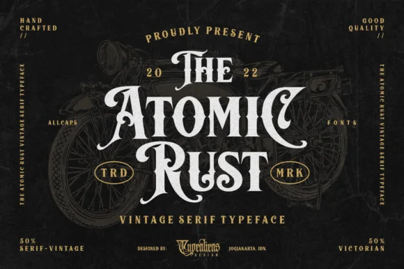
Victorian custom-motorcycle & heritage tattoo display serif
Atomic Rust is an all-caps Victorian heritage serif armed with median stem thorns, curled swash legs, and classic garage-emblem swagger.
Ideas for this font
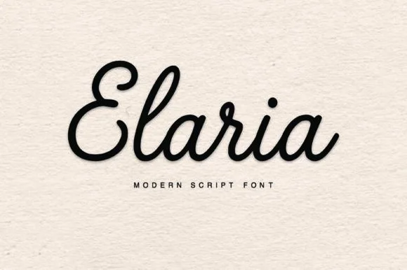
Plump rounded monoline-cord retro script (Ultra vinyl-friendly!)
Elaria is a thick, smooth monoline-cord script with rounded pen ends and open loops—engineered to weed like a dream on Cricut vinyl and HTV!
Ideas for this font
Same independent foundry
Allow optional Google Analytics to measure visits and catalogue actions. Your search words and notes are not included. Privacy & storage