Neutral Sans Workhorse

Aristoreva + Montreal
Lets Aristoreva own the focal silhouette while handling secondary copy, sizing and subheads cleanly.
Inspect Montreal specimenDisclosure: MakerFileHub may earn a commission from qualifying purchases via paid links on this page. How our links work.
Condensed vintage letters with elaborate swashes
Aristoreva is a condensed vintage face in which the letters stay tall with high contrast, the terminals curl and a long A flourish descends below the baseline while several strokes sweep across or under neighbouring characters.
Paid link
Get this fontProject & layout blueprintsAt-a-glance maker compatibility
Sturdy stroke walls and open counters weed cleanly on adhesive vinyl, HTV apparel film, and cut cardstock.
Visual anatomy & craft review
The letters compress tall, the terminals curl outward, one flourish leaves the A and drops well below the line and other strokes cross their neighbours by design. The long descending flourish is the character: it makes a short name read as an engraved label, which is why the sample sets the title inside gold ornamental curls. Because the sweeps travel, keep 22 mm beneath and 18 mm at each end from 28 pt, and treat the ornamental curls in the sample as surrounding artwork rather than part of the face.
Condensed · Swashed · Vintage
Two-font hierarchy recipes
Tested contrast partners — pairing Aristoreva with grounded secondary typography.
Aristoreva + Montreal
Lets Aristoreva own the focal silhouette while handling secondary copy, sizing and subheads cleanly.
Inspect Montreal specimen
Aristoreva + The Avenue Editorial
Grounds bold display lettering with classic typographic authority on posters, badges and apparel.
Inspect The Avenue Editorial specimenPractical applications
Concrete hierarchy, scale and production guidance tailored to Aristoreva’s stroke geometry.
The curled condensed letters suit a heritage box, and the flourishes keep a short name rich at 24 pt on a 70 mm label. The curls stay outside the letters, so the name itself reads plain.
Hierarchy & layout recipe
Print a 70 by 45 mm label: set the name at 24 pt, keep 10 mm beneath for the descending flourish, and set the contents in a 6 pt caps at the foot with 5 mm of clear ground. Keep the box square rather than round.
Pre-production check
A flourish printed at 18 pt thins into a broken line; check the plate proof and keep the name at 22 pt or above.
The condensed swashes give a feature its period voice, and the tall letters hold a two-word title at 50 pt across a printed spread. The tall letters also keep a two-word title from spreading out.
Hierarchy & layout recipe
Print a 210 mm spread: set the title at 50 pt on one row, keep 24 mm beneath for the flourish before the standfirst at 10 pt, and keep the block inside the text column. Keep the column measure fixed under the title.
Pre-production check
A descending flourish printed over body text tangles with the first line; check the page and keep 18 mm of air beneath it.
The curled letters give a small mark an antique air, and the tall forms stay readable at 20 pt on a coated card in one ink. The ornament in the sample belongs to the label, not to the font.
Hierarchy & layout recipe
Print an 85 by 55 mm card: set the wordmark at 20 pt, keep 12 mm of clear ground beneath the flourish, and set the address in a 7 pt caps at the foot with 8 mm of clear space.
Pre-production check
Fine hairlines printed on an uncoated card spread at 18 pt; check the proof and keep the wordmark at 20 pt on coated stock.
Technical & licence verification
Confirm included OTF/TTF/WOFF formats, full glyph tables and licence coverage on the live store page before batch production.
Closest visual alternatives
Matched across letterform anatomy, stroke behaviour and craft applications.
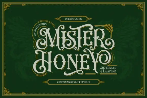
Curled display capitals with ball terminals and a looping Y
Mister Honey revives a Victorian poster style: tall condensed capitals with bulbous serifs, curling tails and a thin inner keyline that opens a second colour inside every letter.
Ideas for this font
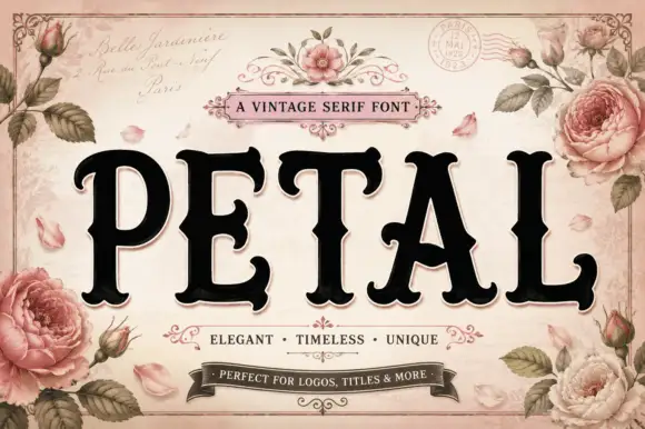
Vintage serif with rose ornament
Petal is a vintage serif in black on a pale rose ground: very heavy caps with bracketed serifs and a high waist, set on one line inside an ornamental frame with painted roses, ribbons, a postmark and a script line above and beneath naming the category and its uses.
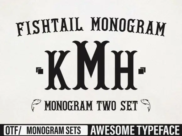
Tall monogram capitals with split fishtail ends
Fishtail Monogram shows a tall central M standing between narrower K and H, where split curved terminals flare at both ends of every upright, small square marks sit beside the outer letters and a fish outline appears at each side of a lower line.
Ideas for this font

Narrow Gothic strokes with curled descenders and split terminals
Kingsbridge sets silver-blackletter capitals on a dark heraldic scene, the strokes tall and angular, the K throwing a long entry swash and the g closing in a hooked tail that curls under the word.
Ideas for this font
Same independent foundry
Allow optional Google Analytics to measure visits and catalogue actions. Your search words and notes are not included. Privacy & storage