Modern Grotesque Body

Western Goldrush + Cultivo
Creates crisp high-hierarchy contrast beneath Western Goldrush headlines across menus, websites and labels.
Inspect Cultivo specimenDisclosure: MakerFileHub may earn a commission from qualifying purchases via paid links on this page. How our links work.
Ornamental western capitals with long curved spurs and heavy slab feet
Western Goldrush is an ornamental western serif in which the capitals carry long curved spurs, the feet flare into heavy slabs and the middle letters stay narrow, so a word reads as a saloon sign.
Paid link
Get this fontProject & layout blueprintsAt-a-glance maker compatibility
Sturdy stroke walls and open counters weed cleanly on adhesive vinyl, HTV apparel film, and cut cardstock.
Visual anatomy & craft review
The W opens with a wide curved spur and the letters after it keep a narrow body: the E holds three arms with spurred ends, the S swells through two heavy curves and the G closes with a straight bar and a curled ear. The H of the second word repeats the spur gesture on both stems, which is what gives the composition its symmetry. Weight is heavy in the verticals with a moderate contrast, and the spurs are thin enough to need a coated stock at small sizes. The fit is tight with deliberate overlaps where the spurs cross the next letter, which is how a painted sign reads. The sand ground, the dark brown ink, the small ornaments and the three caption lines are presentation; the typeface is the two words.
Western · Ornate · Spurred
Two-font hierarchy recipes
Tested contrast partners — pairing Western Goldrush with grounded secondary typography.
Western Goldrush + Cultivo
Creates crisp high-hierarchy contrast beneath Western Goldrush headlines across menus, websites and labels.
Inspect Cultivo specimen
Western Goldrush + Honey
Adds a warm human signature touch for 1-to-3-word callouts without competing against structured serif capitals.
Inspect Honey specimenPractical applications
Concrete hierarchy, scale and production guidance tailored to Western Goldrush’s stroke geometry.
The spurred capitals give a bottle label its period character, and the heavy feet hold at 14 pt where a lighter western face would lose its detail.
Hierarchy & layout recipe
Print a 70 by 90 mm label: set the brand at 14 pt, set the proof in a 6 pt caps serif beneath, and keep 6 mm of margin so the curved spurs are not cut by the label's oval die.
Pre-production check
An oval die crops spurs unevenly; check the die line against the artwork and move the type block to the flattest part of the oval.
The ornate weight reads at 10 cm on a board and gives a themed event a sign that looks painted rather than digitally printed.
Hierarchy & layout recipe
Print a 900 by 600 mm board: set the greeting at 10 cm across the middle, set the names in a 5 cm caps serif beneath, and leave 10 cm of border so the spurs stay clear of the frame.
Pre-production check
A narrow body painted large looks stretched; check the board at full size and keep the letter height consistent rather than filling the width.
The saloon register suits a restaurant front, and the heavy slabs read across a window at 15 cm without a light behind them.
Hierarchy & layout recipe
Cut a 600 by 300 mm window decal: set the restaurant name at 15 cm, set the opening hours in a 5 cm sans beneath, and keep 8 cm from the glass edge so the spurs are not trimmed by the frame.
Pre-production check
Window vinyl viewed from outside reverses; check a mirrored proof and keep the spurs simple enough to read through glass.
Technical & licence verification
Confirm included OTF/TTF/WOFF formats, full glyph tables and licence coverage on the live store page before batch production.
Closest visual alternatives
Matched across letterform anatomy, stroke behaviour and craft applications.
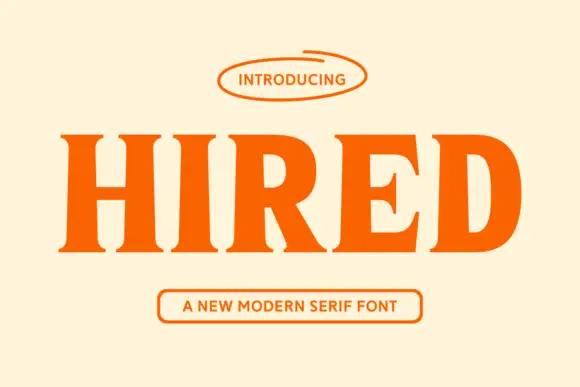
Heavy modern serif with sturdy slabs and a tight, dense fit
Hired is a heavy modern serif in which the stems stay broad, the serifs become sturdy slabs and the fit runs tight, so a single word reads as a bold headline set on a press rather than as a display flourish.
Ideas for this font
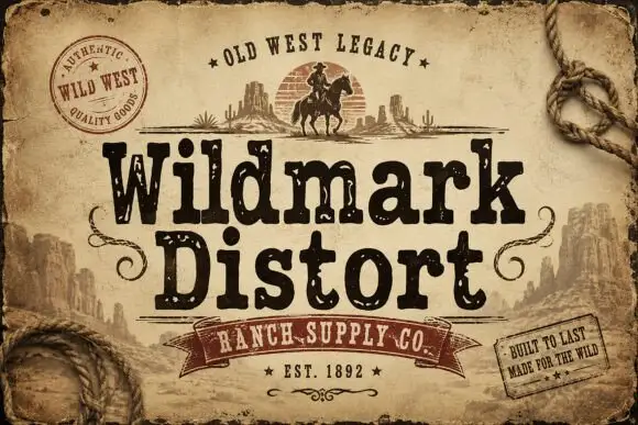
Distressed western display
Wildmark Distort is a distressed western display in black and cream on aged paper: a rounded slab with an uneven, worn outline, a swollen waist and a slight tilt, framed by a rope, a round seal, a ribbon and two small cards with period copy.
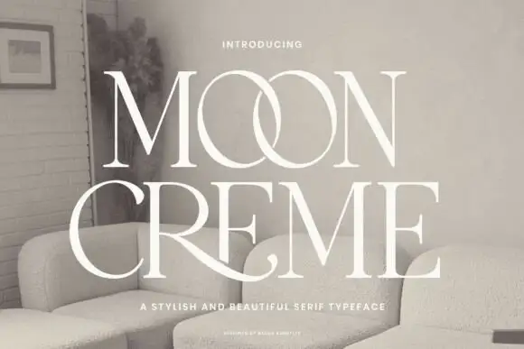
Fine contrasting capitals with overlapping circular bowls
Moon Creme shows tall white serif capitals with fine hairlines and broad round O forms on a muted interior photograph, where the two O letters overlap into a single linked shape and the R leg of the lower row sweeps beneath the following letters before curling away.
Ideas for this font

Swashed vintage editorial serif with a slanted italic companion
Majestic Letters is a vintage editorial serif in which the capitals carry curled swashes, the contrast runs high and a slanted italic companion is supplied, so a title page can mix upright and leaning forms from one family.
Ideas for this font
Same independent foundry
Allow optional Google Analytics to measure visits and catalogue actions. Your search words and notes are not included. Privacy & storage