Modern Grotesque Body

Vintage Strong + Modern Limited
Creates crisp high-hierarchy contrast beneath Vintage Strong headlines across menus, websites and labels.
Inspect Modern Limited specimenDisclosure: MakerFileHub may earn a commission from qualifying purchases via paid links on this page. How our links work.
Weathered woodcut & iron-press grunge Western serif
Vintage Strong is a bold, classic Western-style display serif textured with authentic iron-stamp speckles and worn press contours.
Paid link
Get this fontProject & layout blueprintsAt-a-glance maker compatibility
Fine grain and micro-texture excel in 300 DPI print, sublimation, and screen print rather than small vinyl weeding.
Visual anatomy & craft review
Vintage Strong is a weathered woodcut and iron-press Western serif: heavy bracketed slabs, a slightly irregular stem width and a surface of chipped edges, grain lines and small voids where the wood block wore. The wear is drawn, so a one-colour print keeps it, and the bracket is what closes first at small sizes. It needs roughly 32 mm for the bracket and the grain to read, and it is best in one dense ink on kraft and newsprint, or white on a dark board where the grain prints as light lines.
Rugged · Stamped · Heritage
Two-font hierarchy recipes
Tested contrast partners — pairing Vintage Strong with grounded secondary typography.
Vintage Strong + Modern Limited
Creates crisp high-hierarchy contrast beneath Vintage Strong headlines across menus, websites and labels.
Inspect Modern Limited specimen
Vintage Strong + Abigail
Adds a warm human signature touch for 1-to-3-word callouts without competing against structured serif capitals.
Inspect Abigail specimenPractical applications
Concrete hierarchy, scale and production guidance tailored to Vintage Strong’s stroke geometry.
A weathered woodcut serif reads as a cast iron plate rather than a modern logo, which is what a small workshop wants over its door. The grain holds at 40 mm on a plate, and one ink prints the plate and the crate mark in one order.
Hierarchy & layout recipe
Sign plate 600 x 300 mm, word 90 mm with 12 mm grain clearance, 25 mm margins. Crate mark 300 x 150 mm, word 60 mm, 15 mm margins. Card 85 x 55 mm, word 14 mm, 5 mm margins.
Pre-production check
At 14 mm on the card the grain turns to dirt and the name looks stained. Keep the card word at 20 mm or use the clean cut, and check one card before the run.
A woodcut serif gives a maker a thank-you that reads as pressed rather than printed. The heavy slabs hold at 22 mm on a card, and one ink prints the card, the tag and the crate label in one pass.
Hierarchy & layout recipe
Card A6, greeting 22 mm with 8 mm grain clearance, note 8/11 pt, 12 mm margins. Bottle tag 50 x 80 mm, word 14 mm with a 4 mm hole and 8 mm clear. Crate label 120 x 80 mm, word 24 mm, 8 mm margins.
Pre-production check
A 120 x 80 mm crate label at 24 mm puts a chipped serif against the die edge and the blade clips it. Keep the word 8 mm inside the die, and cut one label from the actual dieline.
A weathered woodcut serif reads as a press poster printed a century ago, which is what a cider maker wants above its barrels. The heavy stems hold at 120 mm, and one ink prints the poster, the label and the barrel mark in one order.
Hierarchy & layout recipe
Poster A2, word 120 mm with 12 mm grain clearance, details 34 mm, 20 mm margins. Cider label 80 x 60 mm, word 16 mm, 5 mm margins. Barrel mark 200 x 120 mm, word 50 mm, 15 mm margins.
Pre-production check
On a wet-pressed label the grain fills and the label prints as a flat slab with no texture. Print labels on a dry uncoated sheet or accept the flat look, and check one label on the bottle.
Technical & licence verification
Confirm included OTF/TTF/WOFF formats, full glyph tables and licence coverage on the live store page before batch production.
Closest visual alternatives
Matched across letterform anatomy, stroke behaviour and craft applications.
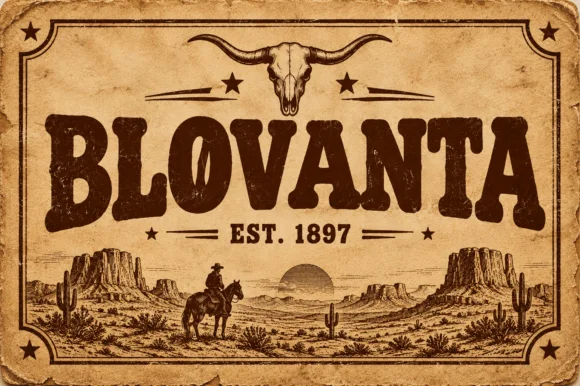
Weathered woodblock Western saloon display serif
Blovanta is a heavy, weathered Western display serif featuring chunky flared stems, a notched 'O' crossbar accent, and vintage ranch grit.
Ideas for this font
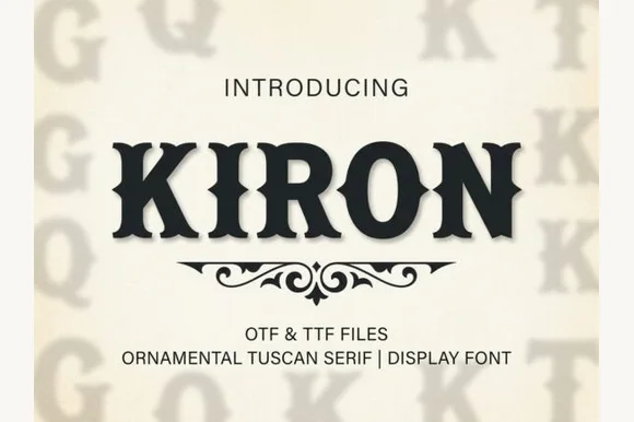
Classic median-spurred Western Tuscan slab-serif
Kiron is a clean, heavy Western Tuscan display serif with crisp diamond median spurs, flared bracketed serifs, and solid single-layer geometry.
Ideas for this font
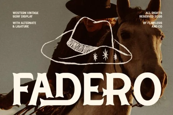
Warm concave-flared Tuscan serif with alternates & ligatures
Fadero is a warm, organic Western serif sculpting concave flared stems, soft waist spurs, and custom alternates & ligatures.
Ideas for this font
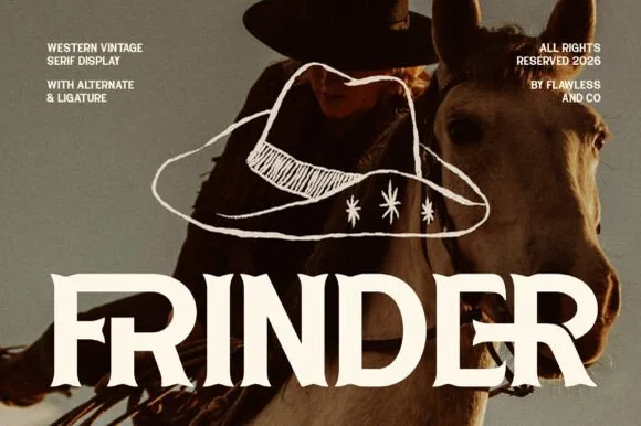
Modern sharp-spurred Western serif with interlocking ligatures
Frinder is a sharp, modern editorial Western serif combining triangular thorn spurs with custom interlocking ligatures ('DE') and hooked 'R' legs.
Ideas for this font
Same independent foundry
Allow optional Google Analytics to measure visits and catalogue actions. Your search words and notes are not included. Privacy & storage