Neutral Sans Workhorse

Brellos + Base Edge
Lets Brellos own the focal silhouette while handling secondary copy, sizing and subheads cleanly.
Inspect Base Edge specimenDisclosure: MakerFileHub may earn a commission from qualifying purchases via paid links on this page. How our links work.
Curving serif capitals with inset accents and long low curls
Brellos is a hand-drawn folk display face with swash capitals in teal and red, a woven banner label and a set of sugar-skull and bird extras drawn in the style of Mexican paper craft.
Paid link
Get this fontProject & layout blueprintsAt-a-glance maker compatibility
Sturdy stroke walls and open counters weed cleanly on adhesive vinyl, HTV apparel film, and cut cardstock.
Visual anatomy & craft review
BRELLOS fills the middle of the card in letters that mix a round bold skeleton with looping swashes: the B and the R carry curled tails that run under the word, the E is built from a slab with a swash on the bar, and the two Ls are drawn as tall strokes with a leaf. Around the letters the card is dressed in the vocabulary of papel picado: a sugar skull in a hat at the upper right, a second skull at the lower left, a bird with spread wings at the lower right, a leaf spray at the upper left, a hand on a ribbon. The palette is a flat teal, brick red and amber on a mustard ground, and a banner at the foot carries the word Typeface. It is a display face for festivals and packaging, and the extras are part of the purchase rather than decoration around the sample.
Curving serif capitals with inset accents and long low curls
Two-font hierarchy recipes
Tested contrast partners — pairing Brellos with grounded secondary typography.
Brellos + Base Edge
Lets Brellos own the focal silhouette while handling secondary copy, sizing and subheads cleanly.
Inspect Base Edge specimen
Brellos + Amor Hadena
Grounds bold display lettering with classic typographic authority on posters, badges and apparel.
Inspect Amor Hadena specimenPractical applications
Concrete hierarchy, scale and production guidance tailored to Brellos’s stroke geometry.
The swash capitals and the skull extras give a festival poster its voice from type alone, and the flat palette prints on a cheap run without losing character.
Hierarchy & layout recipe
Print an A2 poster: set the festival name at 120 pt on one row, keep 34 mm of clear ground beneath for the swashes before the date at 13 pt, and hold 26 mm of margin so the tails stay inside.
Pre-production check
Swash tails cross the trim easily; print one poster at the final size and check the lowest curl before the run.
The folk lettering suits a product built on heat and celebration, and the extras let a small label carry a skull mark without commissioning art.
Hierarchy & layout recipe
Print a 55 by 90 mm bottle label: set the sauce name at 18 pt on one row, keep 8 mm of clear ground beneath before the heat level at 4.5 pt, and hold 5 mm from the swash to the die line.
Pre-production check
Flat red on a dark bottle loses contrast; print one label on the real material and check the tail before the batch.
The lettering reads as a festival rather than a reference book, which is what a guide to food and music wants on a shelf, and the skulls date it precisely.
Hierarchy & layout recipe
Print a 170 by 240 mm cover: set the title at 70 pt across two rows, keep 26 mm of clear ground beneath before the subtitle at 11 pt, and hold 18 mm from the widest swash to the spine edge.
Pre-production check
Two rows of swashes can merge; print one cover and read the title at thumbnail size before the print run.
Technical & licence verification
Confirm included OTF/TTF/WOFF formats, full glyph tables and licence coverage on the live store page before batch production.
Closest visual alternatives
Matched across letterform anatomy, stroke behaviour and craft applications.
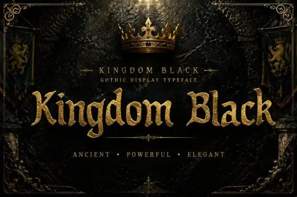
Weighty serif-like Gothic with rounded bowls and tapered sharp tips
Kingdom Black is a gothic display face filled with a textured gold, presented as a royal title plate with a crown above, lion banners at the sides and an ornamental frame.
Ideas for this font
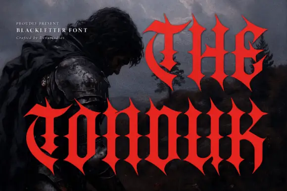
Concave-sided gothic display
The Tonduk is a solid red gothic display over a dark painted landscape: capitals with concave sides, sharp flared ends, narrow bowls and open counters, set in two lines of different sizes with a small presenting note and a credit at the upper left.
Ideas for this font
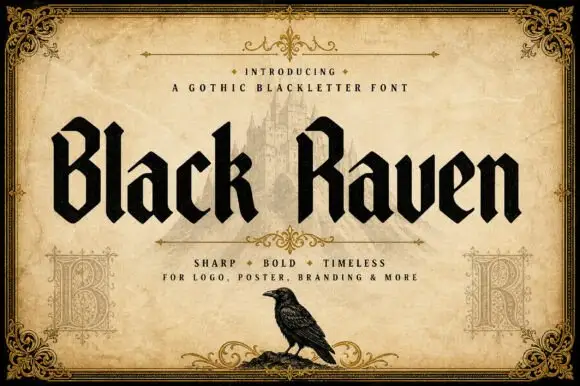
Solid blackletter with angular B and R bowls and pointed feet
Black Raven is a bold blackletter display face with wide stems, tight spacing and a flat black contour, drawn to print solid at large sizes on a light ground.
Ideas for this font
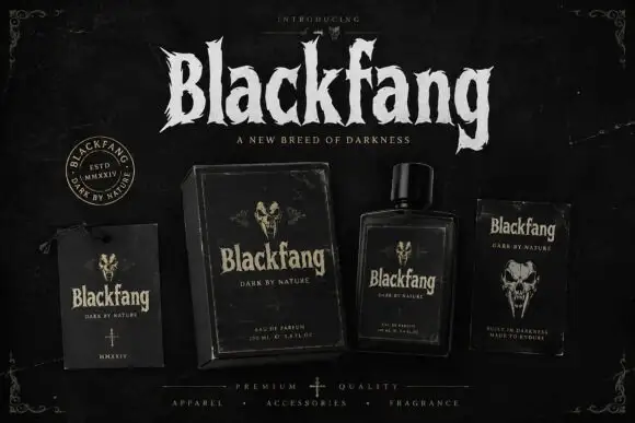
Ragged Gothic lettering with torn points and uneven bowls
Blackfang is a gothic display face with sharp spiked terminals and a smooth filled contour, shown here across a hang tag, a box, a bottle and a folded card.
Ideas for this font
Same independent foundry
Allow optional Google Analytics to measure visits and catalogue actions. Your search words and notes are not included. Privacy & storage