Modern Grotesque Body

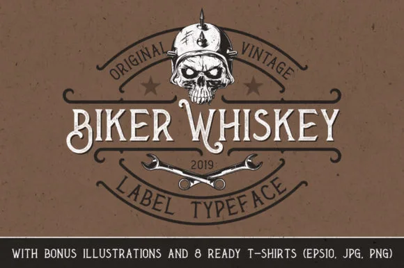
Amber Whiskey + Miniplate
Creates crisp high-hierarchy contrast beneath Amber Whiskey headlines across menus, websites and labels.
Inspect Miniplate specimenDisclosure: MakerFileHub may earn a commission from qualifying purchases via paid links on this page. How our links work.
Tall condensed Victorian bottle-label display serif
Amber Whiskey is a tall, condensed Victorian display serif built for stacked spirits labels, apothecary crests, and heritage posters.
Paid link
Get this fontProject & layout blueprintsAt-a-glance maker compatibility
Sturdy stroke walls and open counters weed cleanly on adhesive vinyl, HTV apparel film, and cut cardstock.
Visual anatomy & craft review
Amber Whiskey is a tall condensed Victorian bottle-label serif: very narrow bracketed stems, exaggerated thin strokes, split serifs with a small spur and a high cap height that fills a label's height. The condensation holds a long distillery name in a narrow panel, and the splits are the finest element. It needs roughly 28 mm for the split serif and the thin stroke to read, and it is best in one dense ink on cream and amber stock, or a fine gold on a dark ground where the splits print as cuts.
Distillery · Imposing · Classic
Two-font hierarchy recipes
Tested contrast partners — pairing Amber Whiskey with grounded secondary typography.
Amber Whiskey + Miniplate
Creates crisp high-hierarchy contrast beneath Amber Whiskey headlines across menus, websites and labels.
Inspect Miniplate specimen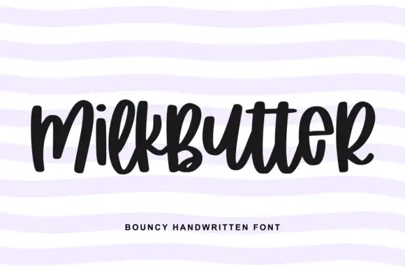
Amber Whiskey + Milkbutter
Adds a warm human signature touch for 1-to-3-word callouts without competing against structured serif capitals.
Inspect Milkbutter specimenPractical applications
Concrete hierarchy, scale and production guidance tailored to Amber Whiskey’s stroke geometry.
A Victorian label serif reads as a printed country bill rather than a modern flyer, which is what an autumn fair wants on a fence. The splits hold at 100 mm on a poster, and one ink prints the poster and the prize labels in one order.
Hierarchy & layout recipe
Poster A2, word 100 mm with 12 mm serif clearance, details 34 mm, 20 mm margins. Tent sign 600 x 400 mm, word 90 mm, 25 mm margins. Prize label 90 x 60 mm, word 16 mm, 5 mm margins.
Pre-production check
A 90 x 60 mm prize label at 16 mm fills the split serif and the word reads as a stain. Raise the label word to 22 mm, and print one label before the batch.
A Victorian label serif reads as a heritage gift pack rather than a printed card, which is what a spirits shop wants at a till. The splits hold at 26 mm on a card, and one ink prints the card, the tags and the shelf cards in one pass.
Hierarchy & layout recipe
Card A6, word 26 mm with 8 mm serif clearance, note 8/11 pt, 12 mm margins. Tag 50 x 90 mm, word 12 mm with a 5 mm hole and 8 mm clear. Shelf card 148 x 105 mm, word 24 mm, 8 mm margins.
Pre-production check
A 50 x 90 mm tag at 12 mm closes the split into a single slab and the name reads as a bar. Raise the tag word to 16 mm, and print one tag before the batch.
A condensed Victorian serif reads as an aged distillery mark rather than a modern label. The narrow stems hold a long name at 24 mm on a bottle, and one ink prints the label and the carton in one order.
Hierarchy & layout recipe
Bottle label 110 x 80 mm, word 24 mm with 6 mm serif clearance, legal line 6/8 pt, 5 mm margins. Carton print 150 x 100 mm, word 34 mm, 10 mm margins. Card 85 x 55 mm, word 14 mm, 5 mm margins.
Pre-production check
A 110 x 80 mm label wrapped on a curve shortens its chord and pushes the serifs past the die line. Pull the word in 4 mm, and check one label on an empty bottle before the run.
Technical & licence verification
Confirm included OTF/TTF/WOFF formats, full glyph tables and licence coverage on the live store page before batch production.
Closest visual alternatives
Matched across letterform anatomy, stroke behaviour and craft applications.
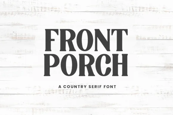
Tall condensed organic farmhouse & country porch serif (NOT cursive handwriting!)
Front Porch is actually a crisp, tall condensed farmhouse serif ('A COUNTRY SERIF FONT'—not casual handwriting!) built for vertical wooden welcome signs!
Ideas for this font
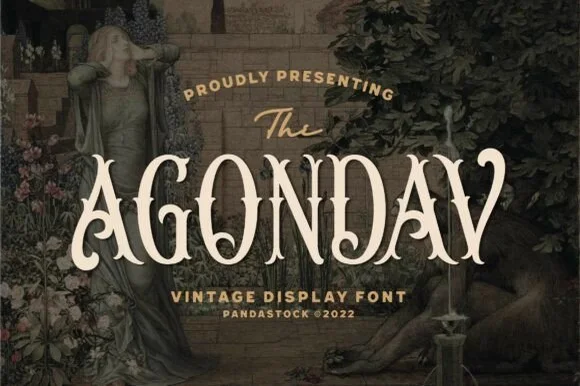
Victorian split-stem Tuscan & Pre-Raphaelite vintage serif
Agondav is a romantic 19th-century Victorian display serif sculpting bifurcated Tuscan stems, waist notches, and curled 'A/V' terminals.
Ideas for this font
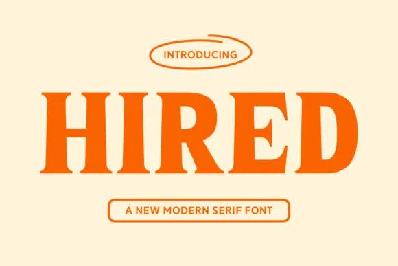
Heavy modern serif with sturdy slabs and a tight, dense fit
Hired is a heavy modern serif in which the stems stay broad, the serifs become sturdy slabs and the fit runs tight, so a single word reads as a bold headline set on a press rather than as a display flourish.
Ideas for this font
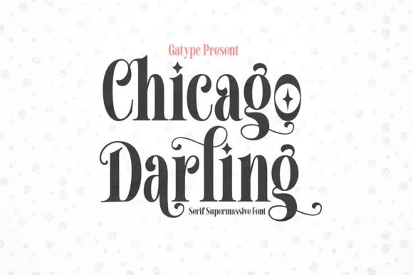
High-contrast vintage display serif with curled ball terminals
Chicago Darling is a bold, condensed modern-vintage serif distinguished by curled spiral terminals, sparkling counters, and deep descender loops.
Ideas for this font
Same independent foundry
Allow optional Google Analytics to measure visits and catalogue actions. Your search words and notes are not included. Privacy & storage