Modern Grotesque Body

Dirty Western + Corven
Creates crisp high-hierarchy contrast beneath Dirty Western headlines across menus, websites and labels.
Inspect Corven specimenDisclosure: MakerFileHub may earn a commission from qualifying purchases via paid links on this page. How our links work.
Heavily weathered Wild-West woodtype & saloon slab serif
Dirty Western is a rugged frontier slab serif stamped with coarse woodblock grain, pitted distress, and classic 1880s wanted-poster authority.
Paid link
Get this fontProject & layout blueprintsAt-a-glance maker compatibility
Fine grain and micro-texture excel in 300 DPI print, sublimation, and screen print rather than small vinyl weeding.
Visual anatomy & craft review
Dirty Western is a heavy frontier slab stamped with coarse woodblock grain and pitted wear, in the register of an 1880s wanted poster rather than a modern retro face. Capitals are tall with bracketed slabs, the counters are large enough to stay legible under the distress, and the wear is on the surface rather than the outline, so the word keeps a solid silhouette at a distance. It needs roughly 18 mm before the pitting reads as age instead of dirt, and it is all-caps in practice, pairing with a plain grotesque for detail lines.
Frontier-worn · Woodpress · Saloon
Two-font hierarchy recipes
Tested contrast partners — pairing Dirty Western with grounded secondary typography.
Dirty Western + Corven
Creates crisp high-hierarchy contrast beneath Dirty Western headlines across menus, websites and labels.
Inspect Corven specimen
Dirty Western + Esmeralda
Adds a warm human signature touch for 1-to-3-word callouts without competing against structured serif capitals.
Inspect Esmeralda specimenPractical applications
Concrete hierarchy, scale and production guidance tailored to Dirty Western’s stroke geometry.
Woodblock grain reads as a label printed on an old press, which is exactly the provenance a small distillery is selling. Large counters keep a product name legible under the wear at 12 mm on a bottle.
Hierarchy & layout recipe
Bottle label 80 x 110 mm, name 18 mm, abv 4.5 pt, 5 mm top arc. Jerky bag 150 x 220 mm, name 30 mm, nutrition panel 5.5 pt. Menu 210 x 320 mm, headings 20 pt, items 9/13 pt.
Pre-production check
Bottle labels pass through a cooler and condensation; pitted wear plus moisture reads as a printing fault. Print on a synthetic label with a matt laminate, and check one chilled bottle before the run.
The wear reads as years of smoke and handling, which is what a pit-master's plaque should look like. Heavy slabs engrave and brand cleanly on timber and leather.
Hierarchy & layout recipe
Plaque 400 x 250 mm on 12 mm oak, word 60 mm, 35 mm margins. Coaster 90 mm square, word 18 mm, 3 mm deboss border. Sign 1200 x 400 mm, word 240 mm, 90 mm margins.
Pre-production check
Branding leather chars and expands the design by about 0.5 mm, which closes the small counters of the S and E. Send one test coaster first, and if the counters fill, brand a shorter word or reduce the woodgrain wear.
An 1880s poster face is the correct historical reference for a haunted saloon, so the prop reads as period rather than costume. Large counters keep the name legible under low light.
Hierarchy & layout recipe
Poster 500 x 700 mm, name 260 mm, copy 16/22 pt, 40 mm margins. Label 80 x 100 mm, name 16 mm. Wanted poster 300 x 400 mm, headline 70 mm, body 12/18 pt, 25 mm margins.
Pre-production check
Prop posters are usually printed cheaply and pinned up; a heavy distressed fill on thin paper looks washed out under venue lighting. Print at 160 gsm minimum, and check one poster on the actual wall before hanging the set.
Technical & licence verification
Confirm included OTF/TTF/WOFF formats, full glyph tables and licence coverage on the live store page before batch production.
Closest visual alternatives
Matched across letterform anatomy, stroke behaviour and craft applications.
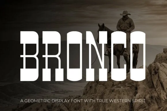
Tall architectural geometric spur-slab Western display
Bronco is a tall, clean-lined geometric Western slab serif pairing crisp rectangular counters with razor-sharp horizontal waist spurs.
Ideas for this font
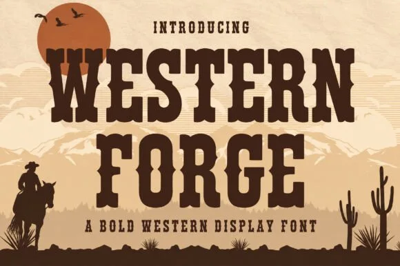
Tuscan western slab display
Western Forge is a tuscan western slab in dark brown on tan: bifurcated serifs, spurred stems, a notched crossbar on the F, and heavy bracketed slabs, set against a desert scene with a low sun, mountains and a rider, so the pair reads as a wood-type poster.
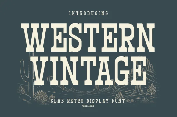
Tall condensed Western saloon slab serif
Western Vintage is a bold, condensed slab serif with crisp bracketed block feet and tall frontier poster proportions.
Ideas for this font
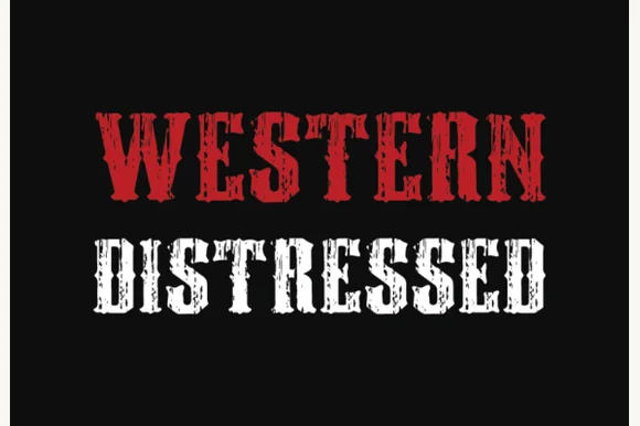
Condensed western display with heavy distress
Western Distressed is a condensed western display in red and white on black: tall narrow caps with wedge serifs, thick stems, and a heavy distress that eats vertical streaks out of the letters so the word reads as a painted sign that has been outdoors for years.
Ideas for this font
Same independent foundry
Allow optional Google Analytics to measure visits and catalogue actions. Your search words and notes are not included. Privacy & storage