Neutral Sans Workhorse

Mister Honey + Modern Limited
Lets Mister Honey own the focal silhouette while handling secondary copy, sizing and subheads cleanly.
Inspect Modern Limited specimenDisclosure: MakerFileHub may earn a commission from qualifying purchases via paid links on this page. How our links work.
Curled display capitals with ball terminals and a looping Y
Mister Honey revives a Victorian poster style: tall condensed capitals with bulbous serifs, curling tails and a thin inner keyline that opens a second colour inside every letter.
Paid link
Get this fontProject & layout blueprintsAt-a-glance maker compatibility
Sturdy stroke walls and open counters weed cleanly on adhesive vinyl, HTV apparel film, and cut cardstock.
Visual anatomy & craft review
The two rows sit on a deep green ground inside a gold rule with corner flourishes, the letters cream with a dark inset edge, the M and the H throwing curled spurs and the Y finishing in a long sweep. Ornament is stacked deliberately: banner labels above and below, an arc of small caps to one side and a boxed note to the other. Because the keyline creates an inner shape, the face carries two tones without being a colour font, which is useful for labels. The setting is dense, and the sample works because the ornament stays outside the words; a busier layout would bury the letterforms.
Curled display capitals with ball terminals and a looping Y
Two-font hierarchy recipes
Tested contrast partners — pairing Mister Honey with grounded secondary typography.
Mister Honey + Modern Limited
Lets Mister Honey own the focal silhouette while handling secondary copy, sizing and subheads cleanly.
Inspect Modern Limited specimen
Mister Honey + Amor Hadena
Grounds bold display lettering with classic typographic authority on posters, badges and apparel.
Inspect Amor Hadena specimenPractical applications
Concrete hierarchy, scale and production guidance tailored to Mister Honey’s stroke geometry.
The Victorian ornament says old-fashioned shop without a printed illustration, and the inner keyline gives a small tin two tones in one pass.
Hierarchy & layout recipe
Print a 70 by 70 mm tin label: set the brand at 20 pt across two rows, keep 8 mm of clear ground beneath before the weight at 6 pt, and keep 7 mm of margin from the tin edge.
Pre-production check
The inset keyline closes under 16 pt; check the printed label proof before the whole tin run.
The period letterforms suit a jar that wants to look inherited, and the condensed caps keep a two-word brand name on a narrow label.
Hierarchy & layout recipe
Print a 60 by 90 mm jar label: set the brand at 22 pt across two rows, keep 9 mm of clear ground beneath before the origin line at 6 pt, and keep 7 mm to the die edge.
Pre-production check
Curled spurs overhang the letter width; check the artwork margins before the labels are cut.
The Victorian weight matches a historical subject, and the inset line keeps a long title from reading as a solid block of cream.
Hierarchy & layout recipe
Print a 190 by 240 mm cover: set the title at 58 pt across two rows, keep 22 mm of clear ground beneath before the author line at 12 pt, and keep 20 mm of margin from the trim.
Pre-production check
Dense ornament around the title needs air; check the cover at final size before the proof.
Technical & licence verification
Confirm included OTF/TTF/WOFF formats, full glyph tables and licence coverage on the live store page before batch production.
Closest visual alternatives
Matched across letterform anatomy, stroke behaviour and craft applications.
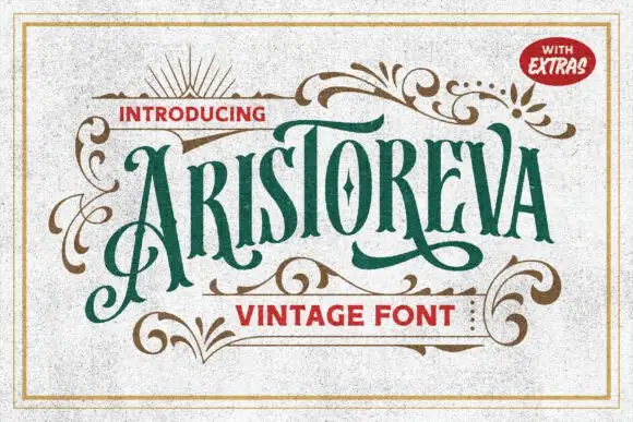
Condensed vintage letters with elaborate swashes
Aristoreva is a condensed vintage face in which the letters stay tall with high contrast, the terminals curl and a long A flourish descends below the baseline while several strokes sweep across or under neighbouring characters.
Ideas for this font
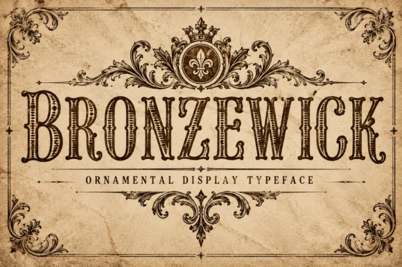
Engraved woodcut western display
Bronzewick pairs tall narrow Old West capitals with fine engraved linework inside every stem, so a single-colour print gains the depth of copperplate or woodblock engraving without a second ink.
Ideas for this font
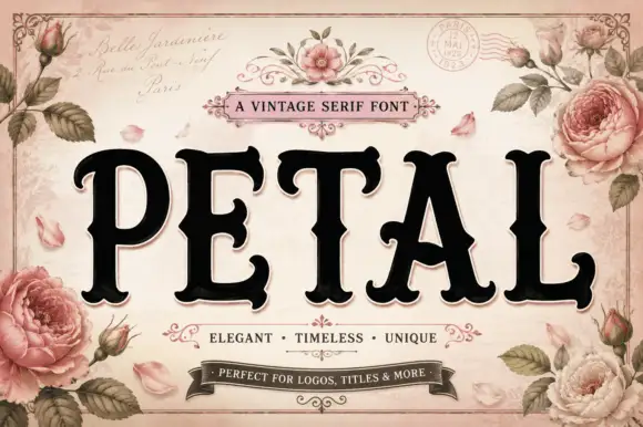
Vintage serif with rose ornament
Petal is a vintage serif in black on a pale rose ground: very heavy caps with bracketed serifs and a high waist, set on one line inside an ornamental frame with painted roses, ribbons, a postmark and a script line above and beneath naming the category and its uses.
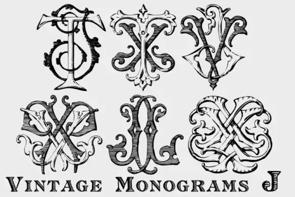
Interlaced ornamental monogram set
Vintage Monograms J is a sheet of six ornamental monograms in black on white: each a pair of interlaced letters built from curled terminals, hatched shading and sword-like crossbars, arranged in two rows of three above a plain engraved line that names the set.
Same independent foundry
Allow optional Google Analytics to measure visits and catalogue actions. Your search words and notes are not included. Privacy & storage