Modern Grotesque Body

Soccer Football Jersey + Monure
Creates crisp high-hierarchy contrast beneath Soccer Football Jersey headlines across menus, websites and labels.
Inspect Monure specimenDisclosure: MakerFileHub may earn a commission from qualifying purchases via paid links on this page. How our links work.
Layered athletic jersey capitals with a stitched fill and star detail
Soccer Football Jersey is a layered athletic capital alphabet in which each letter carries a stitched fill, a heavy keyline and an offset shadow, so a team name reads as the appliqué on a match jersey.
Paid link
Get this fontProject & layout blueprintsAt-a-glance maker compatibility
Cut solid base, outline, and shadow layers in separate vinyl colors and align on registration marks.
Visual anatomy & craft review
The S steps a heavy spine, the O closes a tall block, the C cuts a square crescent, the F sets a wide arm and the R turns a blunt leg, all at a jersey weight with square corners, a fill drawn as fabric and a contour that runs around the whole word. The layers are the character: the sample builds each line from fill, keyline and shadow, which lets one word carry three colours without extra artwork. Because each layer is a separate vector, every edge has to be clean, and the offset must repeat exactly or the word looks broken. The floodlit stadium, the stars, the ball and the small bottom banner are presentation; the white and red jersey words are the face.
Jersey · Layered · Athletic
Two-font hierarchy recipes
Tested contrast partners — pairing Soccer Football Jersey with grounded secondary typography.
Soccer Football Jersey + Monure
Creates crisp high-hierarchy contrast beneath Soccer Football Jersey headlines across menus, websites and labels.
Inspect Monure specimen
Soccer Football Jersey + Easy Handwriting
Adds a warm human signature touch for 1-to-3-word callouts without competing against structured serif capitals.
Inspect Easy Handwriting specimenPractical applications
Concrete hierarchy, scale and production guidance tailored to Soccer Football Jersey’s stroke geometry.
The layered build gives a shirt three colours from one file, and the block letters read across a floodlit pitch at 80 mm.
Hierarchy & layout recipe
Print a 320 mm chest print: set the team name at 80 mm, keep the keyline at 3 mm and the shadow offset at 2 mm down and right, and print with a 0.4 mm trap between the layers.
Pre-production check
A shadow that shifts between letters reads as a mistake; check the film and hold one offset value across the whole word.
The jersey weight fills a cup final banner without extra graphics, and the square corners stay sharp at 120 mm on vinyl.
Hierarchy & layout recipe
Print a two-metre banner: set the headline at 120 mm, set the score line at 60 mm beneath in the same cut, and keep 45 mm of border so the keyline is not trimmed by the hem.
Pre-production check
Three layers at banner size multiply registration error; check a proof and let the keyline carry the strongest colour.
The layered shapes translate into embroidery without redrawing, and the square corners suit a merrowed patch border at 60 mm.
Hierarchy & layout recipe
Digitise a 75 mm supporters patch: set the name at 60 mm, keep the shadow area at 2 mm minimum, and run the keyline as a satin border so the edge stays firm.
Pre-production check
A 1.5 mm shadow cannot be filled with satin stitch; check the digitised preview and widen the offset before the first sew-out.
Technical & licence verification
Confirm included OTF/TTF/WOFF formats, full glyph tables and licence coverage on the live store page before batch production.
Closest visual alternatives
Matched across letterform anatomy, stroke behaviour and craft applications.
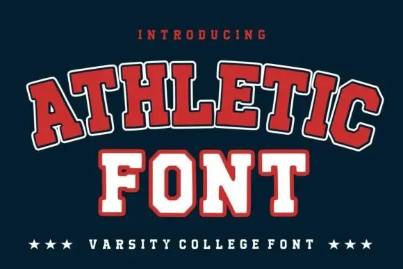
Broad outlined collegiate slabs with clipped corners in an arched specimen
Athletic is a broad collegiate slab in which the capitals clip their corners, the feet run wide and a pale and dark outline separate the fill from the ground, so a team name reads as an arched badge letter.
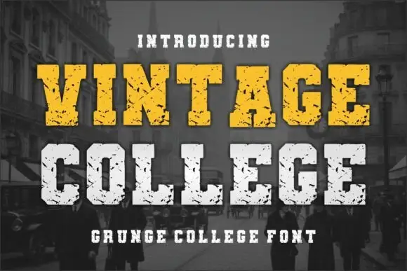
Grunge college slab with picket serifs
Vintage College is a grunge college slab in worn yellow and white on a dark street photograph: fat capitals with picket serifs, a heavy even weight and a scratched surface that eats into every edge.
Ideas for this font
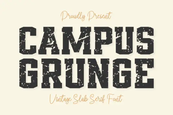
Heavy angular slabs with broad diagonal scars
Campus Grunge shows black athletic blocks on pale cream: large pale chips and diagonal scars interrupt the squared stems while clipped bowl corners and broad feet remain visible beneath the wear.
Ideas for this font
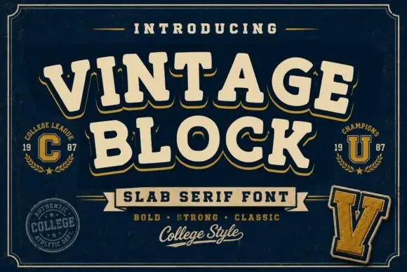
College block slab
Vintage Block is a college block slab in cream with a gold shadow on navy: heavy caps with squared serifs, a high waist and closed counters, set on two lines with small seal badges, a rule-and-ribbon device and a script line at the foot.
Same independent foundry
Allow optional Google Analytics to measure visits and catalogue actions. Your search words and notes are not included. Privacy & storage



