Modern Grotesque Body

Bold Chicago + Clyne Sans
Creates crisp high-hierarchy contrast beneath Bold Chicago headlines across menus, websites and labels.
Inspect Clyne Sans specimenDisclosure: MakerFileHub may earn a commission from qualifying purchases via paid links on this page. How our links work.
Ultra-heavy rounded vintage signage slab serif
Bold Chicago is a massive, ultra-heavy slab serif with pillowy rounded serifs, tiny circular counters, and vintage street-sign clout.
Paid link
Get this fontProject & layout blueprintsAt-a-glance maker compatibility
Sturdy stroke walls and open counters weed cleanly on adhesive vinyl, HTV apparel film, and cut cardstock.
Visual anatomy & craft review
Bold Chicago is an ultra-heavy rounded slab serif drawn from vintage signage: thick square stems with rounded corners, heavy unbracketed slabs, closed counters and a weight that fills the letter shape almost completely. The near-solid construction means counters vanish first at small sizes, and the rounded corners are what keep it from reading as a plain block. It needs roughly 30 mm for the counters to stay open, and it is best in one dense ink on cream and kraft, or a two-colour build where a shadow carries the depth.
Chunky · Retro-American · Booming
Two-font hierarchy recipes
Tested contrast partners — pairing Bold Chicago with grounded secondary typography.
Bold Chicago + Clyne Sans
Creates crisp high-hierarchy contrast beneath Bold Chicago headlines across menus, websites and labels.
Inspect Clyne Sans specimen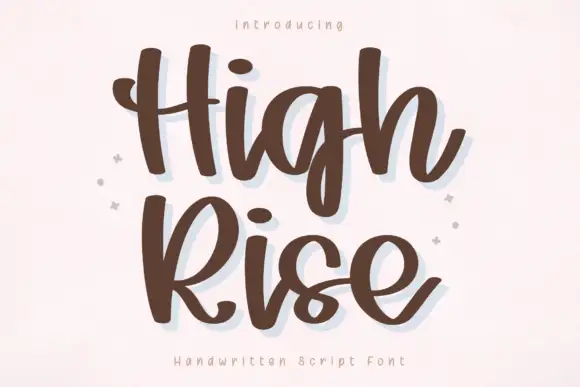
Bold Chicago + High Rise
Adds a warm human signature touch for 1-to-3-word callouts without competing against structured serif capitals.
Inspect High Rise specimenPractical applications
Concrete hierarchy, scale and production guidance tailored to Bold Chicago’s stroke geometry.
An ultra-heavy rounded slab reads as a painted diner sign rather than a modern logo, which is what a roadside café wants above its counter. The heavy stems hold at 90 mm in a bright room, and one ink covers the menu board, the mat and the cup print from a single separation.
Hierarchy & layout recipe
Sign 1800 x 500 mm, word 180 mm with 20 mm edge clearance. Menu board 600 x 900 mm, header 80 mm, items 26 mm, 30 mm margins. Paper mat 300 x 400 mm, word 60 mm, 20 mm margins.
Pre-production check
At 26 mm on the menu board the closed counter of the O fills and the item name reads as a solid block from the queue. Raise items to 32 mm or use the shadow variant for weight, and read one board from three metres before the run.
A heavy rounded slab gives an opener the weight of a printed sign rather than an editorial headline, which suits a story about roadside culture or food. The near-solid letters hold a two-line title at 64 pt, and the rounded corners keep the mass from looking brutal on a coated page.
Hierarchy & layout recipe
Opener 210 x 297 mm, title 64 pt with 10 mm corner clearance, standfirst 11/15 pt, body 9/13 pt, 18 mm margins. Pull quote 44 pt, 12 mm margins. Cover band 210 x 70 mm, word 44 pt.
Pre-production check
At 44 pt on the pull quote the counters close into slits and the quote reads as a black bar with white marks. Keep the face at 52 pt and above, set pull quotes in the body serif, and proof one spread.
A heavy rounded slab reads as a hand-painted market board, which is what a winter stall wants in low light. The thick stems hold at 100 mm behind steam and clutter, and one deep ink on a pale board prints the sign, the label and the tote in a single order.
Hierarchy & layout recipe
Stall sign 800 x 600 mm, word 100 mm with 15 mm corner clearance, prices 34 mm, 25 mm margins. Bottle label 70 x 50 mm, word 14 mm, 4 mm margins. Tote print 300 x 300 mm, word 70 mm, 25 mm margins.
Pre-production check
A 70 x 50 mm bottle label at 14 mm closes the counters entirely and the drink reads as a black rectangle in the fridge. Keep labels at 20 mm or use a lighter cut, and check one bottle in shop light before the batch.
Technical & licence verification
Confirm included OTF/TTF/WOFF formats, full glyph tables and licence coverage on the live store page before batch production.
Closest visual alternatives
Matched across letterform anatomy, stroke behaviour and craft applications.

Tall solid condensed collegiate varsity slab serif
Legend Varsity is a tall, commanding solid-fill collegiate slab serif with crisp chamfered athletic bowls and fast single-layer vinyl weeding.
Ideas for this font
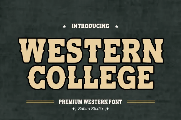
Collegiate-meets-frontier spurred athletic slab serif
Western College fuses stout collegiate varsity block slabs with pointed frontier waist spurs for Texas/Montana campus and rodeo gear.
Ideas for this font
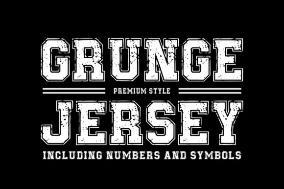
Inline-bordered distressed athletic varsity jersey slab
Grungejersey Regular is a classic collegiate athletic slab serif combining double-inline jersey borders with subtle weathered gym-shirt distress.
Ideas for this font
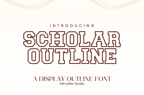
Double-lined collegiate varsity outline slab serif
Scholar Block Outline is a clean, double-contoured collegiate varsity slab serif with octagonal corners and multilingual support.
Ideas for this font
Same independent foundry
Allow optional Google Analytics to measure visits and catalogue actions. Your search words and notes are not included. Privacy & storage