Neutral Sans Workhorse

Block Pop + Kohilo
Lets Block Pop own the focal silhouette while handling secondary copy, sizing and subheads cleanly.
Inspect Kohilo specimenDisclosure: MakerFileHub may earn a commission from qualifying purchases via paid links on this page. How our links work.
Tilted square-tile comic block & toy-brick display
Block Pop is a playful comic display typeface that frames every chunky letter inside its own slightly tilted, outlined square tile.
Paid link
Get this fontProject & layout blueprintsAt-a-glance maker compatibility
Fine grain and micro-texture excel in 300 DPI print, sublimation, and screen print rather than small vinyl weeding.
Visual anatomy & craft review
Block Pop is a comic display that sets every chunky cap inside its own slightly tilted square tile with a bold outline, so a word reads as a row of toy bricks rather than as a line of type. The tiles carry the design, which means the face needs size for the tilt to look deliberate, and the word occupies far more width than the letters alone. It needs roughly 26 mm for the tile and outline to read, and it is best in white with a cobalt tile on bright yellow or in two inks on a pale ground.
Tiled · Toy-block · Funky
Two-font hierarchy recipes
Tested contrast partners — pairing Block Pop with grounded secondary typography.
Block Pop + Kohilo
Lets Block Pop own the focal silhouette while handling secondary copy, sizing and subheads cleanly.
Inspect Kohilo specimen
Block Pop + Papillon Serif – Elegant Modern Luxury
Grounds bold display lettering with classic typographic authority on posters, badges and apparel.
Inspect Papillon Serif – Elegant Modern Luxury specimenPractical applications
Concrete hierarchy, scale and production guidance tailored to Block Pop’s stroke geometry.
Brick-like tiles read as a building-toy party, which is what a young child's birthday is. The tilted boxes give the invite play without a printed illustration, and the heavy forms cut cleanly at 55 mm.
Hierarchy & layout recipe
Invite A6, word 40 mm, details 8/11 pt, 12 mm margins. Banner 900 x 300 mm, word 130 mm, 40 mm margins and 20 mm clear of each eyelet. Topper 130 x 110 mm, word 55 mm with an 8 mm slot and 12 mm clear.
Pre-production check
A topper cut through the tilted tile leaves 2 mm shoulders that snap in the cake. Keep tiles as print only and cut a plain outer shape, and cut one prototype before the batch.
Tiled comic caps read as a section built from blocks, which is what a children's title uses for a puzzle page. The tiles give the header structure at 60 mm, and the outline keeps it legible over a coloured background.
Hierarchy & layout recipe
Header 210 x 60 mm, word 30 mm, 12 mm margins. Activity page A4, title 26 mm, body 12/16 pt, 20 mm margins. Panel 180 x 120 mm, word 40 mm, 10 mm margins.
Pre-production check
A header printed over a coloured page loses the white tile outline and the word merges into the ground. Add a 0.5 mm grey contour around the tiles, and check one printed page before the run.
Brick tiles read as a toy brand's own mark, which is what a small toy shop prints on a box. The outline holds at 40 mm on a lid in two inks, and the tilt keeps the mark playful at any size.
Hierarchy & layout recipe
Box 200 x 150 x 80 mm, word 40 mm on the lid, 20 mm margins. Label 60 x 40 mm, name 9 mm, 3 mm die margin. Decal 600 x 300 mm, word 110 mm, 40 mm margins.
Pre-production check
A 9 mm label narrows each tile to 8 mm and the tilt reads as a badly set row. Keep labels at 13 mm or use the plain letters, and check one applied label under shop light.
Technical & licence verification
Confirm included OTF/TTF/WOFF formats, full glyph tables and licence coverage on the live store page before batch production.
Closest visual alternatives
Matched across letterform anatomy, stroke behaviour and craft applications.
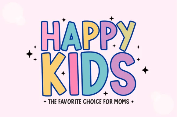
Chunky comic-outlined kids' display with dancing baselines
Happy Kids is a bold, comic-outlined children's display font with oversized playful capitals and energetic baseline tilt.
Ideas for this font
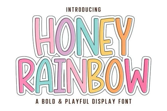
Tall playful rainbow-sticker outlined & solid cartoon display
Honey Rainbow is a tall, upbeat cartoon display font built for multi-colored pastel fills and crisp double-line sticker framing!
Ideas for this font
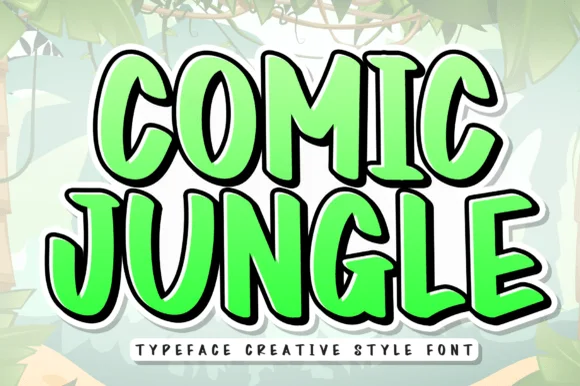
Tall bouncy comic-cartoon jungle & adventure display
Comic Jungle is a tall, lively cartoon display font with slightly organic hand-inked stems and playful vertical bounce.
Ideas for this font
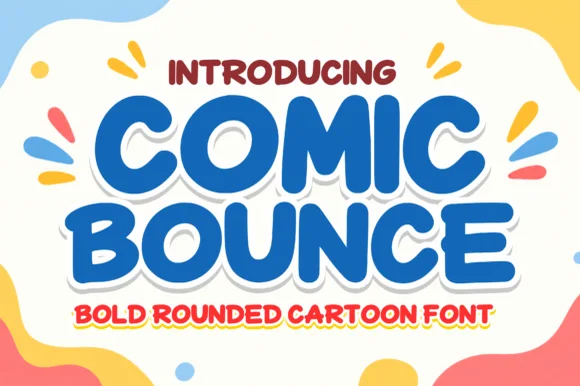
Chunky marshmallow-rounded cartoon headline sans
Comic Bounce is a thick, solid single-layer cartoon display font with puffy rounded strokes, playful tilt, and clean open counters.
Ideas for this font
Same independent foundry
Allow optional Google Analytics to measure visits and catalogue actions. Your search words and notes are not included. Privacy & storage