Editorial Serif Anchor

Boho + The Lumina Awesome
Anchors Boho's fluid strokes with crisp Roman proportions on wedding suites, headers and packaging.
Inspect The Lumina Awesome specimenDisclosure: MakerFileHub may earn a commission from qualifying purchases via paid links on this page. How our links work.
Chunky upright modern brush script
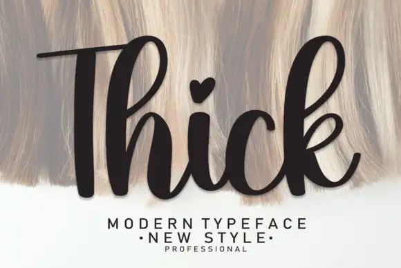
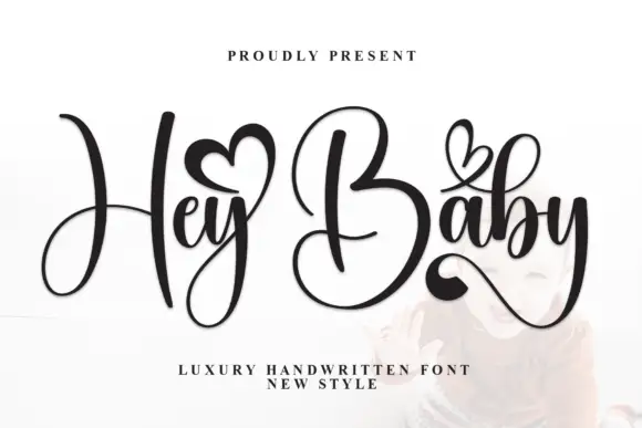
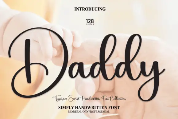
Boho by andikastudio is a thick bouncy modern brush script in which the downstrokes stay generous, the counters open wide and the letters stand nearly upright, so a short phrase reads as warm handwriting that still cuts cleanly.
Paid link
Get this fontProject & layout blueprintsAt-a-glance maker compatibility
Weld or Unite overlapping script joins into one continuous vector path before sending to the blade.
Visual anatomy & craft review
The downstrokes carry most of the weight, the counters stay open enough to keep small sizes legible, the baseline bounces slightly and the upright stance keeps the line steady. The chunky stroke is the character: the word reads as a brush mark rather than a fine pen line, which is why the sample suits vinyl applications. Because the joins stay thick, keep 26 pt as the floor and cut from 1.1 inches of x-height so the connectors weld without tearing; ligature access is a separate step.
Chunky · Upright script · Clean cut
Two-font hierarchy recipes
Tested contrast partners — pairing Boho with grounded secondary typography.
Boho + The Lumina Awesome
Anchors Boho's fluid strokes with crisp Roman proportions on wedding suites, headers and packaging.
Inspect The Lumina Awesome specimen
Boho + Memoir Slang
Keeps small-scale dates, URLs, nutrition facts and care instructions crisp and legible below script titles.
Inspect Memoir Slang specimenPractical applications
Concrete hierarchy, scale and production guidance tailored to Boho’s stroke geometry.
The chunky script suits a nursery sign, and the open counters keep a name readable at 34 pt on a shaped panel. The upright stance also keeps a nursery sign steady.
Hierarchy & layout recipe
Cut a 300 by 150 mm panel: size the name at 34 pt, keep every connector at 3 mm minimum, and keep 20 mm of clear panel around the word so the vinyl lifts cleanly. Keep the panel shape simple.
Pre-production check
A connector cut under 2 mm tears when the transfer tape is pulled; check the file and keep the name at 30 pt or above.
The brush weight reads on canvas, and the upright letters hold a shop name at 25 mm across a printed panel. The thick stroke also holds on canvas without a second pass.
Hierarchy & layout recipe
Print a 200 mm bag panel: set the name at 25 mm, keep 10 mm of clear canvas beneath for a second line, and keep 15 mm of margin at each side. Keep the second line short. Keep the panel square rather than curved.
Pre-production check
A thick script printed on coarse canvas fills its counters; check a swatch and keep the name at 22 mm or above.
The warm script suits a seasonal board, and the heavy strokes read from a path at 55 mm on a painted panel. The brush weight also reads from a field path.
Hierarchy & layout recipe
Paint a 500 by 250 mm board: set the sign at 55 mm, keep 24 mm of border all round, and set the prices in a 16 mm caps on a separate lower band. Keep the prices on their own band.
Pre-production check
A brush script painted at 30 mm loses its bounce; check the mask and keep the sign at 45 mm or above. Check the mask before painting.
Technical & licence verification
Confirm included OTF/TTF/WOFF formats, full glyph tables and licence coverage on the live store page before batch production.
Closest visual alternatives
Matched across letterform anatomy, stroke behaviour and craft applications.

Thick rounded brush script with plump loops and wide transitions
Sweet Boho is a thick rounded brush script in which the strokes stay plump, the joins widen into soft transitions and the loops of S, B and h open wide, so a short phrase holds a large amount of ink on a craft blank.
Ideas for this font
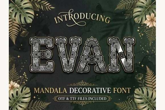
Bold capitals filled with intricate mandala lace and sturdy outer rims
Evan is a decorative capital set in which each letter keeps a sturdy outer rim and the interior fills with botanical mandala lace, so a short word reads as a drawn ornament rather than as plain lettering.
Ideas for this font
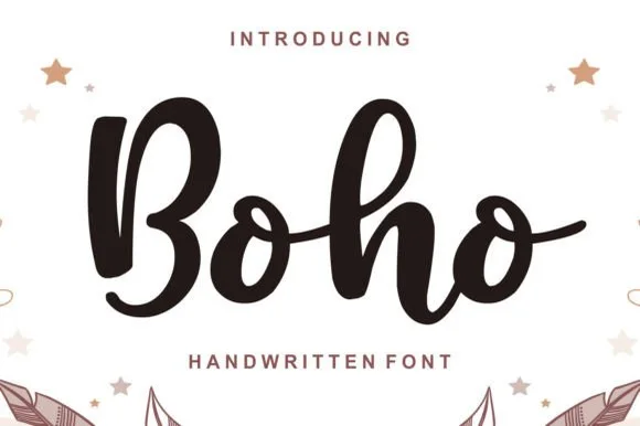
Chunky bouncy bohemian brush-marker script
Boho (by Lisna.Craft) is a thick, welcoming brush-marker script (not a rigid block display) featuring rounded loops and joyful baseline bounce.
Ideas for this font
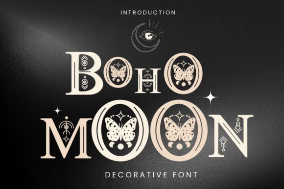
Celestial moth, butterfly & moon-phase bohemian serif
Boho Moon is an enchanting decorative display serif nesting illustrated luna moths/butterflies inside every 'O' and celestial runes across stems!
Ideas for this font
Same independent foundry
Allow optional Google Analytics to measure visits and catalogue actions. Your search words and notes are not included. Privacy & storage