High-Contrast Display Serif

Vintage Serenade + Aureline
Pairs sculptural editorial warmth with Vintage Serenade's clean modern geometry.
Inspect Aureline specimenDisclosure: MakerFileHub may earn a commission from qualifying purchases via paid links on this page. How our links work.
Compact organic serif paired with a long slanted handwritten script
Vintage Serenade pairs a compact organic serif with a long slanted script, so a card carries a firm printed name and a flowing second line that runs well beyond it on both sides.
Paid link
Get this fontProject & layout blueprintsAt-a-glance maker compatibility
Weld or Unite overlapping script joins into one continuous vector path before sending to the blade.
Visual anatomy & craft review
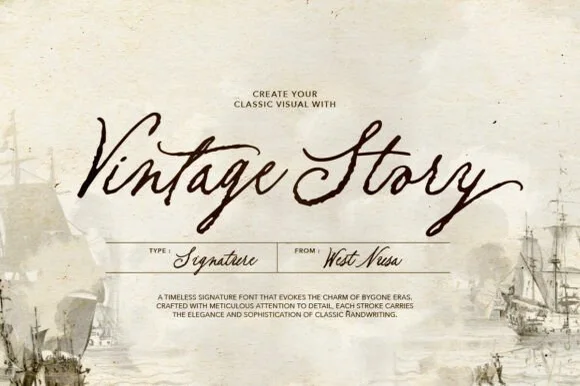
The serif half is a soft roman with slightly uneven serifs, a moderate contrast and tight spacing: the V holds two narrow stems, the g drops a rounded tail and the a keeps a small bowl, which makes a single word read as warm print rather than as editorial. The script half is a light connected hand with a steady slant, tall loops on the l and the d and a long entry and exit stroke that stretch the line past the serif above it. That proportion is the point of the pairing: the serif anchors and the script sails. Both halves hold at 20 pt on an uncoated card, and the script never thins so far that it drops out. The foliage and torn paper photograph, the cream ink and the three caption lines are presentation; the duo is the two lines.
Organic · Compact · Paired
Two-font hierarchy recipes
Tested contrast partners — pairing Vintage Serenade with grounded secondary typography.
Vintage Serenade + Aureline
Pairs sculptural editorial warmth with Vintage Serenade's clean modern geometry.
Inspect Aureline specimen
Vintage Serenade + Abigail
Introduces organic movement on pull-quotes, signatures and gift tags.
Inspect Abigail specimenPractical applications
Concrete hierarchy, scale and production guidance tailored to Vintage Serenade’s stroke geometry.
The compact serif carries the couple's names at 24 pt while the long script adds the date line, which gives a small card two registers without crowding.
Hierarchy & layout recipe
Print a 148 by 105 mm card: set the names in the serif at 24 pt across the upper half, run the script date at 16 pt beneath, and keep 14 mm of margin at each side so the script's exit stroke finishes inside the trim.
Pre-production check
A long script exit stroke close to the trim looks chopped; check the proof at final size and pull the line in by 4 mm before printing.
The organic serif gives a small label a period feel while the script signs the maker, and both stay legible at 10 pt on a lid sticker.
Hierarchy & layout recipe
Print a 50 by 50 mm lid sticker: set the shop name in the serif at 10 pt, set the maker's line in the script at 11 pt beneath, and keep 5 mm inside the die so the script's long stroke is not clipped by the corner radius.
Pre-production check
A light script printed on a small sticker can look like a scratch; check the printed sticker and raise the script to 12 pt rather than a heavier cut.
The pair gives a menu cover a printed title and a flowing subtitle, and the compact serif keeps a long dish name readable at 34 pt.
Hierarchy & layout recipe
Print an A5 cover: set the title in the serif at 34 pt, set the subtitle in the script at 20 pt beneath, and hold 12 mm between the two lines so the script's ascenders clear the serif's descenders.
Pre-production check
Serif descenders and script ascenders can collide at close leading; check the cover at final size and open the gap rather than shrinking either line.
Technical & licence verification
Confirm included OTF/TTF/WOFF formats, full glyph tables and licence coverage on the live store page before batch production.
Closest visual alternatives
Matched across letterform anatomy, stroke behaviour and craft applications.
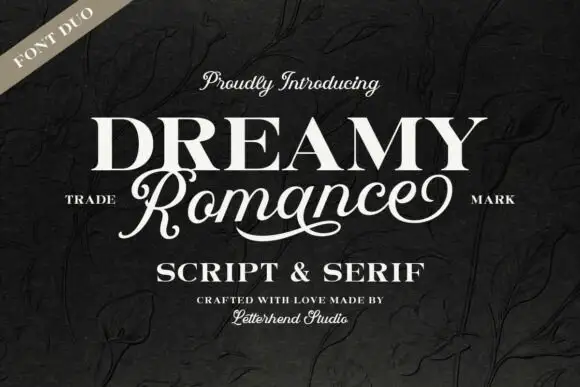
Heavy upright serif heading paired with a flowing script
Dreamy Romance shows bold white serif capitals above a slanted connected script word: the script capital R closes a loop while a long curved underline sweeps beneath the middle of the word, so one card holds a solid statement and a written line.
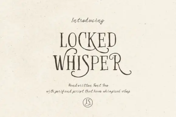
Ornate serif capitals with a whiskered script
Locked Whisper is a duo on speckled cream: ornate display capitals with thin strokes, curled serifs and long whiskers, and a fine script beneath whose letters carry the same curls at a smaller scale.
Ideas for this font
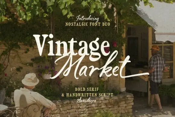
Bold serif paired with a hand-brushed script
Vintage Market is a nostalgic duo in cream over a market photograph: a bold serif for the first word and a hand-brushed script with long tails for the second, sold together as a pair with a small credit line beneath.
Ideas for this font
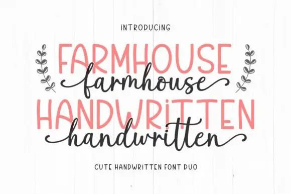
Irregular narrow hand-drawn capitals paired with a looped lowercase script
Farmhouse Handwritten is a two-cut pair in which narrow capitals lean unevenly with rounded A and R bowls, while a looped lowercase script sends a deep f and high h and d loops that curl away at both ends of the word.
Ideas for this font
Same independent foundry
Allow optional Google Analytics to measure visits and catalogue actions. Your search words and notes are not included. Privacy & storage