High-Contrast Display Serif

Dreamy Romance + Marquis - Elegant Modern Serif
Pairs sculptural editorial warmth with Dreamy Romance's clean modern geometry.
Inspect Marquis - Elegant Modern Serif specimenDisclosure: MakerFileHub may earn a commission from qualifying purchases via paid links on this page. How our links work.
Heavy upright serif heading paired with a flowing script
Dreamy Romance shows bold white serif capitals above a slanted connected script word: the script capital R closes a loop while a long curved underline sweeps beneath the middle of the word, so one card holds a solid statement and a written line.
Paid link
Get this fontProject & layout blueprintsAt-a-glance maker compatibility
Weld or Unite overlapping script joins into one continuous vector path before sending to the blade.
Visual anatomy & craft review
The serif cut keeps wide heavy capitals with even counters, the script cut joins a slanted lowercase body and its R loops at the entry, and the underline curve sits beneath the script as a separate drawn stroke. The pairing of a heavy cap row with a flowing line is the character, which is why the sample sets the two at different sizes on a dark textured cover. Because the script slants and the underline sweeps, keep 18 mm between the rows and 20 mm at each end from 28 pt.
Duo · Heavy serif · Flowing script
Two-font hierarchy recipes
Tested contrast partners — pairing Dreamy Romance with grounded secondary typography.
Dreamy Romance + Marquis - Elegant Modern Serif
Pairs sculptural editorial warmth with Dreamy Romance's clean modern geometry.
Inspect Marquis - Elegant Modern Serif specimen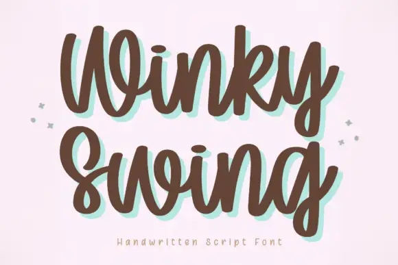
Dreamy Romance + Winky Swing
Introduces organic movement on pull-quotes, signatures and gift tags.
Inspect Winky Swing specimenPractical applications
Concrete hierarchy, scale and production guidance tailored to Dreamy Romance’s stroke geometry.
The pair gives a suite a strong name and a soft written line, and the heavy caps hold the names at 28 pt above a 22 pt script phrase. The two voices keep a card from looking one-sided.
Hierarchy & layout recipe
Print a 130 by 180 mm card: set the names at 28 pt in the serif cut, set the phrase at 22 pt in the script 18 mm beneath, and keep 20 mm of clear card at each end for the underline sweep.
Pre-production check
A sweep printed under a descender merges with it; check the card and keep 14 mm between the script baseline and the stroke.
The heavy and flowing combination suits a valentine, and the pair keeps a short phrase clear at 26 pt and 20 pt on an A6 sheet. The heavy row gives the valentine its structure.
Hierarchy & layout recipe
Print an A6 card: set the heading at 26 pt in the serif, set the phrase at 20 pt in the script beneath with 16 mm of clear ground, and leave the lower third blank for a written line.
Pre-production check
Two script rows on one card crowd the sweep; check the card and keep the script to one line. Keep the sweep on one side of the card.
The pair gives a studio label both weight and hand, and the serif name holds at 20 pt on a 55 mm panel in one ink. The pair fits a small label where a script alone would blur.
Hierarchy & layout recipe
Print a 55 by 40 mm label: set the studio name at 20 pt in the serif, set the phrase at 16 pt in the script with 8 mm of clear ground, and keep 4 mm of border. Keep the serif row centred on the panel.
Pre-production check
A script printed at 14 pt loses its joins; check the proof and keep the phrase at 16 pt or above on coated stock.
Technical & licence verification
Confirm included OTF/TTF/WOFF formats, full glyph tables and licence coverage on the live store page before batch production.
Closest visual alternatives
Matched across letterform anatomy, stroke behaviour and craft applications.
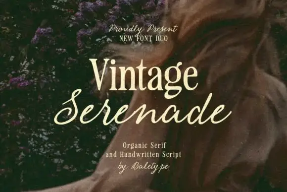
Compact organic serif paired with a long slanted handwritten script
Vintage Serenade pairs a compact organic serif with a long slanted script, so a card carries a firm printed name and a flowing second line that runs well beyond it on both sides.
Ideas for this font
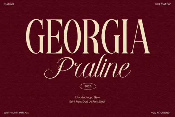
Serif and script duo pairing tall engraved caps with a light italic
Georgia Praline is a two-cut family in which a tall engraved serif carries the headline and a light italic script answers beneath it, so a design gets a formal voice and a written line from one purchase.
Ideas for this font
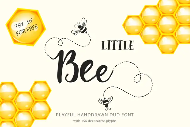
Serif label capitals paired with a rounded connected script
Little Bee Duo pairs a compact serif in wide capitals with a rounded connected script, so a jar label can carry a printed heading and a friendly written line in the same ink.
Ideas for this font
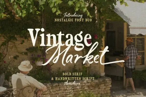
Bold serif paired with a hand-brushed script
Vintage Market is a nostalgic duo in cream over a market photograph: a bold serif for the first word and a hand-brushed script with long tails for the second, sold together as a pair with a small credit line beneath.
Ideas for this font
Same independent foundry
Allow optional Google Analytics to measure visits and catalogue actions. Your search words and notes are not included. Privacy & storage



