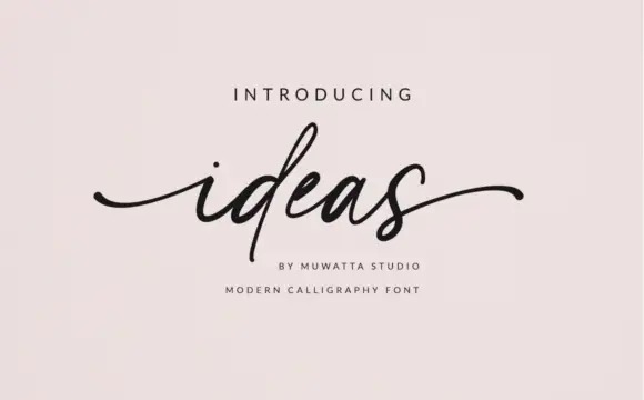
High-Contrast Display Serif

Pablo Duo + The Simple Editorial
Pairs sculptural editorial warmth with Pablo Duo's clean modern geometry.
Inspect The Simple Editorial specimenDisclosure: MakerFileHub may earn a commission from qualifying purchases via paid links on this page. How our links work.
Modern flared geometric serif + fine monoline signature script duo
Pablo Duo pairs a clean, open-counter modern serif with an airy fine-line signature script built for layered editorial knockout logos!
Paid link
Get this fontProject & layout blueprintsAt-a-glance maker compatibility
Weld or Unite overlapping script joins into one continuous vector path before sending to the blade.
Visual anatomy & craft review
Pablo Duo pairs an open-counter modern flared serif with an airy fine-line signature script, designed so the serif can sit large behind an overlapping script in a layered knockout. The serif carries size, the script carries personality, and the two are meant to intersect, which means the layout must leave room for the overlay. The serif needs roughly 24 pt for the flare to read, and the pair is best in cream and charcoal on amber or one ink on ivory.
Editorial-overlay · Clean-serif-plus-pen · Warm-minimal
Two-font hierarchy recipes
Tested contrast partners — pairing Pablo Duo with grounded secondary typography.
Pablo Duo + The Simple Editorial
Pairs sculptural editorial warmth with Pablo Duo's clean modern geometry.
Inspect The Simple Editorial specimen
Pablo Duo + Autography
Introduces organic movement on pull-quotes, signatures and gift tags.
Inspect Autography specimenPractical applications
Concrete hierarchy, scale and production guidance tailored to Pablo Duo’s stroke geometry.
A flared serif with a monoline signature is exactly the layered mark a design studio builds, so a carton and a card come from one family. The serif holds the studio name at 40 mm and the script signs over it at 26 mm, and one ink prints the overlay.
Hierarchy & layout recipe
Card 105 x 148 mm, serif 40 mm, script 26 mm overlapping, 12 mm margins. Carton 200 x 150 x 80 mm, serif 44 mm, 25 mm margins. Label 70 x 45 mm, serif 16 mm, 4 mm die margin.
Pre-production check
The script overlaps the serif, and a 0.3 mm registration shift in a two-colour print leaves a white ghost along every letter. Print one colour with a knockout, and check one card at final size.
A serif with a signature over it reads as a designed rather than engraved suite, which is what a modern wedding wants. The overlap gives the couple's names one mark, and the serif carries details at 9 pt beneath it.
Hierarchy & layout recipe
Invitation 120 x 180 mm, serif names 30 mm, script 20 mm overlapping, details 9/13 pt, 15 mm margins. Menu 120 x 210 mm, header 16 pt, dishes 9/13 pt. Sign 600 x 900 mm, names 90 mm, 25 mm frame clearance.
Pre-production check
A pair of names overlapped at 20 mm on a 120 mm card leaves the script tail hanging over the trim. Keep 10 mm of clear card beyond the script, and check one cut card before the suite.
A flared serif behind a fine script reads as an editorial lock-up, which is what a culture magazine uses on an opener. The pairing makes one lock-up out of a headline and a byline, and one ink keeps the page quiet.
Hierarchy & layout recipe
Opener 420 x 297 mm, serif headline 120 mm, script 60 mm overlapping, body 9/13 pt, 15 mm margins. Cover 210 x 297 mm, serif 90 pt, script 44 pt. Panel 600 x 300 mm, quote 90 mm, source 18 pt.
Pre-production check
A 60 mm signature over a 120 mm headline fills on uncoated stock and the script reads as a stain. Print coated or keep the script at 0.4 mm stroke minimum, and check one printed spread.
Technical & licence verification
Confirm included OTF/TTF/WOFF formats, full glyph tables and licence coverage on the live store page before batch production.
Closest visual alternatives
Matched across letterform anatomy, stroke behaviour and craft applications.
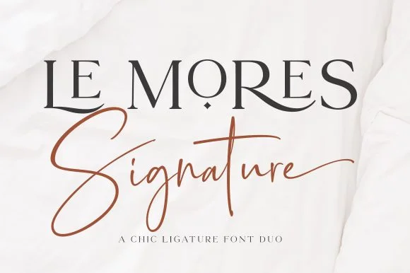
Ligature editorial serif & slanted signature script duo
Le Mores Signature pairs an editorial ligature serif—highlighted by cradled base loops—with a brisk copper-toned signature cursive.
Ideas for this font
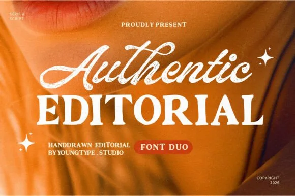
Textured brush signature script & warm hand-crafted serif duo
Authentic Editorial pairs an expressive, textured brush script with a sturdy, softly organic all-caps editorial serif partner.
Ideas for this font
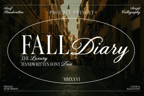
Classical editorial Roman serif + sweeping calligraphy script duo
Fall Diary is an atmospheric editorial font duo pairing tall, crisp hand-crafted Roman serif capitals with a lush slanted calligraphy script.
Ideas for this font
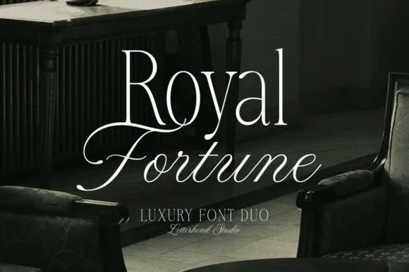
High-contrast luxury serif & fine copperplate script duo
Royal Fortune is a refined luxury font duo pairing a tall, razor-thin high-contrast editorial serif with a poised copperplate calligraphy script.
Ideas for this font
Same independent foundry
Allow optional Google Analytics to measure visits and catalogue actions. Your search words and notes are not included. Privacy & storage